Sunburst chart
info
Charts are available with Avalonia Pro.
Sunburst charts are used to visualize hierarchical data through a series of concentric rings. Each ring represents a level in the hierarchy, with the inner circle being the root level.
When to use
- Nested data: Visualizing complex hierarchies with multiple levels.
- Space-efficiency: When you need a compact alternative to a tree diagram.
- Drill-down: Effectively showing the breakdown of segments at each level.
Code example
XAML
<SunburstChart xmlns="https://github.com/avaloniaui" Name="SunburstChartSample"
                        Title="Organization Structure"
                        Height="350"
                        ItemsSource="{Binding SunburstData}"
                        ValuePath="Size"
                        LabelPath="Name"
                        ChildrenPath="Children" />
Data model (C#)
public class SunburstNode
{
public string Name { get; set; } = string.Empty;
public double Size { get; set; }
public ObservableCollection<SunburstNode> Children { get; set; } = new();
public SunburstNode(string name, double size = 0)
{
Name = name;
Size = size;
}
}
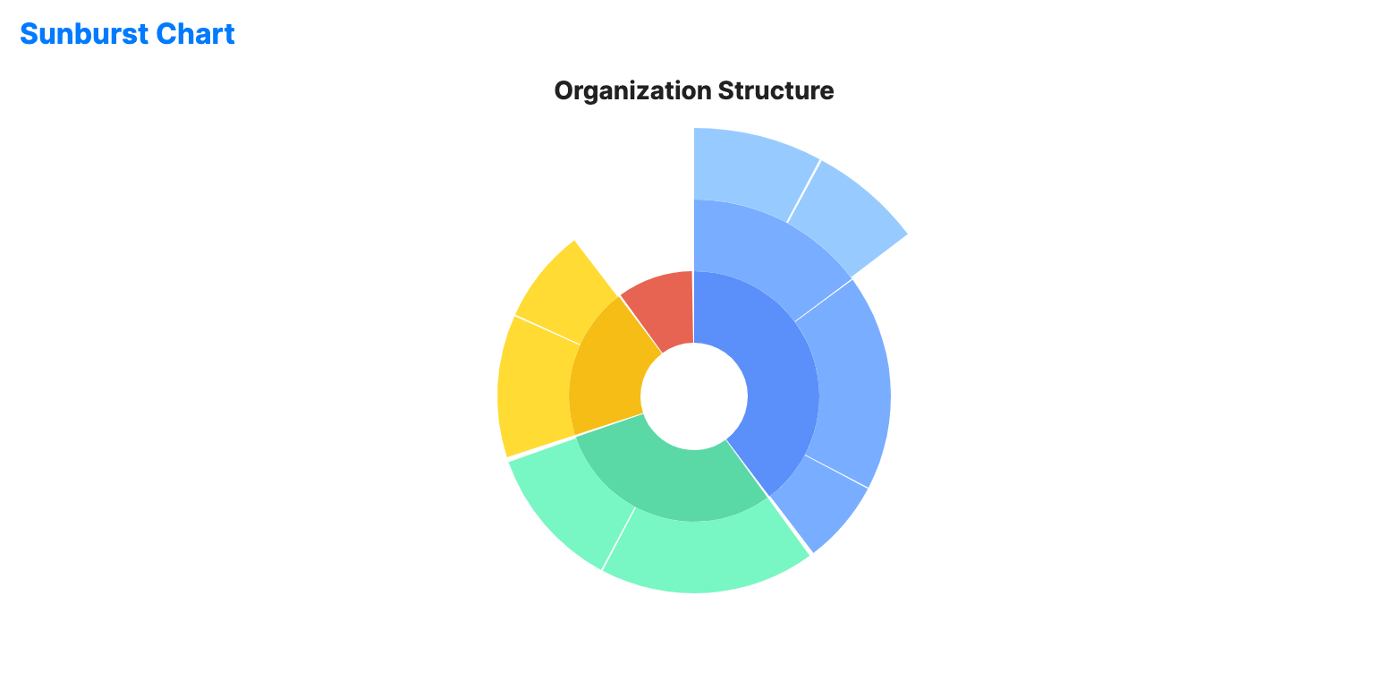
public ObservableCollection<SunburstNode> SunburstData { get; } = new()
{
new SunburstNode("Engineering", 40)
{
Children = new()
{
new SunburstNode("Frontend", 15)
{
Children = new()
{
new SunburstNode("React", 8),
new SunburstNode("Angular", 7)
}
},
new SunburstNode("Backend", 18),
new SunburstNode("DevOps", 7)
}
},
new SunburstNode("Sales", 30)
{
Children = new()
{
new SunburstNode("Pro", 18),
new SunburstNode("SMB", 12)
}
},
new SunburstNode("Marketing", 20)
{
Children = new()
{
new SunburstNode("Digital", 12),
new SunburstNode("Brand", 8)
}
},
new SunburstNode("HR", 10)
};
Common properties
| Property | Description | Default |
|---|---|---|
Title | The chart title. | null |
ItemsSource | The collection of root-level data items. | null |
ValuePath | Path to the property representing segment size. | null |
LabelPath | Path to the property for segment labels. | null |
ChildrenPath | Path to the collection of child items. | null |
InnerRadiusFactor | Relative size of the center hole from 0.0 to 1.0. | 0.2 |
RingThickness | Thickness of each ring. | 40.0 |
GapAngle | Gap angle between segments. | 2.0 |
IsHighlightEnabled | Enables hover highlighting for segments. | false |
IsSelectionEnabled | Whether data point selection is enabled. | false |
SelectionMode | The selection mode, e.g. None, Single, SingleDeselect, or Multiple. | SingleDeselect |
SelectionBrush | Brush used to highlight selected segments. | FromRgb(49, 74, 110) |
SelectionStroke | Brush used to outline selected segments. | Uses theme default. |
SelectionStrokeThickness | Thickness of the outline of selected segments. | 2.0 |
SelectedIndex | Index of the selected data point. | -1 |