Nightingale rose chart
info
Charts are available with Avalonia Pro.
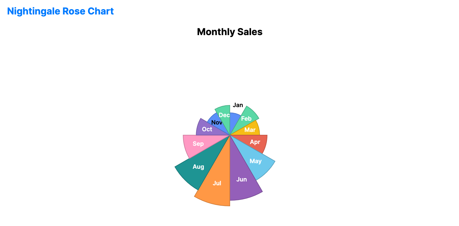
The Nightingale rose chart is a polar area chart with equal angles and variable radii. It is useful when you want a circular alternative to a bar chart while keeping one value per category.
When to use
- Seasonal summaries: Comparing one measurement across months or quarters.
- Category comparison: Showing relative magnitude without using Cartesian axes.
- Circular dashboards: Using a radial layout when the categories form a cycle.
Code example
XAML
<NightingaleRoseChart xmlns="https://github.com/avaloniaui" Name="NightingaleRoseSample"
                               Title="Monthly Sales"
                               Height="350"
                               ShowLabels="True"
                               ItemsSource="{Binding NightingaleData}"
                               ValuePath="Value"
                               LabelPath="Label" />
Data model (C#)
public record RadialPoint(string Label, double Value);

public ObservableCollection<RadialPoint> NightingaleData { get; } = new()
{
    new("Jan", 120.0), new("Feb", 180.0), new("Mar", 160.0),
    new("Apr", 200.0), new("May", 280.0), new("Jun", 350.0),
    new("Jul", 380.0), new("Aug", 340.0), new("Sep", 250.0),
    new("Oct", 180.0), new("Nov", 140.0), new("Dec", 160.0)
};
Common properties
| Property | Description | Default |
|---|---|---|
ItemsSource | The collection of segments. | null |
ValuePath | Radius magnitude of each segment. | null |
LabelPath | Category label for each segment. | null |
InnerRadiusFactor | Inner radius ratio, where 0.0 creates a solid rose chart. | 0.0 |
ShowLabels | Whether to display segment labels. | true |
ShowValues | Whether to display numeric values with the labels. | false |
IsHighlightEnabled | Enables hover highlighting for segments. | false |