Polar area chart
info
Charts are available with Avalonia Pro.
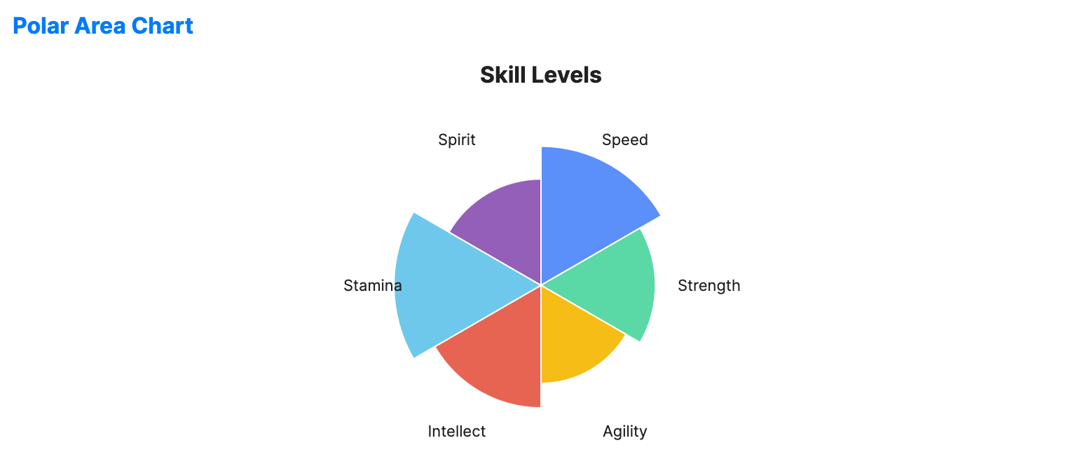
Polar area charts (or coxcomb charts) are similar to pie charts but represent values using the radius of segments instead of the angle. Each segment has an equal angle.
When to use
- Cyclical trends: Visualizing seasonal data or wind patterns.
- Ranking categories: Comparing the magnitude of many categories in a circular layout.
- Historical analysis: The classic chart type for visualizing causes of mortality over time.
Code example
XAML
<PolarAreaChart xmlns="https://github.com/avaloniaui" Name="PolarAreaChartSample" Title="Skill Levels" Height="300"
                                             ItemsSource="{Binding PolarChartData}"
                                             LabelPath="Label" ValuePath="Value" />
Data model (C#)
public record RadialPoint(string Label, double Value);

public ObservableCollection<RadialPoint> PolarChartData { get; } = new()
{
    new("Speed", 85),
    new("Strength", 70),
    new("Agility", 60),
    new("Intellect", 75),
    new("Stamina", 90),
    new("Spirit", 65)
};
Common properties
| Property | Description | Default |
|---|---|---|
ItemsSource | The collection of segments. | null |
ValuePath | Property determining the radius of the slice. | null |
LabelPath | Property for the slice name. | null |
ShowLabels | Whether to display labels for segments. | true |
LabelFontSize | Font size used for segment labels. | 11.0 |
LabelForeground | Brush used for segment labels. When null, the chart uses the effective label foreground. | null |
StartAngle | Start angle in degrees for the first segment. | -90.0 |
Stroke | Outline brush for the segments. When null, the chart uses a white outline. | null (white) |
StrokeThickness | Thickness of the segment outlines. | 1.0 |
IsHighlightEnabled | Enables hover highlighting for polar area segments. | false |