CommandBar
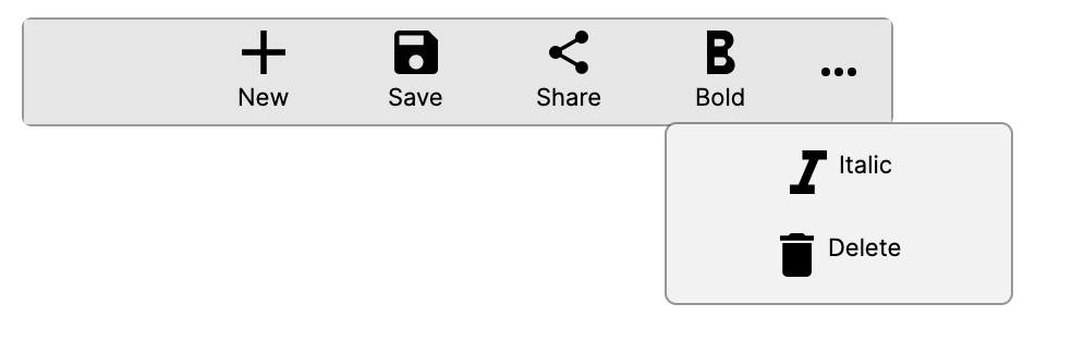
A CommandBar is a toolbar-style control that displays a row of primary commands and an overflow menu for secondary commands. It is commonly used to surface the most relevant actions for the current context, while keeping less frequently used commands accessible through the overflow ("more") button.
Primary commands appear directly in the bar. When space is limited, commands can automatically move into the overflow area. Secondary commands always appear in the overflow menu.
ICommandBarElement
Items placed in a CommandBar must implement the ICommandBarElement interface. Avalonia provides three built-in implementations:
CommandBarButton: A button with an icon, a label, or both. Supports commands via the inheritedCommandproperty.CommandBarToggleButton: A toggle button that maintains a checked/unchecked state. Useful for toggling options such as bold or italic formatting.CommandBarSeparator: A visual divider used to group related commands within the bar or the overflow menu.
CommandBar properties
| Property | Type | Default | Description |
|---|---|---|---|
PrimaryCommands | IList<ICommandBarElement> | Empty | The collection of primary commands displayed directly in the bar. |
SecondaryCommands | IList<ICommandBarElement> | Empty | The collection of secondary commands displayed in the overflow menu. |
Content | object? | null | Custom content displayed before the primary commands. |
DefaultLabelPosition | CommandBarDefaultLabelPosition | Bottom | Controls where labels appear relative to icons for all commands in the bar. |
IsDynamicOverflowEnabled | bool | false | When true, primary commands automatically move to the overflow menu if the bar is too narrow to display them all. |
OverflowButtonVisibility | CommandBarOverflowButtonVisibility | Auto | Controls when the overflow ("more") button is visible. |
IsOpen | bool | false | Whether the overflow menu is currently open. |
IsSticky | bool | false | When true, the overflow menu stays open until the user explicitly closes it, rather than closing on light dismiss. |
ItemWidthBottom | double | 70 | The estimated item width used for dynamic overflow when DefaultLabelPosition is Bottom. |
ItemWidthRight | double | 102 | The estimated item width used for dynamic overflow when DefaultLabelPosition is Right. |
ItemWidthCollapsed | double | 42 | The estimated item width used for dynamic overflow when DefaultLabelPosition is Collapsed. |
HasSecondaryCommands | bool | Read-only | Indicates whether the overflow menu currently has items, including secondary commands and any primary commands moved to overflow. |
IsOverflowButtonVisible | bool | Read-only | Indicates whether the overflow button is currently visible, based on OverflowButtonVisibility and available commands. |
VisiblePrimaryCommands | ReadOnlyObservableCollection<ICommandBarElement> | Read-only | The subset of primary commands that are currently visible in the bar (not overflowed). |
OverflowItems | ReadOnlyObservableCollection<ICommandBarElement> | Read-only | The combined list of overflowed primary commands and secondary commands shown in the overflow menu. |
CommandBar events
| Event | Description |
|---|---|
Opened | Raised when the overflow menu is opened. |
Closed | Raised when the overflow menu is closed. |
Opening | Raised just before the overflow menu opens. |
Closing | Raised just before the overflow menu closes. |
DefaultLabelPosition values
| Value | Description |
|---|---|
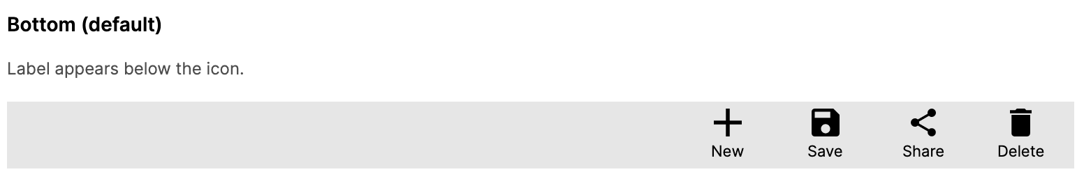
Bottom | Labels appear below the icon. This is the default. |
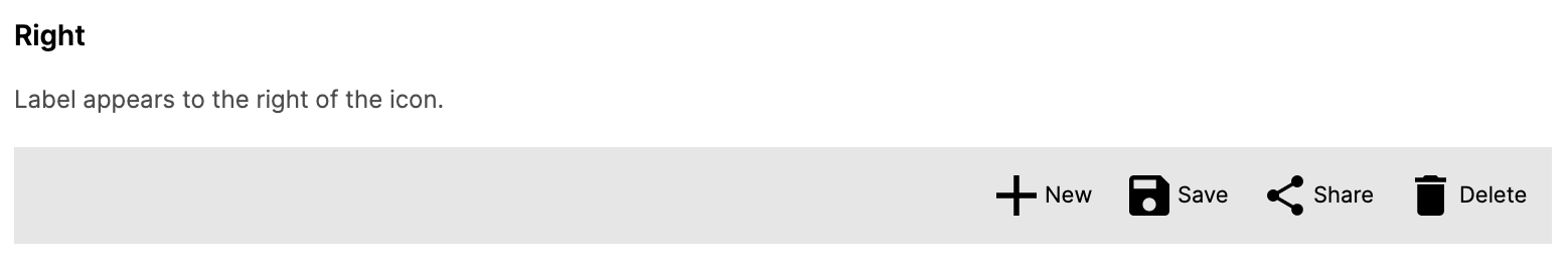
Right | Labels appear to the right of the icon. |
Collapsed | Labels are hidden; only icons are shown. |
OverflowButtonVisibility values
| Value | Description |
|---|---|
Auto | The overflow button is shown automatically when there are secondary commands or overflowed primary commands. |
Visible | The overflow button is always shown. |
Collapsed | The overflow button is always hidden. |
CommandBarButton properties
| Property | Type | Default | Description |
|---|---|---|---|
Icon | object? | null | The icon displayed on the button. Typically a PathIcon, SymbolIcon, or BitmapIcon. |
Label | string? | null | The text label for the button. |
Command | ICommand? | null | The command to invoke when the button is clicked. |
CommandParameter | object? | null | The parameter passed to the command. |
IsCompact | bool | false | Hides the label and shows compact button chrome. |
IsInOverflow | bool | false | Indicates whether the button is currently displayed in the overflow menu. Set automatically by CommandBar. |
LabelPosition | CommandBarDefaultLabelPosition | Bottom | The label position applied by the parent CommandBar. |
DynamicOverflowOrder | int | 0 | Controls which primary commands stay visible longest when space is limited. Lower values have higher priority and overflow later. |
CommandBarToggleButton properties
| Property | Type | Default | Description |
|---|---|---|---|
Icon | object? | null | The icon displayed on the toggle button. |
Label | string? | null | The text label for the toggle button. |
IsChecked | bool? | false | Whether the toggle button is currently in the checked state. |
Command | ICommand? | null | The command to invoke when the toggle button is clicked. |
CommandParameter | object? | null | The parameter passed to the command. |
IsCompact | bool | false | Hides the label and shows compact button chrome. |
IsInOverflow | bool | false | Indicates whether the toggle button is currently displayed in the overflow menu. Set automatically by CommandBar. |
LabelPosition | CommandBarDefaultLabelPosition | Bottom | The label position applied by the parent CommandBar. |
DynamicOverflowOrder | int | 0 | Controls which primary commands stay visible longest when space is limited. Lower values have higher priority and overflow later. |
CommandBarSeparator
CommandBarSeparator renders a vertical line in the primary command area or a horizontal line in the overflow menu to visually group related commands.
Examples
Basic CommandBar
A simple command bar with icon buttons:
<CommandBar>
    <CommandBar.PrimaryCommands>
        <CommandBarButton Label="Add">
            <CommandBarButton.Icon>
                <PathIcon Data="{StaticResource AddIcon}" />
            </CommandBarButton.Icon>
        </CommandBarButton>
        <CommandBarButton Label="Edit">
            <CommandBarButton.Icon>
                <PathIcon Data="{StaticResource EditIcon}" />
            </CommandBarButton.Icon>
        </CommandBarButton>
        <CommandBarButton Label="Delete">
            <CommandBarButton.Icon>
                <PathIcon Data="{StaticResource DeleteIcon}" />
            </CommandBarButton.Icon>
        </CommandBarButton>
    </CommandBar.PrimaryCommands>
</CommandBar>
Primary and secondary commands with separators
Use CommandBarSeparator to group commands, and place less common actions in SecondaryCommands:
<CommandBar>
    <CommandBar.PrimaryCommands>
        <CommandBarButton Label="Cut">
            <CommandBarButton.Icon>
                <PathIcon Data="{StaticResource CutIcon}" />
            </CommandBarButton.Icon>
        </CommandBarButton>
        <CommandBarButton Label="Copy">
            <CommandBarButton.Icon>
                <PathIcon Data="{StaticResource CopyIcon}" />
            </CommandBarButton.Icon>
        </CommandBarButton>
        <CommandBarButton Label="Paste">
            <CommandBarButton.Icon>
                <PathIcon Data="{StaticResource PasteIcon}" />
            </CommandBarButton.Icon>
        </CommandBarButton>
        <CommandBarSeparator />
        <CommandBarButton Label="Undo">
            <CommandBarButton.Icon>
                <PathIcon Data="{StaticResource UndoIcon}" />
            </CommandBarButton.Icon>
        </CommandBarButton>
        <CommandBarButton Label="Redo">
            <CommandBarButton.Icon>
                <PathIcon Data="{StaticResource RedoIcon}" />
            </CommandBarButton.Icon>
        </CommandBarButton>
    </CommandBar.PrimaryCommands>
    <CommandBar.SecondaryCommands>
        <CommandBarButton Label="Select All" />
        <CommandBarButton Label="Find and Replace" />
        <CommandBarSeparator />
        <CommandBarButton Label="Settings" />
    </CommandBar.SecondaryCommands>
</CommandBar>
Custom content area
The Content property lets you place custom content before the primary commands:
<CommandBar>
    <CommandBar.PrimaryCommands>
        <CommandBarButton Label="Back">
            <CommandBarButton.Icon>
                <PathIcon Data="{StaticResource BackIcon}" />
            </CommandBarButton.Icon>
        </CommandBarButton>
        <CommandBarButton Label="Forward">
            <CommandBarButton.Icon>
                <PathIcon Data="{StaticResource ForwardIcon}" />
            </CommandBarButton.Icon>
        </CommandBarButton>
    </CommandBar.PrimaryCommands>
    <CommandBar.Content>
        <TextBox Watermark="Search..." Width="200" Margin="8,0" />
    </CommandBar.Content>
</CommandBar>
Label positions
Control where labels appear relative to icons using the DefaultLabelPosition property.
Bottom (default)
<CommandBar DefaultLabelPosition="Bottom">
    <CommandBar.PrimaryCommands>
        <CommandBarButton Label="Add">
            <CommandBarButton.Icon>
                <PathIcon Data="{StaticResource AddIcon}" />
            </CommandBarButton.Icon>
        </CommandBarButton>
        <CommandBarButton Label="Edit">
            <CommandBarButton.Icon>
                <PathIcon Data="{StaticResource EditIcon}" />
            </CommandBarButton.Icon>
        </CommandBarButton>
    </CommandBar.PrimaryCommands>
</CommandBar>
Right
<CommandBar DefaultLabelPosition="Right">
    <CommandBar.PrimaryCommands>
        <CommandBarButton Label="Add">
            <CommandBarButton.Icon>
                <PathIcon Data="{StaticResource AddIcon}" />
            </CommandBarButton.Icon>
        </CommandBarButton>
        <CommandBarButton Label="Edit">
            <CommandBarButton.Icon>
                <PathIcon Data="{StaticResource EditIcon}" />
            </CommandBarButton.Icon>
        </CommandBarButton>
    </CommandBar.PrimaryCommands>
</CommandBar>
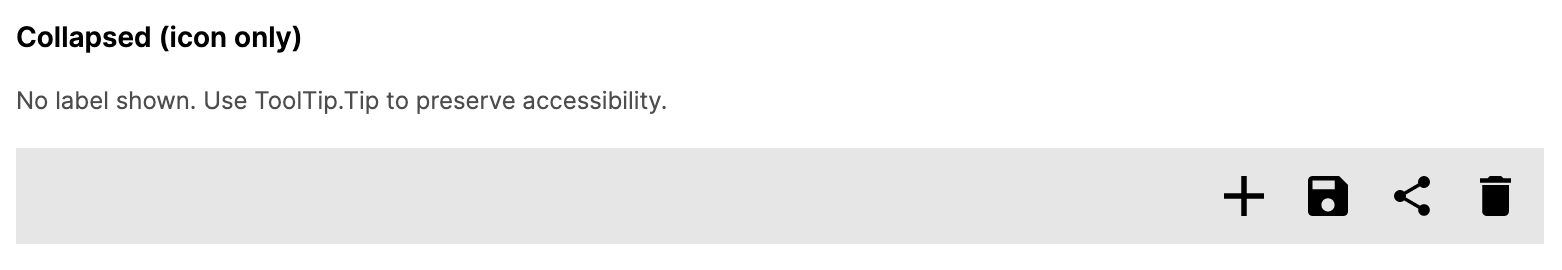
Collapsed
<CommandBar DefaultLabelPosition="Collapsed">
    <CommandBar.PrimaryCommands>
        <CommandBarButton Label="Add">
            <CommandBarButton.Icon>
                <PathIcon Data="{StaticResource AddIcon}" />
            </CommandBarButton.Icon>
        </CommandBarButton>
        <CommandBarButton Label="Edit">
            <CommandBarButton.Icon>
                <PathIcon Data="{StaticResource EditIcon}" />
            </CommandBarButton.Icon>
        </CommandBarButton>
    </CommandBar.PrimaryCommands>
</CommandBar>
Dynamic overflow
When IsDynamicOverflowEnabled is true, primary commands that do not fit in the available space automatically move into the overflow menu. Use DynamicOverflowOrder to control which commands stay visible longest:
<CommandBar IsDynamicOverflowEnabled="True">
    <CommandBar.PrimaryCommands>
        <CommandBarButton Label="Low Priority" DynamicOverflowOrder="2">
            <CommandBarButton.Icon>
                <PathIcon Data="{StaticResource StarIcon}" />
            </CommandBarButton.Icon>
        </CommandBarButton>
        <CommandBarButton Label="High Priority" DynamicOverflowOrder="0">
            <CommandBarButton.Icon>
                <PathIcon Data="{StaticResource InfoIcon}" />
            </CommandBarButton.Icon>
        </CommandBarButton>
        <CommandBarButton Label="Medium Priority" DynamicOverflowOrder="1">
            <CommandBarButton.Icon>
                <PathIcon Data="{StaticResource EditIcon}" />
            </CommandBarButton.Icon>
        </CommandBarButton>
    </CommandBar.PrimaryCommands>
</CommandBar>
In this example, "High Priority" has the highest visibility priority (order 0), then "Medium Priority" (order 1), and "Low Priority" moves to overflow first (order 2).
Overflow button visibility
Control when the overflow button appears:
<!-- Always show the overflow button -->
<CommandBar OverflowButtonVisibility="Visible">
    <CommandBar.PrimaryCommands>
        <CommandBarButton Label="Save">
            <CommandBarButton.Icon>
                <PathIcon Data="{StaticResource SaveIcon}" />
            </CommandBarButton.Icon>
        </CommandBarButton>
    </CommandBar.PrimaryCommands>
</CommandBar>

<!-- Never show the overflow button -->
<CommandBar OverflowButtonVisibility="Collapsed">
    <CommandBar.PrimaryCommands>
        <CommandBarButton Label="Save">
            <CommandBarButton.Icon>
                <PathIcon Data="{StaticResource SaveIcon}" />
            </CommandBarButton.Icon>
        </CommandBarButton>
    </CommandBar.PrimaryCommands>
</CommandBar>
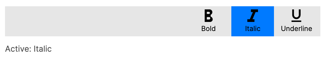
Sticky overflow
When IsSticky is true, the overflow menu remains open until the user explicitly dismisses it. This is useful when multiple selections or interactions within the overflow menu are expected:
<CommandBar IsSticky="True">
    <CommandBar.SecondaryCommands>
        <CommandBarToggleButton Label="Bold">
            <CommandBarToggleButton.Icon>
                <PathIcon Data="{StaticResource BoldIcon}" />
            </CommandBarToggleButton.Icon>
        </CommandBarToggleButton>
        <CommandBarToggleButton Label="Italic">
            <CommandBarToggleButton.Icon>
                <PathIcon Data="{StaticResource ItalicIcon}" />
            </CommandBarToggleButton.Icon>
        </CommandBarToggleButton>
        <CommandBarToggleButton Label="Underline">
            <CommandBarToggleButton.Icon>
                <PathIcon Data="{StaticResource UnderlineIcon}" />
            </CommandBarToggleButton.Icon>
        </CommandBarToggleButton>
    </CommandBar.SecondaryCommands>
</CommandBar>
Controlling overflow programmatically
You can open or close the overflow menu from code by binding to the IsOpen property:
<CommandBar IsOpen="{Binding IsOverflowOpen}">
    <CommandBar.SecondaryCommands>
        <CommandBarButton Label="Option A" />
        <CommandBarButton Label="Option B" />
    </CommandBar.SecondaryCommands>
</CommandBar>
[ObservableProperty]
private bool _isOverflowOpen;

[RelayCommand]
private void ShowOverflow() => IsOverflowOpen = true;
Responding to events
Handle the Opened and Closed events to react when the overflow menu state changes:
public partial class MyPage : ContentPage
{
    private void OnCommandBarOpened(object? sender, RoutedEventArgs e)
    {
        // The overflow menu was opened
    }

    private void OnCommandBarClosed(object? sender, RoutedEventArgs e)
    {
        // The overflow menu was closed
    }
}
<CommandBar Opened="OnCommandBarOpened" Closed="OnCommandBarClosed">
    <CommandBar.SecondaryCommands>
        <CommandBarButton Label="Help" />
    </CommandBar.SecondaryCommands>
</CommandBar>
CommandBar in ContentPage
Use the TopCommandBar or BottomCommandBar properties of ContentPage to attach a CommandBar to a page:
<ContentPage xmlns="https://github.com/avaloniaui"
            Header="My Page">
    <ContentPage.TopCommandBar>
        <CommandBar>
            <CommandBar.PrimaryCommands>
                <CommandBarButton Label="Refresh">
                    <CommandBarButton.Icon>
                        <PathIcon Data="{StaticResource RefreshIcon}" />
                    </CommandBarButton.Icon>
                </CommandBarButton>
                <CommandBarButton Label="Filter">
                    <CommandBarButton.Icon>
                        <PathIcon Data="{StaticResource FilterIcon}" />
                    </CommandBarButton.Icon>
                </CommandBarButton>
            </CommandBar.PrimaryCommands>
        </CommandBar>
    </ContentPage.TopCommandBar>

    <TextBlock Text="Page content here" Margin="16" />
</ContentPage>
CommandBar via NavigationPage attached property
You can set a CommandBar on a page using the NavigationPage.TopCommandBar attached property, which places the bar within the navigation chrome:
<ContentPage xmlns="https://github.com/avaloniaui"
             Header="Details">
    <NavigationPage.TopCommandBar>
        <CommandBar>
            <CommandBar.PrimaryCommands>
                <CommandBarButton Label="Share">
                    <CommandBarButton.Icon>
                        <PathIcon Data="{StaticResource ShareIcon}" />
                    </CommandBarButton.Icon>
                </CommandBarButton>
                <CommandBarButton Label="Favorite">
                    <CommandBarButton.Icon>
                        <PathIcon Data="{StaticResource HeartIcon}" />
                    </CommandBarButton.Icon>
                </CommandBarButton>
            </CommandBar.PrimaryCommands>
        </CommandBar>
    </NavigationPage.TopCommandBar>

    <TextBlock Text="Detail content" Margin="16" />
</ContentPage>
MVVM command binding
Bind CommandBarButton commands to your view model:
<CommandBar>
    <CommandBar.PrimaryCommands>
        <CommandBarButton Label="Save"
                          Command="{Binding SaveCommand}">
            <CommandBarButton.Icon>
                <PathIcon Data="{StaticResource SaveIcon}" />
            </CommandBarButton.Icon>
        </CommandBarButton>
        <CommandBarButton Label="Delete"
                          Command="{Binding DeleteCommand}"
                          CommandParameter="{Binding SelectedItem}">
            <CommandBarButton.Icon>
                <PathIcon Data="{StaticResource DeleteIcon}" />
            </CommandBarButton.Icon>
        </CommandBarButton>
    </CommandBar.PrimaryCommands>
</CommandBar>
[RelayCommand]
private async Task Save()
{
    await _dataService.SaveAsync();
}

[RelayCommand]
private async Task Delete(object item)
{
    await _dataService.DeleteAsync(item);
}
Toggle button state handling
Use CommandBarToggleButton to create togglable options. Bind the IsChecked property to track state:
<CommandBar>
    <CommandBar.PrimaryCommands>
        <CommandBarToggleButton Label="Bold"
                                IsChecked="{Binding IsBold}">
            <CommandBarToggleButton.Icon>
                <PathIcon Data="{StaticResource BoldIcon}" />
            </CommandBarToggleButton.Icon>
        </CommandBarToggleButton>
        <CommandBarToggleButton Label="Italic"
                                IsChecked="{Binding IsItalic}">
            <CommandBarToggleButton.Icon>
                <PathIcon Data="{StaticResource ItalicIcon}" />
            </CommandBarToggleButton.Icon>
        </CommandBarToggleButton>
        <CommandBarToggleButton Label="Underline"
                                IsChecked="{Binding IsUnderline}">
            <CommandBarToggleButton.Icon>
                <PathIcon Data="{StaticResource UnderlineIcon}" />
            </CommandBarToggleButton.Icon>
        </CommandBarToggleButton>
    </CommandBar.PrimaryCommands>
</CommandBar>
[ObservableProperty]
private bool _isBold;

[ObservableProperty]
private bool _isItalic;

[ObservableProperty]
private bool _isUnderline;