ContentPage
ContentPage is the foundational building block for screen-based UI in Avalonia. It represents a single page of content and provides built-in support for headers, icons, safe area padding, and command bars. Every screen the user sees is typically a ContentPage (or a subclass of one).
ContentPage is most commonly used as a child of NavigationPage, TabbedPage, or DrawerPage, but it can also be placed directly inside a Window for single-page apps.
How the header displays
The Header property serves different purposes depending on which container hosts the page:
| Host control | Where the header appears |
|---|---|
NavigationPage | Displayed in the navigation bar at the top of the screen. |
TabbedPage | Used as the tab label. |
DrawerPage | Not displayed automatically for child ContentPage content. Use DrawerPage.Header, DrawerHeader, or render your own header content. |
Standalone (in a Window) | Not displayed automatically. You must render it yourself if needed. |
Useful properties
ContentPage properties
| Property | Type | Default | Description |
|---|---|---|---|
Content | object? | null | The main content to display on the page. This value cannot be another Page; use a NavigationPage, TabbedPage, DrawerPage, or another MultiPage control to host child pages. |
ContentTemplate | IDataTemplate? | null | A data template used to render the content. |
Header | object? | null | The page header, displayed in the navigation bar when hosted inside a NavigationPage. |
HeaderTemplate | IDataTemplate? | null | A data template used to render the header. |
Icon | object? | null | An icon for the page, displayed in tab bars when hosted inside a TabbedPage. |
IconTemplate | IDataTemplate? | null | A data template used to render the icon. |
Background | IBrush? | null | The page background brush. For image backgrounds, use an ImageBrush and set its Stretch property. |
AutomaticallyApplySafeAreaPadding | bool | true | Automatically adjusts padding for device safe areas (notches, status bars). |
TopCommandBar | object? | null | Content displayed in a command bar area above the page content. |
BottomCommandBar | object? | null | Content displayed in a command bar area below the page content. |
HorizontalContentAlignment | HorizontalAlignment | Stretch | Horizontal alignment of the page content. |
VerticalContentAlignment | VerticalAlignment | Stretch | Vertical alignment of the page content. |
SafeAreaPadding | Thickness | 0 | The current safe area padding assigned to the page. Page containers update this value when safe-area insets change. |
Page base properties
These properties are inherited from Page and are available on all page types:
| Property | Type | Default | Description |
|---|---|---|---|
Navigation | INavigation? | null | Provides access to the hosting NavigationPage for push/pop operations. |
CurrentPage | Page? | null | The active child page for page-container controls. This is usually null for a ContentPage. |
IsInNavigationPage | bool | false | Indicates whether the page is currently hosted by a NavigationPage. |
Navigation events
Every Page (including ContentPage) supports lifecycle events that fire during navigation. The events fire in a specific order when a navigation occurs:
| Event | Description | Order |
|---|---|---|
Navigating | Raised on the current page before navigating away from it. Uses NavigatingFromEventArgs and supports cancellation via e.Cancel = true. | 1 |
NavigatedFrom | Raised on the old page after the navigation has completed. | 2 |
NavigatedTo | Raised on the new page after the navigation has completed. | 3 |
Overriding lifecycle methods
You can also override the corresponding protected methods instead of subscribing to events:
public class HomePage : ContentPage
{
    protected override void OnNavigatedTo(NavigatedToEventArgs args)
    {
        base.OnNavigatedTo(args);
        // Page is now visible, load or refresh data here
    }

    protected override void OnNavigatingFrom(NavigatingFromEventArgs args)
    {
        base.OnNavigatingFrom(args);
        if (HasUnsavedChanges)
        {
            args.Cancel = true; // Prevent navigation away
        }
    }

    protected override void OnNavigatedFrom(NavigatedFromEventArgs args)
    {
        base.OnNavigatedFrom(args);
        // Page is no longer visible, clean up resources
    }
}
NavigatedTo is not the same as the Loaded event. Loaded fires once when the control is first added to the visual tree, while NavigatedTo fires every time the page becomes the active page (for example, when returning to it via a back navigation).
Examples
Minimal XAML page
The simplest possible ContentPage with inline content:
<ContentPage xmlns="https://github.com/avaloniaui"
             Header="Home">
    <TextBlock Text="Hello, world!" Margin="16" />
</ContentPage>
Creating a ContentPage in code
var page = new ContentPage
{
    Header = "Home",
    Content = new TextBlock
    {
        Text = "Hello from code!",
        Margin = new Thickness(16)
    }
};
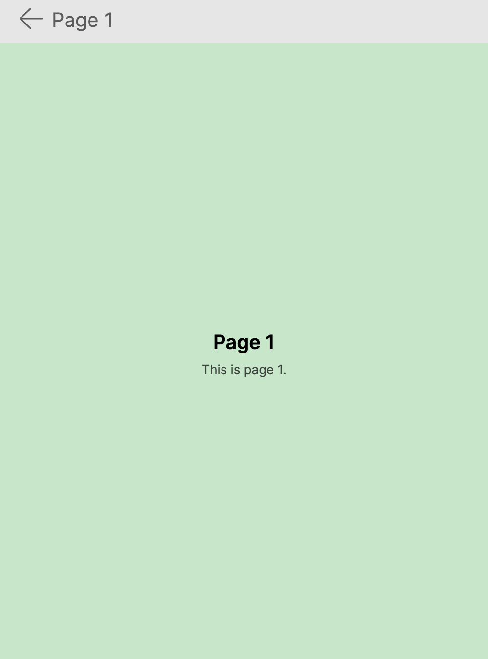
ContentPage inside a NavigationPage
When hosted in a NavigationPage, the Header is displayed in the navigation bar:
<NavigationPage xmlns="https://github.com/avaloniaui">
    <ContentPage Header="Dashboard">
        <StackPanel Margin="16" Spacing="8">
            <TextBlock Text="Welcome back!" FontSize="24" FontWeight="Bold" />
            <Button Content="Go to Details" Click="OnGoToDetails" />
        </StackPanel>
    </ContentPage>
</NavigationPage>
ContentPage as a window root
For single-page applications, you can place a ContentPage directly inside a Window:
<Window xmlns="https://github.com/avaloniaui"
        Title="My App">
    <ContentPage>
        <StackPanel Margin="16" Spacing="8">
            <TextBlock Text="Single-page app" FontSize="24" />
            <TextBlock Text="No navigation container needed." />
        </StackPanel>
    </ContentPage>
</Window>
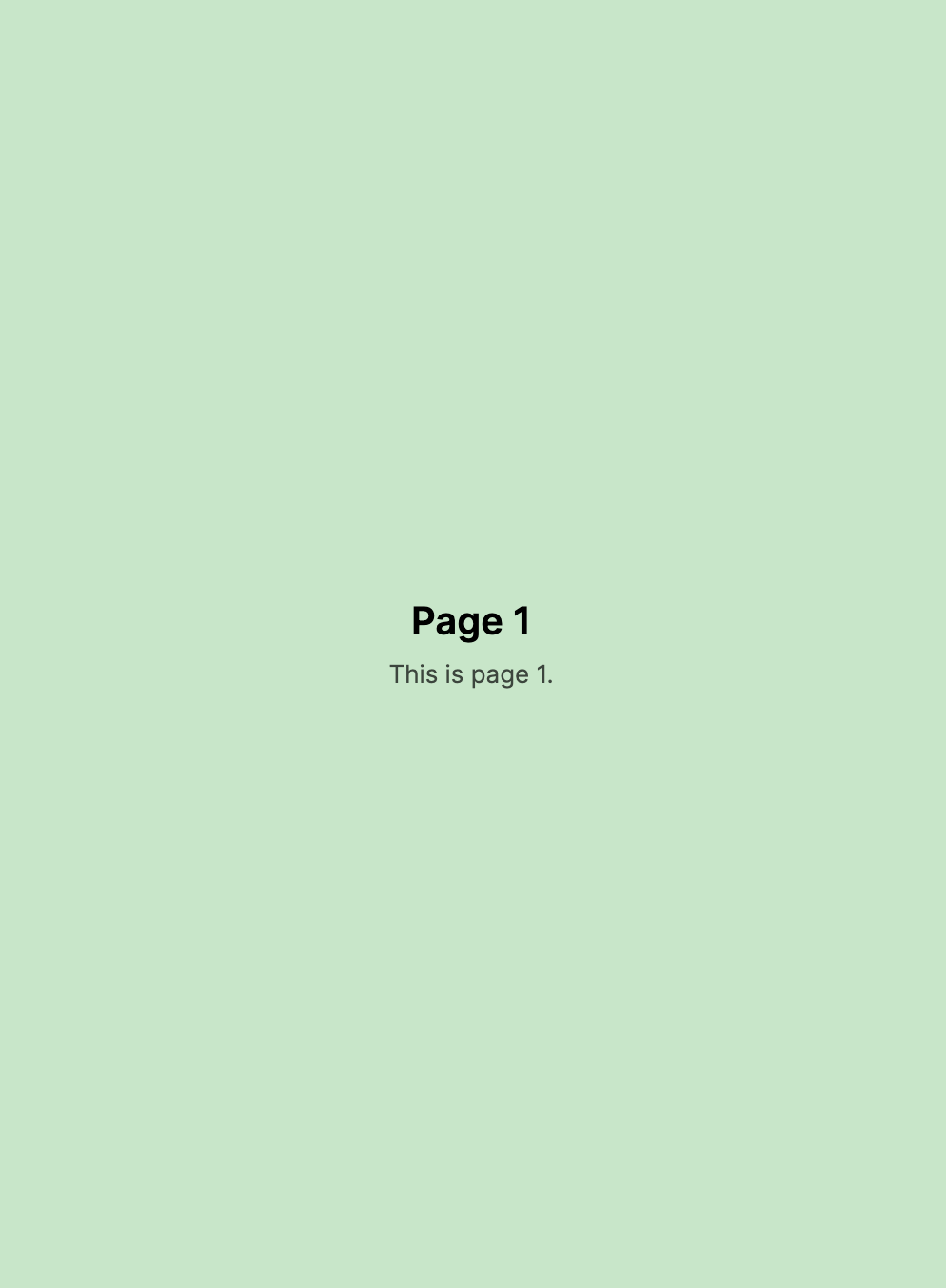
Scrollable layout
ContentPage does not include a built-in scroll viewer. Wrap your content in a ScrollViewer if it may overflow:
<ContentPage xmlns="https://github.com/avaloniaui"
             Header="Long Content">
    <ScrollViewer>
        <StackPanel Margin="16" Spacing="8">
            <TextBlock Text="Item 1" />
            <TextBlock Text="Item 2" />
            <TextBlock Text="Item 3" />
            <!-- Many more items -->
        </StackPanel>
    </ScrollViewer>
</ContentPage>
MVVM binding
Bind the page content to a view model using ContentTemplate:
<ContentPage xmlns="https://github.com/avaloniaui"
             Header="{Binding Title}"
             Content="{Binding}">
    <ContentPage.ContentTemplate>
        <DataTemplate>
            <StackPanel Margin="16" Spacing="8">
                <TextBlock Text="{Binding Description}" FontSize="18" />
                <TextBlock Text="{Binding Detail}" />
            </StackPanel>
        </DataTemplate>
    </ContentPage.ContentTemplate>
</ContentPage>
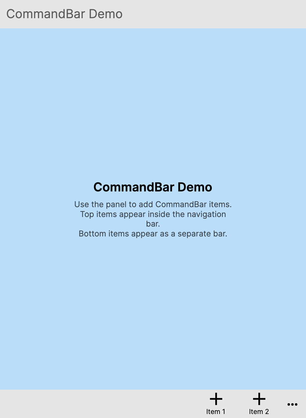
TopCommandBar
Display a toolbar above the page content:
<ContentPage xmlns="https://github.com/avaloniaui"
             Header="Inbox">
    <ContentPage.TopCommandBar>
        <StackPanel Orientation="Horizontal" Spacing="4" Margin="8">
            <Button Content="Filter" />
            <Button Content="Sort" />
        </StackPanel>
    </ContentPage.TopCommandBar>

    <TextBlock Text="Messages go here" Margin="16" />
</ContentPage>
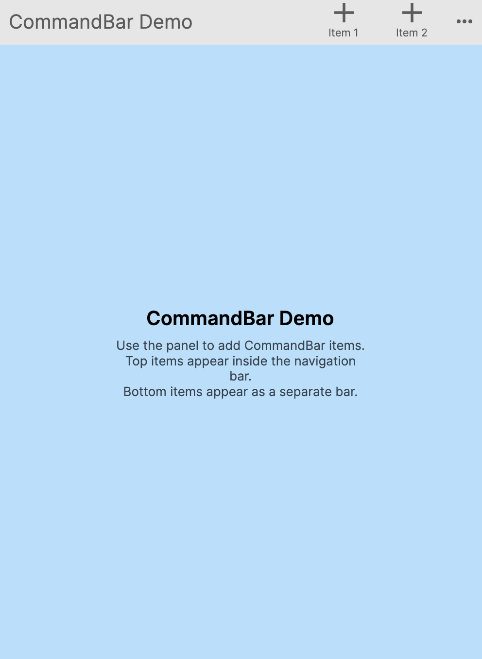
BottomCommandBar
Display a toolbar below the page content:
<ContentPage xmlns="https://github.com/avaloniaui"
             Header="Settings">
    <ContentPage.BottomCommandBar>
        <StackPanel Orientation="Horizontal" Spacing="8" Margin="8">
            <Button Content="Save" />
            <Button Content="Cancel" />
        </StackPanel>
    </ContentPage.BottomCommandBar>

    <TextBlock Text="Page content goes here" Margin="16" />
</ContentPage>
Cancelling navigation
Use the Navigating event or override OnNavigatingFrom to prevent the user from leaving a page with unsaved changes:
public class EditPage : ContentPage
{
    public bool HasUnsavedChanges { get; set; }

    protected override void OnNavigatingFrom(NavigatingFromEventArgs args)
    {
        base.OnNavigatingFrom(args);

        if (HasUnsavedChanges)
        {
            args.Cancel = true;
            // Optionally show a confirmation dialog here
        }
    }
}
Intercepting the system back button
On platforms with a hardware or system back button (Android, browser), Navigating fires before the back action occurs. Cancelling it also cancels the system back navigation:
protected override void OnNavigatingFrom(NavigatingFromEventArgs args)
{
    base.OnNavigatingFrom(args);

    if (ShouldPreventBack())
    {
        args.Cancel = true;
    }
}
Refreshing data when the page reappears
NavigatedTo fires every time the page becomes active, making it the ideal place to refresh data:
public class OrdersPage : ContentPage
{
    protected override async void OnNavigatedTo(NavigatedToEventArgs args)
    {
        base.OnNavigatedTo(args);
        await ViewModel.LoadOrdersAsync();
    }
}
Full-bleed layout (disabling safe area padding)
Set AutomaticallyApplySafeAreaPadding to false to let your content extend behind the notch and status bar:
<ContentPage xmlns="https://github.com/avaloniaui"
             AutomaticallyApplySafeAreaPadding="False">
    <Image Source="avares://MyApp/Assets/hero.jpg"
           Stretch="UniformToFill" />
</ContentPage>
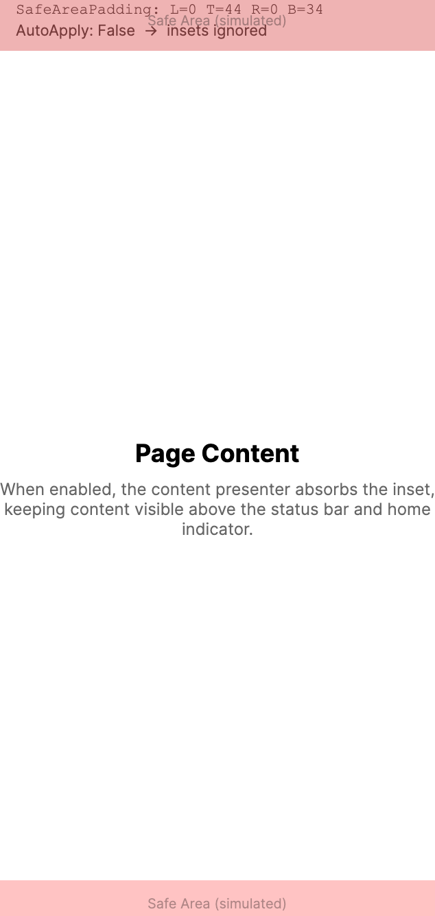
Image background
ContentPage does not have BackgroundImage or BackgroundImageStretch properties. Use the inherited Background property with an ImageBrush instead:
<ContentPage xmlns="https://github.com/avaloniaui"
             Header="Welcome">
    <ContentPage.Background>
        <ImageBrush Source="avares://MyApp/Assets/background.jpg"
                    Stretch="UniformToFill" />
    </ContentPage.Background>

    <TextBlock Text="Page content" Margin="16" />
</ContentPage>
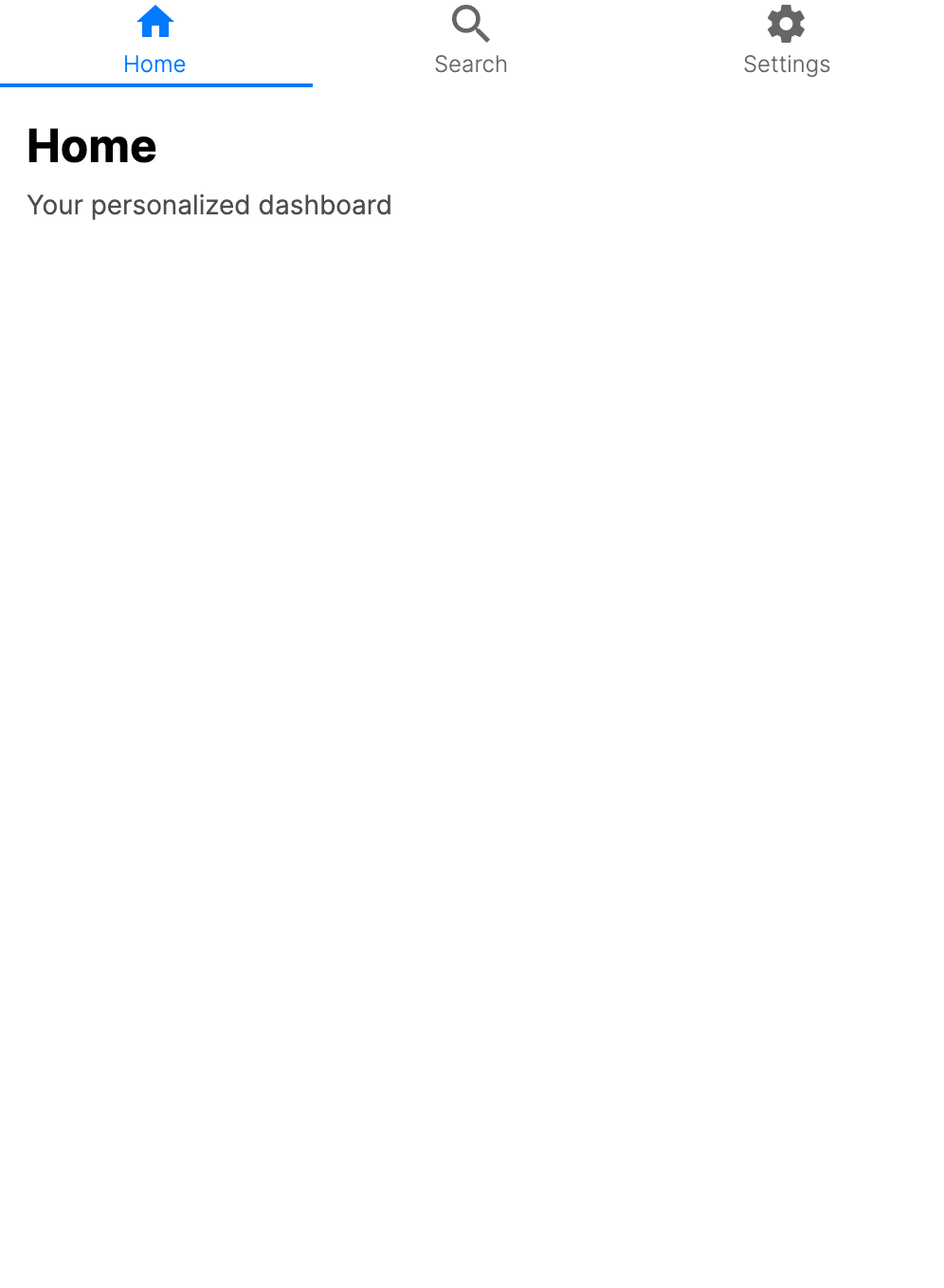
Tab with icon
When used inside a TabbedPage, the Header and Icon properties control the tab appearance:
<TabbedPage xmlns="https://github.com/avaloniaui"
            TabPlacement="Bottom">
    <ContentPage Header="Home">
        <ContentPage.Icon>
            <PathIcon Data="{StaticResource HomeIcon}" />
        </ContentPage.Icon>
        <TextBlock Text="Home content" Margin="16" />
    </ContentPage>
    <ContentPage Header="Settings">
        <ContentPage.Icon>
            <PathIcon Data="{StaticResource SettingsIcon}" />
        </ContentPage.Icon>
        <TextBlock Text="Settings content" Margin="16" />
    </ContentPage>
</TabbedPage>