NavigationPage
The NavigationPage manages a stack-based navigation system, allowing you to push and pop pages with animated transitions. It displays a navigation bar with a back button and the current page's header.
NavigationPage implements the INavigation interface, providing a full set of async navigation methods for pushing, popping, and replacing pages.
Navigation bar layout
The navigation bar is divided into three zones:
| Zone | Content |
|---|---|
| Left | Back button (when applicable) or custom BackButtonContent |
| Center | The current page's Header |
| Right | Per-page command content from NavigationPage.TopCommandBar |
Useful properties
| Property | Type | Default | Description |
|---|---|---|---|
Content | object? | null | The initial root page displayed in the navigation stack. Assigns a Page instance. |
PageTransition | IPageTransition? | Theme default | The transition animation used when navigating between pages. |
ModalTransition | IPageTransition? | Theme default | The transition animation used when presenting or dismissing modal pages. |
HasShadow | bool | false | Displays a shadow beneath the navigation bar. |
BarHeight | double | 48 | The height of the navigation bar. |
EffectiveBarHeight | double | Computed | Read-only. The actual bar height after applying safe area insets and overrides. |
IsBackButtonVisible | bool | true | Controls whether the back button is shown when navigation is possible. |
IsGestureEnabled | bool | true | Enables swipe gestures for back navigation. |
IsNavigating | bool | false | Read-only. Returns true while a navigation operation is running. |
CanGoBack | bool | false | Read-only. Returns true when there is more than one page on the navigation stack. |
IsBackButtonEffectivelyVisible | bool | Computed | Read-only. The resolved visibility of the back button, accounting for stack depth, IsBackButtonVisible, and per-page overrides. |
NavigationStack | IReadOnlyList<Page> | Empty | Read-only. The current stack of pages. |
ModalStack | IReadOnlyList<Page> | Empty | Read-only. The current stack of modal pages. |
StackDepth | int | 0 | Read-only. The number of pages in the navigation stack. |
Attached properties
These properties can be set on individual Page instances to customize their appearance within the NavigationPage:
| Attached Property | Type | Default | Description |
|---|---|---|---|
NavigationPage.HasNavigationBar | bool | true | Whether the navigation bar is visible for this page. |
NavigationPage.HasBackButton | bool | true | Whether the back button is shown for this page. |
NavigationPage.IsBackButtonEnabled | bool | true | Whether the back button is enabled for this page. |
NavigationPage.BackButtonContent | object? | null | Custom content for the back button. |
NavigationPage.TopCommandBar | Control? | null | Command content displayed on the right side of the navigation bar for this page. |
NavigationPage.BottomCommandBar | Control? | null | A command bar displayed below the page content. |
NavigationPage.BarLayoutBehavior | BarLayoutBehavior? | null | Controls how the navigation bar interacts with page content. |
NavigationPage.BarHeightOverride | double? | null | Overrides the bar height for this page. |
BarLayoutBehavior values
| Value | Description |
|---|---|
Inset | The navigation bar pushes page content down. This is the default behavior. |
Overlay | The navigation bar floats over the page content without affecting its layout. |
Navigation methods
Navigation methods that change the visible page are asynchronous and return Task. Those methods have an overload that accepts an IPageTransition parameter to override the default transition. InsertPage and RemovePage modify the stack without animation and return void.
| Method | Description |
|---|---|
PushAsync(Page) | Pushes a new page onto the navigation stack. |
PopAsync() | Removes the current page from the stack and returns it. |
PopToRootAsync() | Pops all pages except the root page. |
PopToPageAsync(Page) | Pops pages until the specified page is on top. |
ReplaceAsync(Page) | Replaces the current page with a new page. |
InsertPage(Page, Page) | Inserts a page into the stack before the specified page. |
RemovePage(Page) | Removes a specific page from the stack. |
Modal navigation
| Method | Description |
|---|---|
PushModalAsync(Page) | Presents a page as a modal overlay. |
PopModalAsync() | Dismisses the current modal and returns it. |
PopAllModalsAsync() | Dismisses all modals. |
Stack properties
| Property | Description |
|---|---|
NavigationStack | Read-only list of pages currently on the navigation stack. |
ModalStack | Read-only list of pages currently presented as modals. |
StackDepth | The number of pages on the navigation stack. |
CanGoBack | Returns true when there is more than one page on the stack. |
Events
| Event | Description |
|---|---|
Pushed | Raised after a page is pushed onto the stack. |
Popped | Raised after a page is popped from the stack. |
PoppedToRoot | Raised after all pages are popped to the root. |
PageInserted | Raised after a page is inserted into the stack. |
PageRemoved | Raised after a page is removed from the stack. |
ModalPushed | Raised after a modal page is presented. |
ModalPopped | Raised after a modal page is dismissed. |
Examples
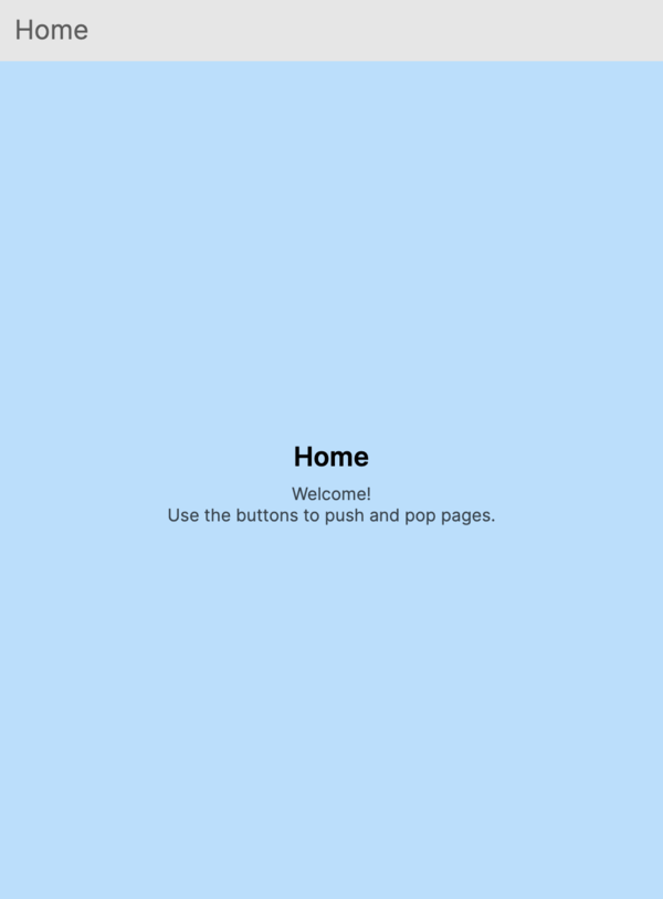
Basic NavigationPage in XAML
Define a NavigationPage with an initial root page:
<NavigationPage xmlns="https://github.com/avaloniaui">
    <ContentPage Header="Home">
        <StackPanel Margin="16" Spacing="8">
            <TextBlock Text="Home Page" FontSize="24" />
            <Button Content="Go to Details" Click="OnGoToDetails" />
        </StackPanel>
    </ContentPage>
</NavigationPage>
Basic NavigationPage in code
You can also create a NavigationPage and set its root page in code:
var navigationPage = new NavigationPage
{
    Content = new ContentPage
    {
        Header = "Home",
        Content = new StackPanel
        {
            Margin = new Thickness(16),
            Spacing = 8,
            Children =
            {
                new TextBlock { Text = "Home Page", FontSize = 24 },
                new Button { Content = "Go to Details" }
            }
        }
    }
};
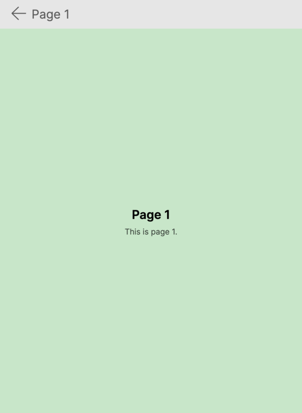
Pushing and popping pages
Every Page exposes a Navigation property (of type INavigation) that references the nearest NavigationPage ancestor. Use this to navigate from within any page:
// Push a new page onto the stack
await Navigation.PushAsync(new DetailsPage());

// Pop back to the previous page
await Navigation.PopAsync();

// Pop all the way back to the root page
await Navigation.PopToRootAsync();
Tracking stack depth
Use the StackDepth property or the CanGoBack property to respond to navigation changes:
navigationPage.Pushed += (sender, args) =>
{
    Console.WriteLine($"Stack depth: {navigationPage.StackDepth}");
    Console.WriteLine($"Can go back: {navigationPage.CanGoBack}");
};

navigationPage.Popped += (sender, args) =>
{
    Console.WriteLine($"Returned to: {navigationPage.NavigationStack.Last().Header}");
};
Hiding the navigation bar
Set the NavigationPage.HasNavigationBar attached property to False on a page to hide the navigation bar for that page:
<ContentPage xmlns="https://github.com/avaloniaui"
             Header="Immersive View"
             NavigationPage.HasNavigationBar="False">
    <!-- Full-screen content with no navigation bar -->
    <Image Source="avares://MyApp/Assets/hero.jpg" Stretch="UniformToFill" />
</ContentPage>
Hiding the back button
Set the NavigationPage.HasBackButton attached property to False on a page to hide the back button while keeping the navigation bar visible:
<ContentPage xmlns="https://github.com/avaloniaui"
             Header="No Back Button"
             NavigationPage.HasBackButton="False">
    <TextBlock Text="The back button is hidden on this page" Margin="16" />
</ContentPage>
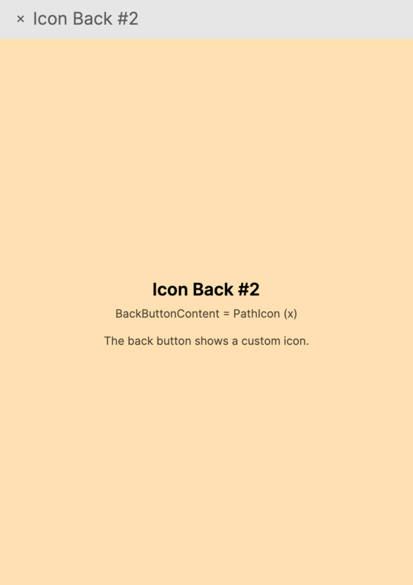
Custom back button content
Provide custom content for the back button using the NavigationPage.BackButtonContent attached property:
<ContentPage xmlns="https://github.com/avaloniaui"
             Header="Custom Back">
    <NavigationPage.BackButtonContent>
        <StackPanel Orientation="Horizontal" Spacing="4">
            <PathIcon Data="{StaticResource ArrowLeftIcon}" />
            <TextBlock Text="Return" VerticalAlignment="Center" />
        </StackPanel>
    </NavigationPage.BackButtonContent>

    <TextBlock Text="Page with custom back button" Margin="16" />
</ContentPage>
Per-page TopCommandBar
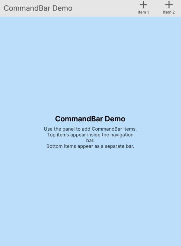
Add command content to the right side of the navigation bar for a specific page using the NavigationPage.TopCommandBar attached property:
<ContentPage xmlns="https://github.com/avaloniaui"
             Header="Search">
    <NavigationPage.TopCommandBar>
        <CommandBar IsDynamicOverflowEnabled="True">
            <CommandBar.PrimaryCommands>
                <CommandBarButton Label="Search">
                    <CommandBarButton.Icon>
                        <PathIcon Data="M9.5,3A6.5,6.5 0 0,1 16,9.5C16,11.11 15.41,12.59 14.44,13.73L14.71,14H15.5L20.5,19L19,20.5L14,15.5V14.71L13.73,14.44C12.59,15.41 11.11,16 9.5,16A6.5,6.5 0 0,1 3,9.5A6.5,6.5 0 0,1 9.5,3Z" />
                    </CommandBarButton.Icon>
                </CommandBarButton>
                <CommandBarButton Label="Share" />
            </CommandBar.PrimaryCommands>
        </CommandBar>
    </NavigationPage.TopCommandBar>

    <TextBlock Text="Search results appear here" Margin="16" />
</ContentPage>
Page transitions
Customize the transition animation used when pushing and popping pages:
<NavigationPage xmlns="https://github.com/avaloniaui">
    <NavigationPage.PageTransition>
        <PageSlide Duration="0:00:00.300" Orientation="Horizontal" />
    </NavigationPage.PageTransition>

    <ContentPage Header="Home">
        <TextBlock Text="Slide transitions" Margin="16" />
    </ContentPage>
</NavigationPage>
You can also override the transition for a single navigation call:
var customTransition = new PageSlide(TimeSpan.FromMilliseconds(500));
await Navigation.PushAsync(new DetailsPage(), customTransition);
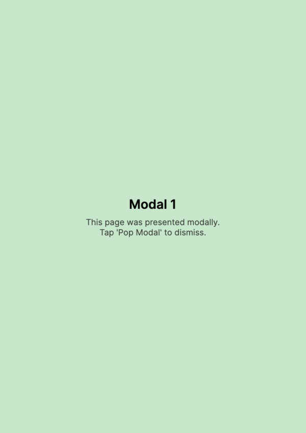
Modal pages
Modal pages are presented on top of the current navigation stack. They have their own separate stack:
// Present a modal page
await Navigation.PushModalAsync(new LoginPage());

// Dismiss the modal page
await Navigation.PopModalAsync();

// Dismiss all modal pages at once
await Navigation.PopAllModalsAsync();
Modal transitions
Customize the transition animation for modal pages separately from regular page transitions:
<NavigationPage xmlns="https://github.com/avaloniaui">
    <NavigationPage.ModalTransition>
        <PageSlide Duration="0:00:00.400" Orientation="Vertical" />
    </NavigationPage.ModalTransition>

    <ContentPage Header="Home">
        <Button Content="Show Modal" Click="OnShowModal" />
    </ContentPage>
</NavigationPage>
Customizing bar height
Set a custom height for the navigation bar across all pages, or override it for a specific page:
<!-- Global bar height -->
<NavigationPage xmlns="https://github.com/avaloniaui"
                BarHeight="64">
    <ContentPage Header="Tall Bar">
        <TextBlock Text="This page has a taller navigation bar" Margin="16" />
    </ContentPage>
</NavigationPage>
<!-- Per-page bar height override -->
<ContentPage xmlns="https://github.com/avaloniaui"
             Header="Custom Height"
             NavigationPage.BarHeightOverride="72">
    <TextBlock Text="This page overrides the bar height" Margin="16" />
</ContentPage>
Navigation bar shadow
Enable a shadow beneath the navigation bar for a subtle depth effect:
<NavigationPage xmlns="https://github.com/avaloniaui"
                HasShadow="True">
    <ContentPage Header="Home">
        <TextBlock Text="The navigation bar has a shadow" Margin="16" />
    </ContentPage>
</NavigationPage>
Overlay navigation bar
Use the BarLayoutBehavior attached property to make the navigation bar float over the page content instead of pushing it down:
<ContentPage xmlns="https://github.com/avaloniaui"
             Header="Overlay"
             NavigationPage.BarLayoutBehavior="Overlay">
    <!-- Content extends behind the navigation bar -->
    <Image Source="avares://MyApp/Assets/hero.jpg" Stretch="UniformToFill" />
</ContentPage>
Replacing a login screen
Use ReplaceAsync to swap the current page without adding to the back stack. This is useful for replacing a login screen with the main app screen after authentication:
// After successful login, replace the login page with the main page
await Navigation.ReplaceAsync(new MainPage());
The user will not be able to navigate back to the replaced page.
DrawerPage integration
When a DrawerPage hosts a NavigationPage as its Content, the hamburger menu icon appears in the navigation bar at the root of the stack. It automatically switches to a back button when pages are pushed:
<DrawerPage xmlns="https://github.com/avaloniaui"
            DrawerLength="280">
    <DrawerPage.Drawer>
        <StackPanel Spacing="4" Margin="8">
            <Button Content="Home" />
            <Button Content="Settings" />
        </StackPanel>
    </DrawerPage.Drawer>

    <NavigationPage>
        <ContentPage Header="Home">
            <StackPanel Margin="16" Spacing="8">
                <TextBlock Text="Home Page" FontSize="24" />
                <Button Content="Go to Details" Click="OnGoToDetails" />
            </StackPanel>
        </ContentPage>
    </NavigationPage>
</DrawerPage>
Disabling back-swipe gesture
Disable the swipe-to-go-back gesture globally or check whether it is enabled:
<NavigationPage xmlns="https://github.com/avaloniaui"
                IsGestureEnabled="False">
    <ContentPage Header="No Swipe">
        <TextBlock Text="Back-swipe gesture is disabled" Margin="16" />
    </ContentPage>
</NavigationPage>