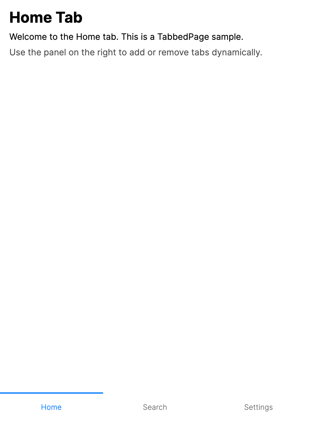
TabbedPage
The TabbedPage displays a collection of pages through a tab strip, allowing users to switch between pages by selecting tabs. Each child page becomes a tab, with the tab header and icon derived from the page's Header and Icon properties.
TabbedPage inherits from SelectingMultiPage, which in turn inherits from MultiPage. This inheritance chain provides built-in selection tracking, page lifecycle management, and support for page transitions.
If you need a simple tab strip without page-based navigation features (lifecycle events, safe area handling), consider using the standard TabControl instead.
Useful properties
| Property | Type | Default | Description |
|---|---|---|---|
Pages | IEnumerable<Page>? | Empty list | The collection of Page children displayed as tabs. |
ItemsSource | IEnumerable? | null | A view-model collection used to generate pages with PageTemplate. When set, it takes precedence over Pages. |
PageTemplate | IDataTemplate? | Default page template | A data template used to create Page instances when binding to non-Page items with ItemsSource. |
TabPlacement | TabPlacement | Auto | Controls where tabs are positioned. See the TabPlacement values table below. |
IsKeyboardNavigationEnabled | bool | true | Allows tab switching with keyboard input. |
IsGestureEnabled | bool | false | Enables swipe gestures to switch tabs. |
PageTransition | IPageTransition? | null | The transition animation used when switching between tabs. |
IndicatorTemplate | IDataTemplate? | null | A data template for the selected tab indicator. |
SelectedIndex | int | -1 | The index of the currently selected tab. A page is selected when the tab items are realized. |
SelectedPage | Page? | null | Read-only. The currently selected Page. |
TabPlacement values
| Value | Description |
|---|---|
Auto | Automatically determines the tab placement based on the target platform. Resolves to Bottom on iOS and Android, and Top on all other platforms. |
Top | Tabs are placed along the top edge. |
Bottom | Tabs are placed along the bottom edge. |
Left | Tabs are placed along the left edge. |
Right | Tabs are placed along the right edge. |
Attached properties
| Attached Property | Type | Default | Description |
|---|---|---|---|
TabbedPage.IsTabEnabled | bool | true | Set on a child Page to enable or disable its tab. A disabled tab cannot be selected by the user. |
Tab icons
The Icon property on a child page accepts any object. In the default templates, use a visual such as PathIcon, or provide IconTemplate when the icon value is non-visual data, such as a geometry or image object.
Common icon values include:
PathIconDrawingImagewith a matchingIconTemplateBitmapor otherIImageimplementations with a matchingIconTemplateGeometryorStreamGeometrywith a matchingIconTemplate
Events
| Event | Description |
|---|---|
SelectionChanged | Raised when the selected tab changes. Provides PreviousPage and CurrentPage. |
CurrentPageChanged | Raised when the current page changes. |
PagesChanged | Raised when the Pages collection is modified (tabs added or removed). |
Keyboard navigation
When IsKeyboardNavigationEnabled is true (the default), users can switch tabs using the keyboard. The exact key bindings depend on the TabPlacement value:
- Top/Bottom tabs: Left and Right arrow keys move between tabs.
- Left/Right tabs: Up and Down arrow keys move between tabs.
Examples
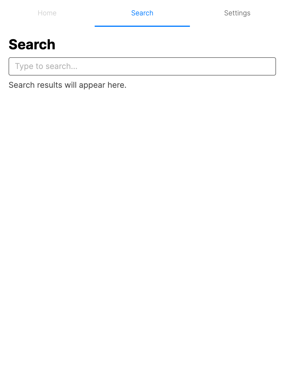
Basic tabbed layout (XAML)
<TabbedPage xmlns="https://github.com/avaloniaui">
    <ContentPage Header="Home">
        <ContentPage.Icon>
            <PathIcon Data="{StaticResource HomeIcon}" />
        </ContentPage.Icon>
        <TextBlock Text="Home content" Margin="16" />
    </ContentPage>
    <ContentPage Header="Search">
        <ContentPage.Icon>
            <PathIcon Data="{StaticResource SearchIcon}" />
        </ContentPage.Icon>
        <TextBlock Text="Search content" Margin="16" />
    </ContentPage>
    <ContentPage Header="Profile">
        <ContentPage.Icon>
            <PathIcon Data="{StaticResource ProfileIcon}" />
        </ContentPage.Icon>
        <TextBlock Text="Profile content" Margin="16" />
    </ContentPage>
</TabbedPage>
Basic tabbed layout (code)
var tabbedPage = new TabbedPage();

var homePage = new ContentPage
{
    Header = "Home",
    Content = new TextBlock { Text = "Home content", Margin = new Thickness(16) }
};

var searchPage = new ContentPage
{
    Header = "Search",
    Content = new TextBlock { Text = "Search content", Margin = new Thickness(16) }
};

var profilePage = new ContentPage
{
    Header = "Profile",
    Content = new TextBlock { Text = "Profile content", Margin = new Thickness(16) }
};

tabbedPage.Pages = new[] { homePage, searchPage, profilePage };
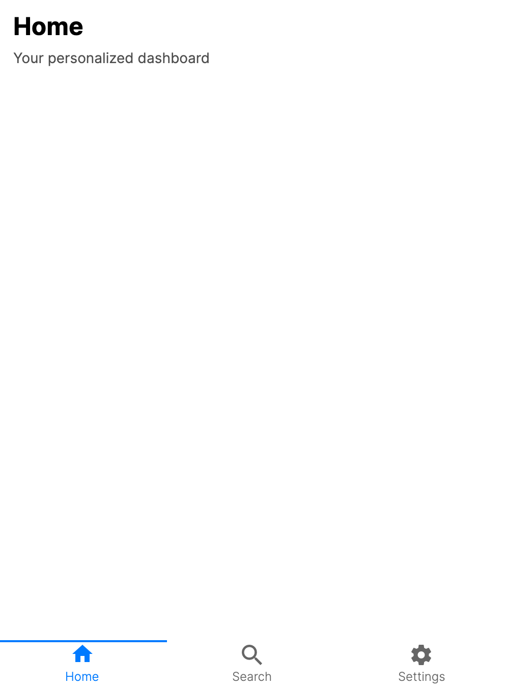
Tab icons
You can assign icons to tabs using the Icon property on each child page. Icons appear alongside the tab header text.
<TabbedPage xmlns="https://github.com/avaloniaui"
            TabPlacement="Bottom">
    <ContentPage Header="Home">
        <ContentPage.Icon>
            <PathIcon Data="M10,20V14H14V20H19V12H22L12,3L2,12H5V20H10Z" />
        </ContentPage.Icon>
        <TextBlock Text="Home content" Margin="16" />
    </ContentPage>
    <ContentPage Header="Search">
        <ContentPage.Icon>
            <PathIcon Data="M9.5,3A6.5,6.5 0 0,1 16,9.5C16,11.11 15.41,12.59 14.44,13.73L14.71,14H15.5L20.5,19L19,20.5L14,15.5V14.71L13.73,14.44C12.59,15.41 11.11,16 9.5,16A6.5,6.5 0 0,1 3,9.5A6.5,6.5 0 0,1 9.5,3M9.5,5C7,5 5,7 5,9.5C5,12 7,14 9.5,14C12,14 14,12 14,9.5C14,7 12,5 9.5,5Z" />
        </ContentPage.Icon>
        <TextBlock Text="Search content" Margin="16" />
    </ContentPage>
</TabbedPage>
var homePage = new ContentPage
{
    Header = "Home",
    Icon = new PathIcon
    {
        Data = StreamGeometry.Parse("M10,20V14H14V20H19V12H22L12,3L2,12H5V20H10Z")
    },
    Content = new TextBlock { Text = "Home content", Margin = new Thickness(16) }
};
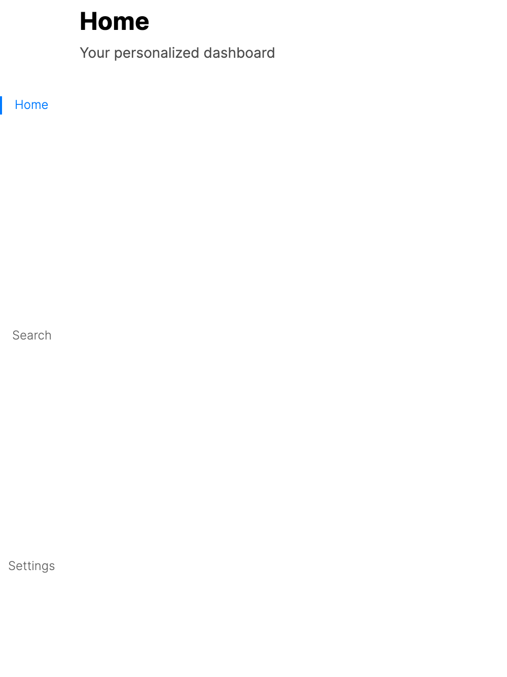
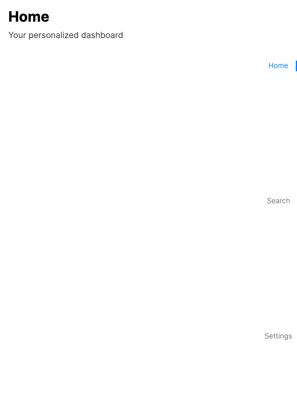
Controlling TabPlacement
Use the TabPlacement property to position tabs on different edges of the control.
<TabbedPage xmlns="https://github.com/avaloniaui"
            TabPlacement="Bottom">
    <ContentPage Header="Feed">
        <TextBlock Text="Feed content" Margin="16" />
    </ContentPage>
    <ContentPage Header="Messages">
        <TextBlock Text="Messages content" Margin="16" />
    </ContentPage>
</TabbedPage>
- Bottom tabs
- Left tabs
- Right tabs
Dynamic tab management
You can add and remove tabs at runtime by assigning an observable Pages collection and then modifying that collection.
var pages = new ObservableCollection<Page>
{
    homePage,
    searchPage,
    profilePage
};

tabbedPage.Pages = pages;

// Add a new tab
var newPage = new ContentPage
{
    Header = "New Tab",
    Content = new TextBlock { Text = "Dynamically added tab", Margin = new Thickness(16) }
};
pages.Add(newPage);

// Remove a tab
pages.Remove(newPage);
Enabling swipe gestures
Set IsGestureEnabled to True to allow users to swipe between tabs on touch devices.
<TabbedPage xmlns="https://github.com/avaloniaui"
            IsGestureEnabled="True"
            TabPlacement="Bottom">
    <ContentPage Header="Page 1">
        <TextBlock Text="Swipe left or right" Margin="16" />
    </ContentPage>
    <ContentPage Header="Page 2">
        <TextBlock Text="Page 2 content" Margin="16" />
    </ContentPage>
</TabbedPage>
Disabling a tab
Use the TabbedPage.IsTabEnabled attached property to prevent a specific tab from being selected.
<TabbedPage xmlns="https://github.com/avaloniaui">
    <ContentPage Header="Active Tab">
        <TextBlock Text="This tab is enabled" Margin="16" />
    </ContentPage>
    <ContentPage Header="Locked Tab" TabbedPage.IsTabEnabled="False">
        <TextBlock Text="This tab is disabled" Margin="16" />
    </ContentPage>
</TabbedPage>
Responding to selection changes
Handle the SelectionChanged event to react when the user switches tabs.
tabbedPage.SelectionChanged += (sender, args) =>
{
    var previousPage = args.PreviousPage;
    var currentPage = args.CurrentPage;
    Console.WriteLine($"Switched from {previousPage?.Header} to {currentPage?.Header}");
};
Programmatic tab selection
You can change the active tab in code by setting SelectedIndex. SelectedPage is read-only and reflects the current selection.
// Select by index
tabbedPage.SelectedIndex = 2;

// Select by page reference
if (tabbedPage.Pages is IList<Page> pages)
{
    var index = pages.IndexOf(profilePage);
    if (index >= 0)
    {
        tabbedPage.SelectedIndex = index;
    }
}
Independent navigation stack per tab
A common pattern is to place a NavigationPage inside each tab, giving each tab its own independent navigation stack.
<TabbedPage xmlns="https://github.com/avaloniaui"
            TabPlacement="Bottom">
    <NavigationPage Header="Home">
        <NavigationPage.Icon>
            <PathIcon Data="{StaticResource HomeIcon}" />
        </NavigationPage.Icon>
        <ContentPage Header="Home">
            <Button Content="View Details" Click="OnViewDetails" />
        </ContentPage>
    </NavigationPage>
    <NavigationPage Header="Settings">
        <NavigationPage.Icon>
            <PathIcon Data="{StaticResource SettingsIcon}" />
        </NavigationPage.Icon>
        <ContentPage Header="Settings">
            <TextBlock Text="Settings page" Margin="16" />
        </ContentPage>
    </NavigationPage>
</TabbedPage>
Data-driven tabs with PageTemplate
Use ItemsSource and PageTemplate to generate tabs from a bound data collection. Each item in the collection is converted into a Page using the specified template.
<TabbedPage xmlns="https://github.com/avaloniaui"
            ItemsSource="{Binding Tabs}">
    <TabbedPage.PageTemplate>
        <DataTemplate>
            <ContentPage Header="{Binding Title}">
                <TextBlock Text="{Binding Body}" Margin="16" />
            </ContentPage>
        </DataTemplate>
    </TabbedPage.PageTemplate>
</TabbedPage>
public class MainViewModel
{
    public ObservableCollection<TabItem> Tabs { get; } = new()
    {
        new TabItem { Title = "Home", Body = "Home content" },
        new TabItem { Title = "News", Body = "News content" },
        new TabItem { Title = "Settings", Body = "Settings content" }
    };
}

public class TabItem
{
    public string Title { get; set; } = string.Empty;
    public string Body { get; set; } = string.Empty;
}
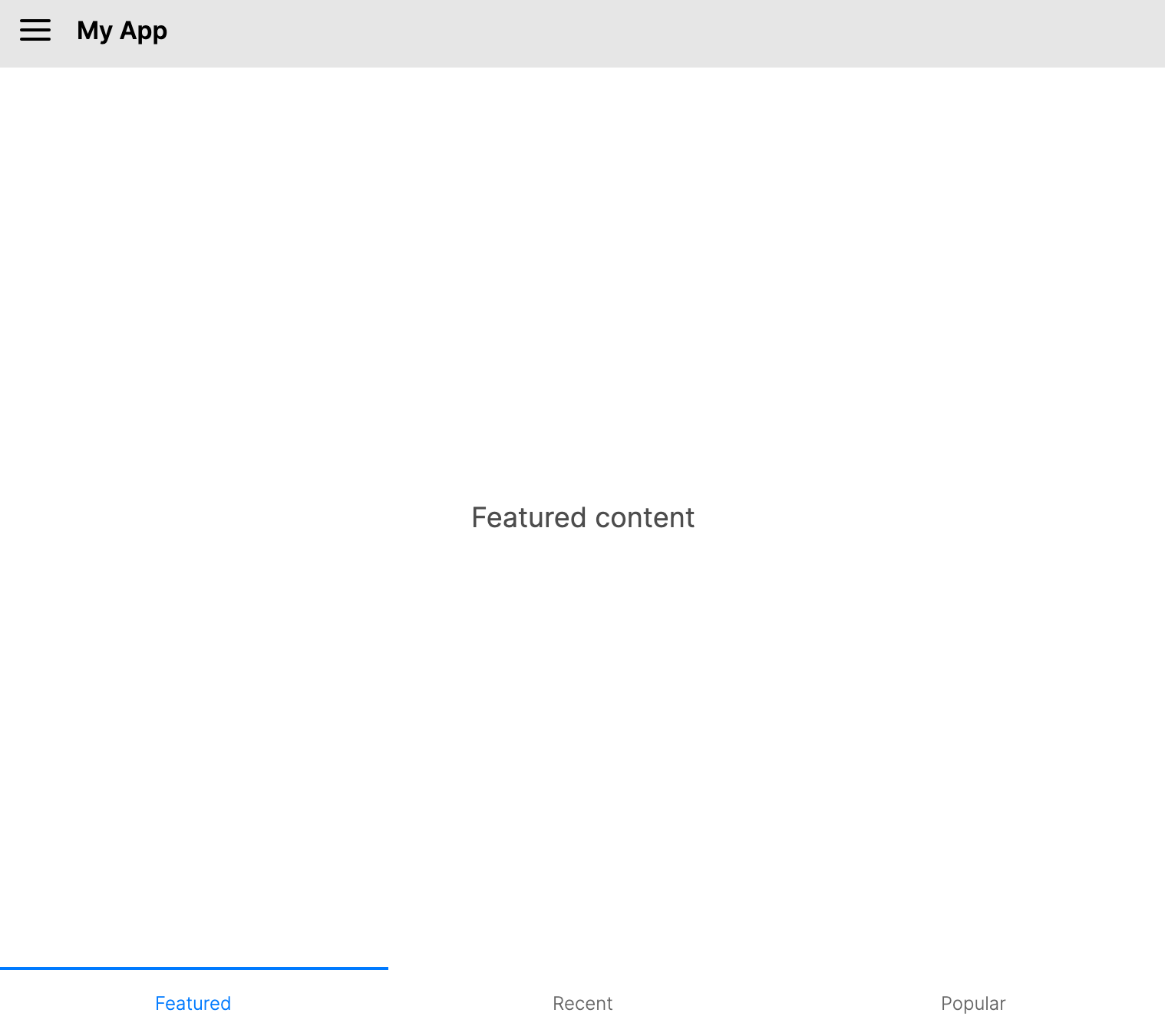
TabbedPage inside a DrawerPage
You can nest a TabbedPage inside a DrawerPage to combine a side drawer with tabbed navigation.
<DrawerPage xmlns="https://github.com/avaloniaui">
    <DrawerPage.Drawer>
        <StackPanel Margin="16">
            <TextBlock Text="Drawer Menu" FontSize="20" />
            <Button Content="Option A" />
            <Button Content="Option B" />
        </StackPanel>
    </DrawerPage.Drawer>
    <TabbedPage TabPlacement="Bottom">
        <ContentPage Header="Home">
            <TextBlock Text="Home content" Margin="16" />
        </ContentPage>
        <ContentPage Header="Search">
            <TextBlock Text="Search content" Margin="16" />
        </ContentPage>
    </TabbedPage>
</DrawerPage>