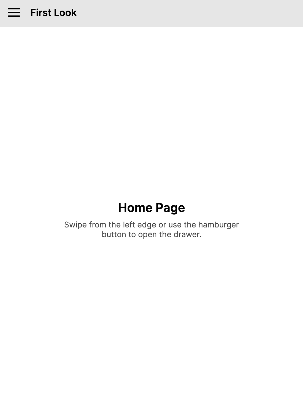
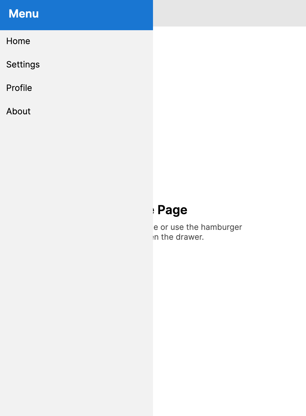
DrawerPage
The DrawerPage combines a sliding drawer pane with a main content area, providing a common navigation pattern for applications. It is built on top of SplitView and adds page-based navigation features such as lifecycle events, safe area support, and automatic integration with NavigationPage.
When the Content of a DrawerPage is a NavigationPage, the drawer toggle is shown in the navigation bar at the root of the navigation stack. It automatically switches to the back button when the navigation stack has more than one page.
DrawerPage is similar to SplitView but adds page-based navigation features such as lifecycle events, safe area support, and automatic integration with NavigationPage.
- Drawer closed
- Drawer open
Useful properties
| Property | Type | Default | Description |
|---|---|---|---|
Content | object? | null | The main content area of the page. |
ContentTemplate | IDataTemplate? | Default page template | A data template for the main content. |
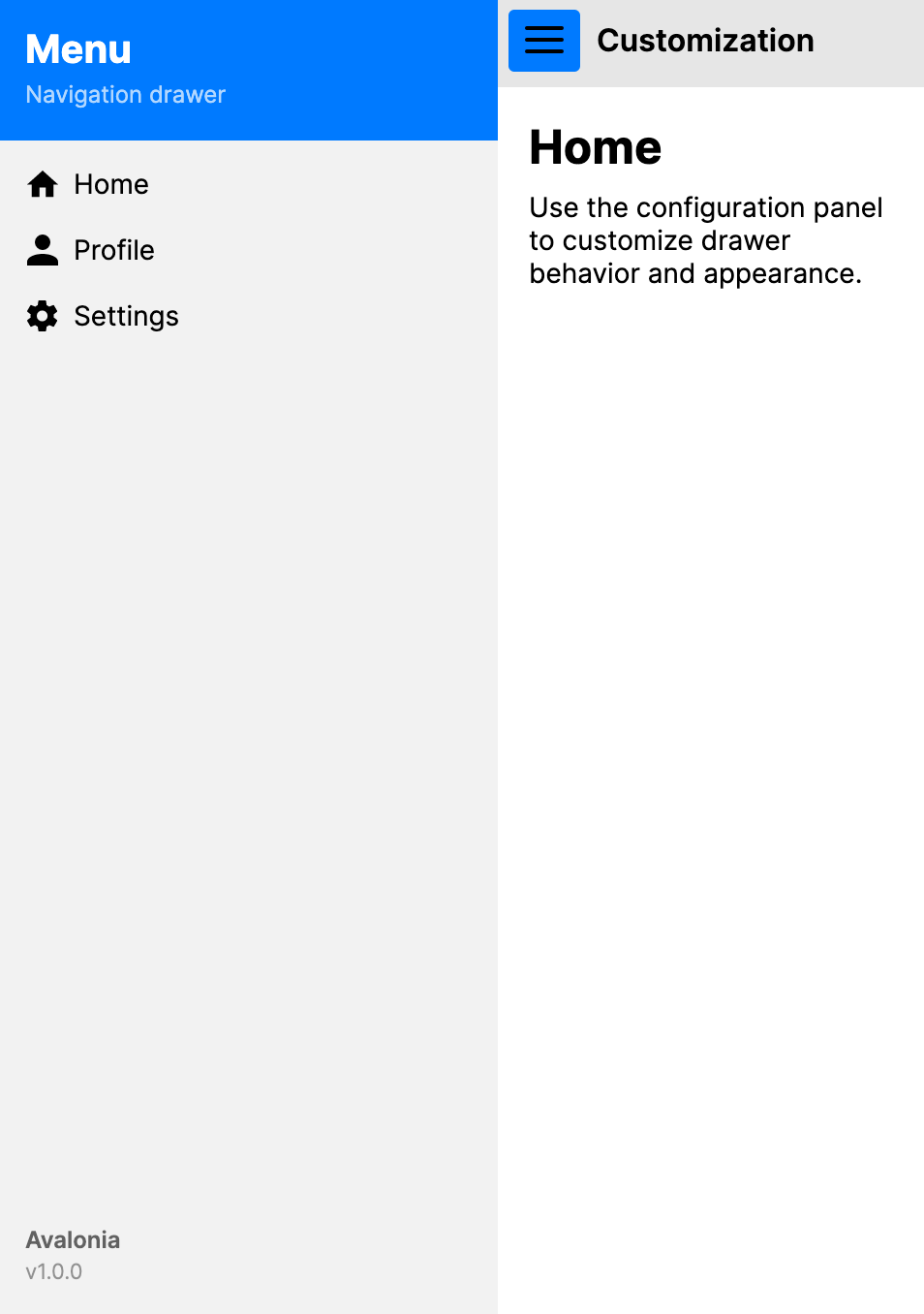
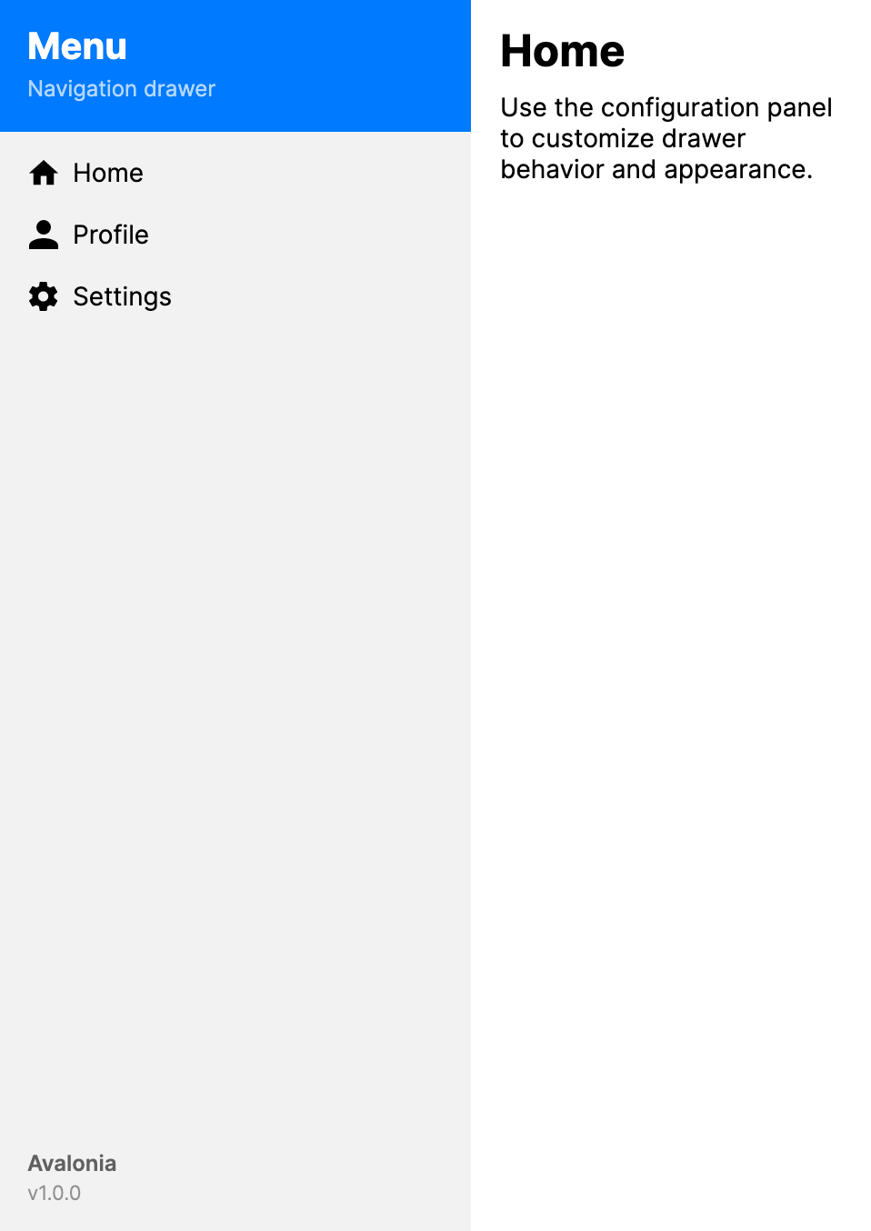
Drawer | object? | null | The content displayed inside the drawer pane. |
DrawerTemplate | IDataTemplate? | null | A data template for the drawer content. |
IsOpen | bool | false | Controls whether the drawer is open. |
DrawerLength | double | 320 | The width (or height) of the drawer when open. |
CompactDrawerLength | double | 48 | The width, or height for top and bottom placement, of the compact drawer rail. |
DrawerBreakpointLength | double | 0 | The container width, or height for top and bottom placement, at which the drawer automatically switches between overlay and inline modes. A value of 0 disables the breakpoint. |
IsGestureEnabled | bool | true | Enables swipe gestures to open and close the drawer. |
DrawerBehavior | DrawerBehavior | Auto | Controls drawer visibility behavior. See the DrawerBehavior Values table below. |
DrawerLayoutBehavior | DrawerLayoutBehavior | Overlay | How the drawer interacts with the content area. See the DrawerLayoutBehavior Values table below. |
DrawerPlacement | DrawerPlacement | Left | The logical side where the drawer appears. Left and right are mirrored when FlowDirection is RightToLeft. See the DrawerPlacement Values table below. |
DrawerHeader | object? | null | Content displayed at the top of the drawer. |
DrawerHeaderTemplate | IDataTemplate? | null | A data template for DrawerHeader. |
DrawerHeaderBackground | IBrush? | null | The brush used for the drawer header background. |
DrawerHeaderForeground | IBrush? | null | The brush used for the drawer header foreground. |
DrawerFooter | object? | null | Content displayed at the bottom of the drawer. |
DrawerFooterTemplate | IDataTemplate? | null | A data template for DrawerFooter. |
DrawerFooterBackground | IBrush? | null | The brush used for the drawer footer background. |
DrawerFooterForeground | IBrush? | null | The brush used for the drawer footer foreground. |
DrawerIcon | object? | null | An icon shown in the drawer toggle button. |
DrawerIconTemplate | IDataTemplate? | null | A data template for DrawerIcon when the icon value is non-visual data. |
DrawerBackground | IBrush? | null | The brush used for the drawer background. |
BackdropBrush | IBrush? | null | The brush used for the overlay backdrop when the drawer is open. |
DisplayMode | SplitViewDisplayMode | Overlay | The effective SplitView display mode resolved from DrawerBehavior, DrawerLayoutBehavior, and DrawerBreakpointLength. |
HorizontalContentAlignment | HorizontalAlignment | Stretch | Horizontal alignment of the main content. |
VerticalContentAlignment | VerticalAlignment | Stretch | Vertical alignment of the main content. |
DrawerBehavior values
| Value | Description |
|---|---|
Auto | The drawer opens and closes normally. DrawerLayoutBehavior and DrawerBreakpointLength determine whether it overlays or takes layout space. |
Flyout | The drawer behaves as a flyout overlay, closing automatically when the user taps outside. |
Locked | The drawer stays open and cannot be closed by the user. |
Disabled | The drawer is hidden and cannot be opened. |
DrawerLayoutBehavior values
| Value | Description |
|---|---|
Overlay | The drawer slides over the content. The content area is not resized. |
Split | The drawer pushes the content to the side. Both the drawer and content are visible simultaneously. |
CompactOverlay | A narrow strip of the drawer is always visible (showing icons). When opened, the drawer overlays the content. |
CompactInline | A narrow strip of the drawer is always visible. When opened, the drawer pushes the content aside. |
DrawerPlacement values
| Value | Description |
|---|---|
Left | The drawer appears on the leading side: left in left-to-right layouts, right in right-to-left layouts. |
Right | The drawer appears on the trailing side: right in left-to-right layouts, left in right-to-left layouts. |
Top | The drawer appears at the top. |
Bottom | The drawer appears at the bottom. |
Events
| Event | Description |
|---|---|
Opened | Raised when the drawer finishes opening. |
Closing | Raised when the drawer is about to close. Set Cancel = true on the event args to prevent closing. |
Closed | Raised when the drawer finishes closing. |
Gestures and keyboard
DrawerPage supports swipe gestures to open and close the drawer on touch-enabled devices. This can be toggled with the IsGestureEnabled property.
On desktop, pressing the Escape key closes the drawer when it is open in Overlay or CompactOverlay mode.
NavigationPage integration
When a DrawerPage hosts a NavigationPage as its Content, and pages are pushed onto the navigation stack, the hamburger menu icon in the navigation bar automatically becomes a back button. This provides a seamless transition between drawer navigation and hierarchical page navigation without additional code.
Examples
Basic XAML
<DrawerPage xmlns="https://github.com/avaloniaui"
            Header="My App"
            DrawerLength="280">
    <DrawerPage.Drawer>
        <StackPanel Spacing="4" Margin="8">
            <Button Content="Home" Click="OnHomeClicked" />
            <Button Content="Settings" Click="OnSettingsClicked" />
            <Button Content="About" Click="OnAboutClicked" />
        </StackPanel>
    </DrawerPage.Drawer>

    <TextBlock Text="Select an item from the drawer"
               Margin="16" FontSize="18" />
</DrawerPage>
Basic code
var drawerPage = new DrawerPage
{
    Header = "My App",
    DrawerLength = 280,
    Drawer = new StackPanel
    {
        Spacing = 4,
        Margin = new Thickness(8),
        Children =
        {
            new Button { Content = "Home" },
            new Button { Content = "Settings" },
            new Button { Content = "About" }
        }
    },
    Content = new TextBlock
    {
        Text = "Select an item from the drawer",
        Margin = new Thickness(16),
        FontSize = 18
    }
};
Toggling the drawer
private void ToggleDrawer()
{
    myDrawerPage.IsOpen = !myDrawerPage.IsOpen;
}
Navigating from the drawer
private async void OnSettingsClicked(object? sender, RoutedEventArgs e)
{
    myDrawerPage.IsOpen = false;
    if (myDrawerPage.Content is NavigationPage navigation)
    {
        await navigation.PushAsync(new SettingsPage());
    }
}
Header and footer
Use DrawerHeader and DrawerFooter for fixed content above and below the drawer body. They do not replace the drawer content. Put menu items inside DrawerPage.Drawer.
<DrawerPage xmlns="https://github.com/avaloniaui"
            Header="My App"
            DrawerLength="280">
    <DrawerPage.DrawerHeader>
        <Border Background="#1E3A5F" Padding="16">
            <StackPanel>
                <TextBlock Text="My App"
                           Foreground="White"
                           FontSize="20"
                           FontWeight="SemiBold" />
                <TextBlock Text="[email protected]"
                           Foreground="#AAD4F5"
                           FontSize="13" />
            </StackPanel>
        </Border>
    </DrawerPage.DrawerHeader>

    <DrawerPage.DrawerFooter>
        <Border Padding="12">
            <Button Content="Sign Out"
                    HorizontalAlignment="Stretch" />
        </Border>
    </DrawerPage.DrawerFooter>

    <DrawerPage.Drawer>
        <StackPanel Spacing="4" Margin="8">
            <Button Content="Home" />
            <Button Content="Profile" />
            <Button Content="Settings" />
        </StackPanel>
    </DrawerPage.Drawer>

    <TextBlock Text="Main content" Margin="16" />
</DrawerPage>
Split layout
Use DrawerLayoutBehavior="Split" when an open drawer should take layout space instead of overlaying the content.
Set IsOpen="True" to show the drawer initially.
Use DrawerBehavior="Locked" to make the drawer a permanently visible sidebar.
<DrawerPage xmlns="https://github.com/avaloniaui"
            Header="My App"
            DrawerLayoutBehavior="Split"
            IsOpen="True"
            DrawerLength="250">
    <DrawerPage.Drawer>
        <StackPanel Spacing="4" Margin="8">
            <Button Content="Home" />
            <Button Content="Settings" />
        </StackPanel>
    </DrawerPage.Drawer>

    <TextBlock Text="Content is pushed to the side" Margin="16" />
</DrawerPage>
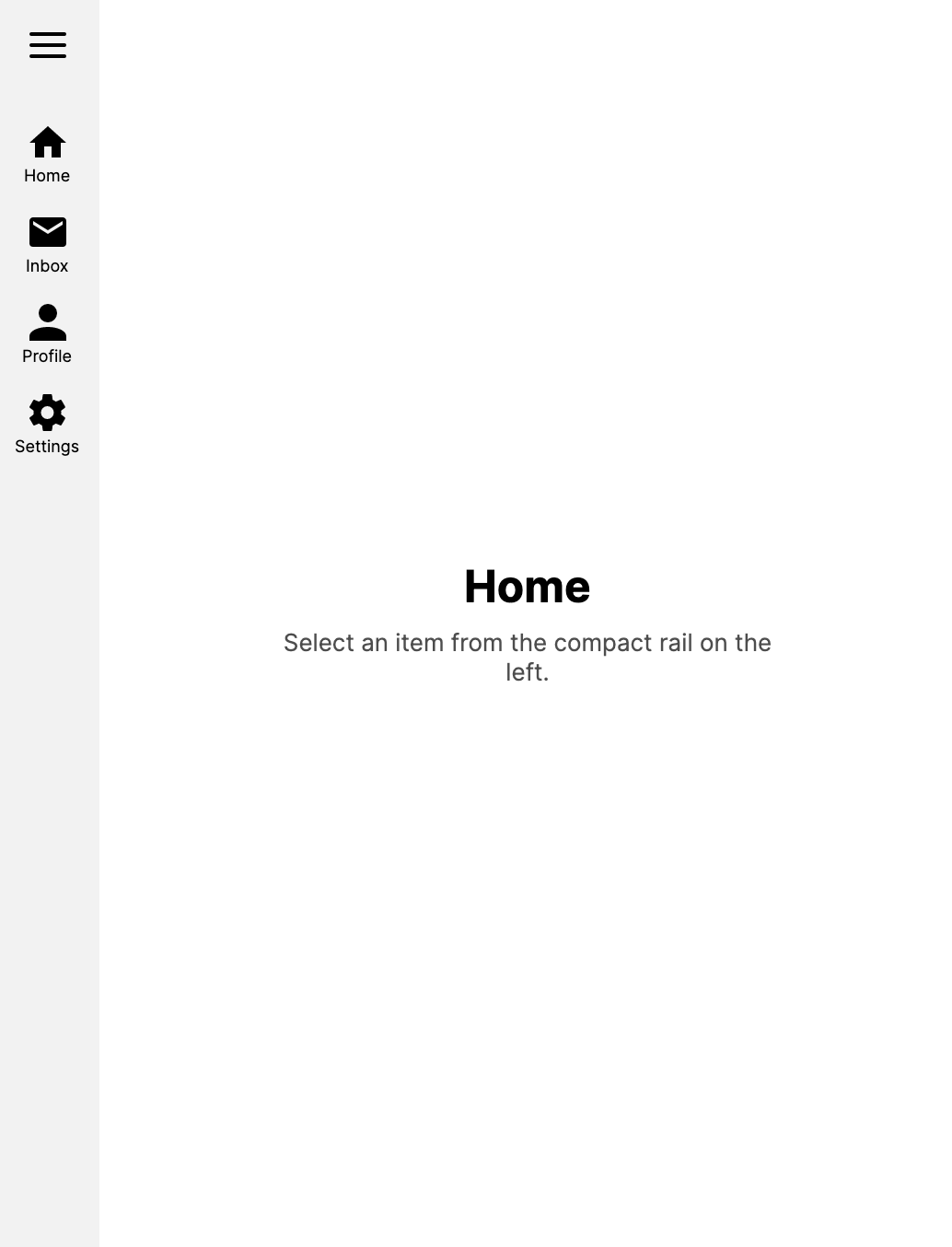
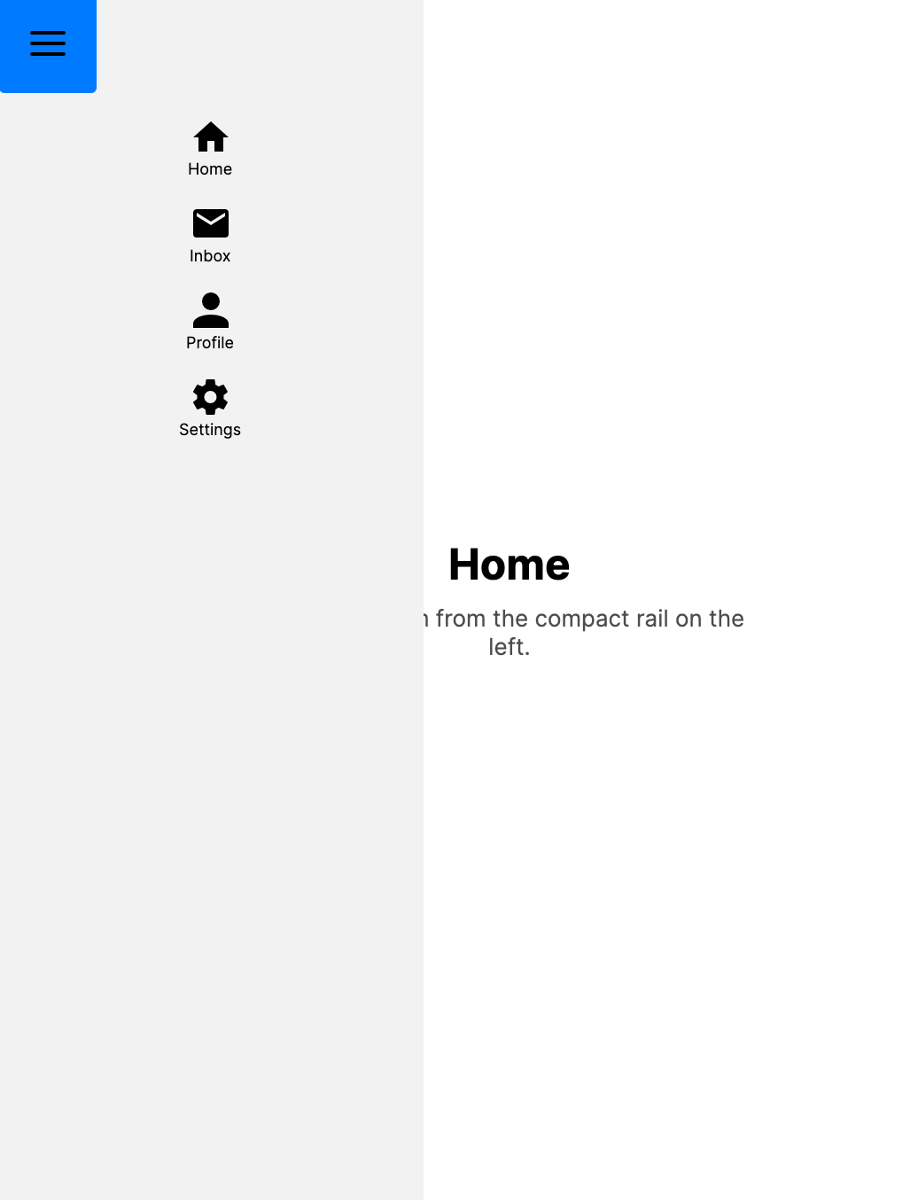
Compact navigation rail
Use CompactOverlay or CompactInline to show a narrow strip of the drawer (such as icon buttons) when closed, expanding to the full drawer on open.
<DrawerPage xmlns="https://github.com/avaloniaui"
            Header="My App"
            DrawerLayoutBehavior="CompactInline"
            CompactDrawerLength="48"
            DrawerLength="250">
    <DrawerPage.Drawer>
        <StackPanel Spacing="4">
            <Button Width="48" Content="H" />
            <Button Width="48" Content="S" />
        </StackPanel>
    </DrawerPage.Drawer>

    <TextBlock Text="Content adjusts when drawer opens" Margin="16" />
</DrawerPage>
- DrawerPage collapsed
- DrawerPage expanded
Responsive layout
Automatically switch the drawer between overlay and inline based on the container width, or height for top and bottom drawers.
<DrawerPage xmlns="https://github.com/avaloniaui"
            Header="Responsive App"
            DrawerBreakpointLength="800"
            DrawerLayoutBehavior="Split">
    <DrawerPage.Drawer>
        <StackPanel Spacing="4" Margin="8">
            <Button Content="Home" />
            <Button Content="Settings" />
        </StackPanel>
    </DrawerPage.Drawer>

    <TextBlock Text="Resize the window to see the drawer adapt" Margin="16" />
</DrawerPage>
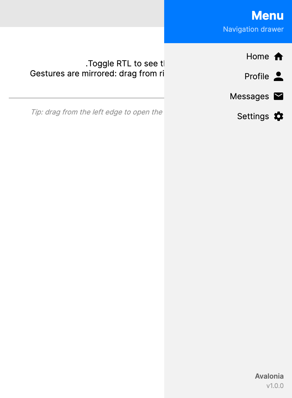
RTL support
DrawerPage respects FlowDirection for drawer placement, gesture direction, and safe-area handling. DrawerPlacement="Left" is the leading side, so it appears on the right in a right-to-left (RTL) layout.
<DrawerPage xmlns="https://github.com/avaloniaui"
            Header="RTL App"
            FlowDirection="RightToLeft">
    <DrawerPage.Drawer>
        <StackPanel Spacing="4" Margin="8">
            <Button Content="الصفحة الرئيسية" />
            <Button Content="الإعدادات" />
        </StackPanel>
    </DrawerPage.Drawer>

    <TextBlock Text="محتوى من اليمين إلى اليسار" Margin="16" />
</DrawerPage>
Right-side drawer
<DrawerPage xmlns="https://github.com/avaloniaui"
            Header="Right Drawer"
            DrawerPlacement="Right"
            DrawerLength="280">
    <DrawerPage.Drawer>
        <StackPanel Spacing="4" Margin="8">
            <Button Content="Option A" />
            <Button Content="Option B" />
        </StackPanel>
    </DrawerPage.Drawer>

    <TextBlock Text="The drawer opens from the right" Margin="16" />
</DrawerPage>
Backdrop scrim
Use the BackdropBrush property to add a semi-transparent overlay behind the drawer when it is open in overlay mode.
<DrawerPage xmlns="https://github.com/avaloniaui"
            Header="Scrim Example"
            BackdropBrush="#80000000">
    <DrawerPage.Drawer>
        <StackPanel Spacing="4" Margin="8">
            <Button Content="Home" />
        </StackPanel>
    </DrawerPage.Drawer>

    <TextBlock Text="A scrim appears behind the drawer" Margin="16" />
</DrawerPage>
Cancelling close
Handle the Closing event to prevent the drawer from closing under certain conditions.
private void OnDrawerClosing(object sender, DrawerClosingEventArgs e)
{
    if (hasUnsavedChanges)
    {
        e.Cancel = true;
    }
}
Responding to open/close
private void OnDrawerOpened(object? sender, RoutedEventArgs e)
{
    Debug.WriteLine("Drawer opened");
}

private void OnDrawerClosed(object? sender, RoutedEventArgs e)
{
    Debug.WriteLine("Drawer closed");
}
MVVM binding
Bind the IsOpen property to a view model for full control over the drawer state.
<DrawerPage xmlns="https://github.com/avaloniaui"
            Header="MVVM Example"
            IsOpen="{Binding IsDrawerOpen}">
    <DrawerPage.Drawer>
        <StackPanel Spacing="4" Margin="8">
            <Button Content="Home" Command="{Binding GoHomeCommand}" />
            <Button Content="Settings" Command="{Binding GoSettingsCommand}" />
        </StackPanel>
    </DrawerPage.Drawer>

    <ContentControl Content="{Binding CurrentContent}" />
</DrawerPage>
Custom drawer icon
Replace the default hamburger icon with a custom icon.
<DrawerPage xmlns="https://github.com/avaloniaui"
            Header="Custom Icon">
    <DrawerPage.DrawerIcon>
        <PathIcon Data="M3,6H21V8H3V6M3,11H21V13H3V11M3,16H21V18H3V16Z" />
    </DrawerPage.DrawerIcon>

    <DrawerPage.Drawer>
        <StackPanel Spacing="4" Margin="8">
            <Button Content="Home" />
        </StackPanel>
    </DrawerPage.Drawer>

    <TextBlock Text="Custom drawer icon" Margin="16" />
</DrawerPage>
Locked drawer
Use DrawerBehavior="Locked" to keep the drawer permanently open.
<DrawerPage xmlns="https://github.com/avaloniaui"
            Header="Locked Drawer"
            DrawerBehavior="Locked"
            DrawerLayoutBehavior="Split"
            DrawerLength="250">
    <DrawerPage.Drawer>
        <StackPanel Spacing="4" Margin="8">
            <Button Content="Home" />
            <Button Content="Settings" />
        </StackPanel>
    </DrawerPage.Drawer>

    <TextBlock Text="The drawer cannot be closed" Margin="16" />
</DrawerPage>
Disabling the drawer
Use DrawerBehavior="Disabled" to hide the drawer entirely.
<DrawerPage xmlns="https://github.com/avaloniaui"
            Header="No Drawer"
            DrawerBehavior="Disabled">
    <TextBlock Text="The drawer is disabled on this page" Margin="16" />
</DrawerPage>
NavigationPage content
When the main content is a NavigationPage, the hamburger menu icon automatically becomes a back button when pages are pushed.
<DrawerPage xmlns="https://github.com/avaloniaui"
            DrawerLength="280">
    <DrawerPage.Drawer>
        <StackPanel Spacing="4" Margin="8">
            <Button Content="Home" />
            <Button Content="Settings" />
        </StackPanel>
    </DrawerPage.Drawer>

    <NavigationPage>
        <ContentPage Header="Home">
            <StackPanel Margin="16" Spacing="8">
                <TextBlock Text="Home Page" FontSize="24" />
                <Button Content="Go to Details" Click="OnGoToDetails" />
            </StackPanel>
        </ContentPage>
    </NavigationPage>
</DrawerPage>
Navigation transitions
DrawerPage does not have its own PageTransition property. If the drawer hosts a NavigationPage, configure transitions on that NavigationPage:
<DrawerPage xmlns="https://github.com/avaloniaui"
            DrawerLength="280">
    <DrawerPage.Drawer>
        <StackPanel Spacing="4" Margin="8">
            <Button Content="Home" />
            <Button Content="Settings" />
        </StackPanel>
    </DrawerPage.Drawer>

    <NavigationPage>
        <NavigationPage.PageTransition>
            <CrossFade Duration="0:00:00.300" />
        </NavigationPage.PageTransition>

        <ContentPage Header="Home">
            <TextBlock Text="Home Page" Margin="16" />
        </ContentPage>
    </NavigationPage>
</DrawerPage>