UserControl
UserControl is a ContentControl that composes a reusable collection of controls in a predefined layout. In general, it is the quickest way to create a custom control for reuse within an app. The most common use case is a view or page that must appear repeatedly in an app, such as a settings panel or a user profile card.
When to use UserControl
UserControl is the standard approach for creating views in MVVM applications. Each view in your application is typically a UserControl subclass, paired with a corresponding view model.
If you need a general-purpose control that can be re-styled for use across different apps, use a templated control instead. If you need a control with a unique appearance not provided by Avalonia's built-in controls, use a custom-drawn control instead.
Basic example
Creating a confirmation view
The following example creates a simple confirmation view. UserControl is used as the container for a composition of StackPanel, TextBlock and Button controls.
- XAML
<UserControl xmlns="https://github.com/avaloniaui">
    <StackPanel Margin="20" Spacing="12">
        <TextBlock Text="Are you sure?"
                   HorizontalAlignment="Center"/>
        <StackPanel Orientation="Horizontal"
                    HorizontalAlignment="Center"
                    Spacing="12">
            <Button Content="Yes" />
            <Button Content="No" />
        </StackPanel>
    </StackPanel>
</UserControl>
Adding code-behind
In a real project, the confirmation view demonstrated above would typically live in a standalone XAML file named ConfirmationView.axaml. To give it additional functionality, such as event handling or styled properties, you would pair the XAML with a matching code-behind file named ConfirmationView.axaml.cs. This requires setting an x:Class on the UserControl to associate the XAML file with a class in code.
<UserControl xmlns="https://github.com/avaloniaui"
             x:Class="UserControlExample.ConfirmationView">
    <!-- Same control composition as above -->
</UserControl>
For more information on code-behind, see Code-behind.
Handling events
This example adds event handling logic to allow the Yes/No buttons in the confirmation view to respond to clicks.
- XAML
- C#
<UserControl xmlns="https://github.com/avaloniaui">
    <StackPanel Margin="20" Spacing="12">
        <TextBlock Text="Are you sure?"
                   HorizontalAlignment="Center"/>
        <StackPanel Orientation="Horizontal"
                    HorizontalAlignment="Center"
                    Spacing="12">
            <Button Content="Yes" Click="OnClick" />
            <Button Content="No" Click="OnClick" />
        </StackPanel>
    </StackPanel>
</UserControl>
using Avalonia.Controls;
using Avalonia.Interactivity;

public partial class ConfirmationView : UserControl
{

    private void OnClick(object? sender, RoutedEventArgs args)
    {
        if (sender is Button button)
        {
            button.Content = "Clicked!";
        }
    }
}
Adding a styled property
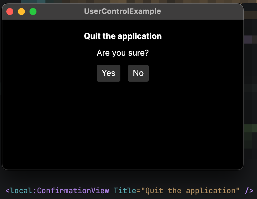
This example creates a styled property named Title, which displays a variable title at the top of ConfirmationView that allows binding.
The styled property is declared on the root UserControl element. To use it in a binding, you must reference that element. In the sample below, root is highlighted in ConfirmationView.axaml to demonstrate how this is done.
For more information on binding to a data context, see Data context.
- MainWindow.axaml
- ConfirmationView.axaml
- ConfirmationView.axaml.cs
<Window xmlns="https://github.com/avaloniaui"
        xmlns:x="http://schemas.microsoft.com/winfx/2006/xaml"
        xmlns:vm="using:UserControlExample.ViewModels"
        xmlns:local="clr-namespace:UserControlExample"
        x:Class="UserControlExample.Views.MainWindow"
        x:DataType="vm:MainWindowViewModel"
        Title="UserControlExample">

    <local:ConfirmationView Title="Quit the application" />

</Window>
<UserControl xmlns="https://github.com/avaloniaui"
             xmlns:x="http://schemas.microsoft.com/winfx/2006/xaml"
             x:Class="UserControlExample.ConfirmationView"
             x:Name="root">

    <StackPanel Margin="20" Spacing="12">
            <TextBlock Text="{Binding #root.Title}"
                       HorizontalAlignment="Center"
                       FontWeight="Bold" />
            <TextBlock Text="Are you sure?"
                       HorizontalAlignment="Center"/>
            <StackPanel Orientation="Horizontal"
                        HorizontalAlignment="Center"
                        Spacing="12">
                <Button Content="Yes" />
                <Button Content="No" />
            </StackPanel>
        </StackPanel>

</UserControl>
using Avalonia;
using Avalonia.Controls;

namespace UserControlExample;

public partial class ConfirmationView : UserControl
{
    public ConfirmationView()
    {
        InitializeComponent();
    }

    public static readonly StyledProperty<string?> TitleProperty =
        AvaloniaProperty.Register<ConfirmationView, string?>(nameof(Title));

    public string? Title
    {
        get => GetValue(TitleProperty);
        set => SetValue(TitleProperty, value);
    }
}
Reusing a user control
To reuse the same user control in another view, reference its namespace using xmlns in a Window or any other container. You can then bring up another instance of the user control using the x:Class you set for it.
Here is how you might reuse the same ConfirmationView from the examples above:
- UserControl
- Window
<UserControl xmlns="https://github.com/avaloniaui"
             x:Class="UserControlExample.ConfirmationView">
    <!-- Same control composition as above -->
</UserControl>
<Window xmlns:local="clr-namespace:UserControlExample">
    <local:ConfirmationView />
</Window>