Area chart
info
Charts are available with Avalonia Pro.
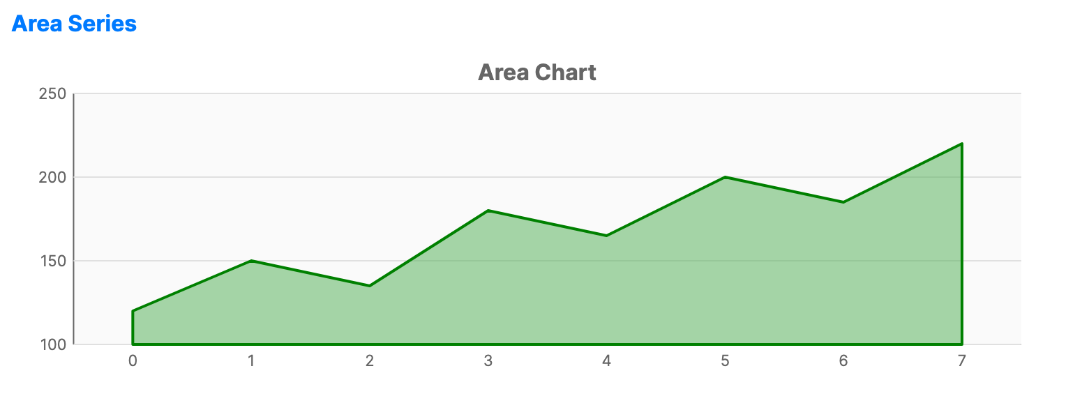
Area charts are based on the line chart. The area between the axis and the line is filled with color or gradients, emphasizing the magnitude of change over time.
When to use
- Cumulative totals: Visualizing how different components contribute to a whole over time.
- Volume: Emphasizing the total volume or magnitude of data points.
- Visual contrast: Providing a more distinct visual representation than a simple line chart.
Code example
XAML
<CartesianChart xmlns="https://github.com/avaloniaui" Name="AreaChart" Title="Area Chart" Height="250">
                        <CartesianChart.HorizontalAxis>
                            <CategoryAxis />
                        </CartesianChart.HorizontalAxis>
                        <CartesianChart.VerticalAxis>
                            <NumericalAxis />
                        </CartesianChart.VerticalAxis>
                        <CartesianChart.Series>
                            <AreaSeries Title="Revenue" ItemsSource="{Binding AreaSeriesData}" Fill="#7E4CAF50" Stroke="Green" StrokeThickness="2" />
                        </CartesianChart.Series>
                    </CartesianChart>
Data model (C#)
public ObservableCollection<int> AreaSeriesData { get; } = new()
{
    120, 150, 135, 180, 165, 200, 185, 220
};
Common properties
| Property | Description | Default |
|---|---|---|
Title | The name of the series. | null |
ItemsSource | The collection of data items. | null |
Stroke | Color of the top line. | Theme-dependent |
Fill | Brush used to fill the area under the line. | Theme-dependent |
FillOpacity | Transparency of the fill (0.0 to 1.0). | 0.5 |
StrokeThickness | Width of the line. | 2 |