Scatter chart
info
Charts are available with Avalonia Pro.
Scatter charts use dots to represent values for two different numeric variables. They are essential for displaying and comparing numeric values, such as scientific, statistical, and engineering data.
When to use
- Correlation: Identifying relationships between two variables (e.g., height vs weight).
- Distribution: Visualizing the spread and clustering of data points.
- Outlier detection: Easily spotting data points that fall far from the norm.
Code example
XAML
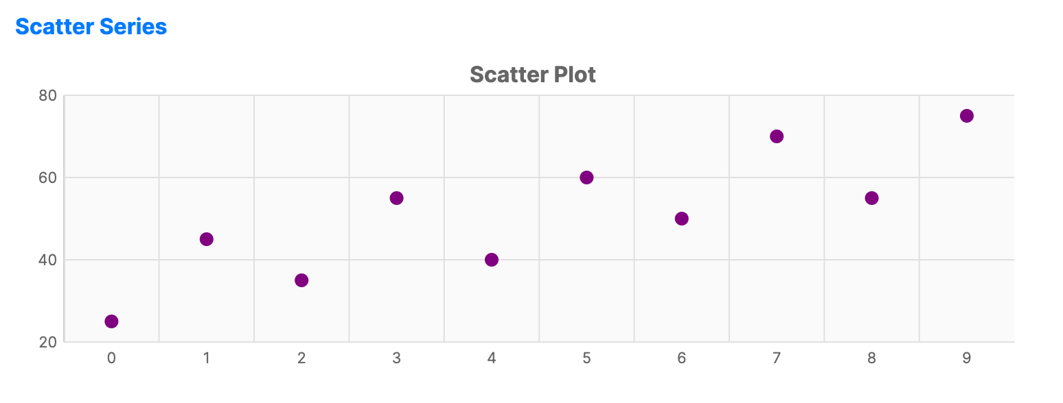
<CartesianChart xmlns="https://github.com/avaloniaui" Name="ScatterChart" Title="Scatter Plot" Height="250">
    <CartesianChart.HorizontalAxis>
        <NumericalAxis />
    </CartesianChart.HorizontalAxis>
    <CartesianChart.VerticalAxis>
        <NumericalAxis />
    </CartesianChart.VerticalAxis>
    <CartesianChart.Series>
        <ScatterSeries Title="Data Points"
                              ItemsSource="{Binding ScatterSeriesData}"
                              Fill="Purple"
                              MarkerSize="10"
                              MarkerShape="Circle" />
    </CartesianChart.Series>
</CartesianChart>
Data model (C#)
public ObservableCollection<int> ScatterSeriesData { get; } =
    new() { 25, 45, 35, 55, 40, 60, 50, 70, 55, 75 };
Common properties
| Property | Description | Default |
|---|---|---|
Title | The name of the series. | null |
ItemsSource | The collection of data points. | null |
CategoryPath | Value of the category path (X-axis). | null |
ValuePath | Value of the value path (Y-axis). | null |
ShowMarkers | Whether to display data point markers. | true |
MarkerSize | Size of the dots in pixels. | 8 |
MarkerShape | Shape of the dots, such as Circle or Square. | Circle |
MarkerFill | Brush used to fill the markers. When null, Fill is used. | null |
MarkerStroke | Brush used for marker outlines. | null |
MarkerStrokeThickness | Thickness of marker outlines. When NaN, the series StrokeThickness is used. | NaN |
Fill | The color of the scatter dots. | Theme-dependent |
Scatter line variant
The ScatterLineSeries extends scatter charts by drawing connecting lines between data points, combining scatter dot visibility with line trend visualization.
XAML
<CartesianChart xmlns="https://github.com/avaloniaui" Name="ScatterChart" Title="Scatter Plot" Height="250">
                        <CartesianChart.HorizontalAxis>
                            <NumericalAxis />
                        </CartesianChart.HorizontalAxis>
                        <CartesianChart.VerticalAxis>
                            <NumericalAxis />
                        </CartesianChart.VerticalAxis>
                        <CartesianChart.Series>
                            <ScatterLineSeries Title="Data Points" ItemsSource="{Binding ScatterSeriesData}" Fill="Purple" MarkerSize="10" MarkerShape="Circle" />
                        </CartesianChart.Series>
                    </CartesianChart>
ScatterLineSeries properties
| Property | Description | Default |
|---|---|---|
ShowLines | Whether to show connecting lines between scatter points. | true |
StrokeDashStyle | Dash style for the connecting lines. When null, lines are solid. | null |
ShowMarkers | Whether to display data point markers. | true |
MarkerSize | Size of the markers in pixels. | 8 |
MarkerShape | Shape of the markers, such as Circle or Square. | Circle |
MarkerFill | Brush used to fill the markers. When null, Fill is used. | null |
MarkerStroke | Brush used for marker outlines. | null |
MarkerStrokeThickness | Thickness of marker outlines. When NaN, the series StrokeThickness is used. | NaN |