Bar chart
info
Charts are available with Avalonia Pro.
Bar charts represent data using rectangular bars with lengths proportional to the values they represent.
When to use
- Comparisons: Comparing discrete quantities across different categories.
- Ranking: Showing which categories have the highest or lowest values.
- Categorical data: When data is grouped into distinct, non-continuous groups.
Code example
XAML
<CartesianChart xmlns="https://github.com/avaloniaui" Name="BarChart" Title="Bar Chart" Height="250">
                        <CartesianChart.HorizontalAxis>
                            <CategoryAxis />
                        </CartesianChart.HorizontalAxis>
                        <CartesianChart.VerticalAxis>
                            <NumericalAxis />
                        </CartesianChart.VerticalAxis>
                        <CartesianChart.Series>
                            <BarSeries Title="Sales" ItemsSource="{Binding BarSeriesData}" Fill="DodgerBlue" />
                        </CartesianChart.Series>
                    </CartesianChart>
Data model (C#)
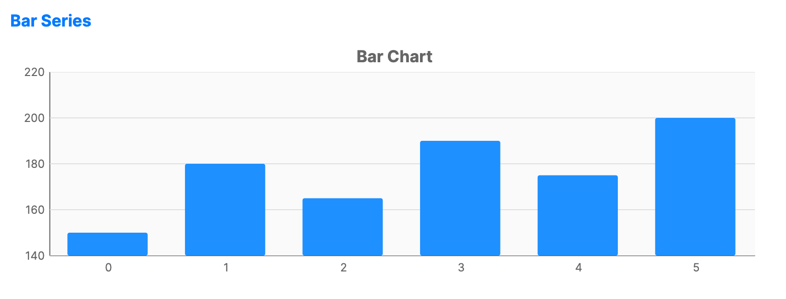
public ObservableCollection<int> BarSeriesData { get; } = new()
{
    150, 180, 165, 190, 175, 200
};
Common properties
| Property | Description | Default |
|---|---|---|
Title | The name of the series shown in the legend. | null |
ItemsSource | The collection of data items to display. | null |
CategoryPath | Path to the property used for the X-axis. | null |
ValuePath | Path to the property used for the Y-axis. | null |
Fill | The color/brush used to fill the bars. | Theme-dependent |
Stroke | The outline color of the bars. | Transparent |
ColorByPoint | Whether each bar uses its own palette color. | false |
BarCornerRadius | The rounding of the bar corners. | 0 |
BarWidth | The width of each bar as a fraction of the category band (0.0 to 1.0). | 0.7 |