Pareto chart
info
Charts are available with Avalonia Pro.
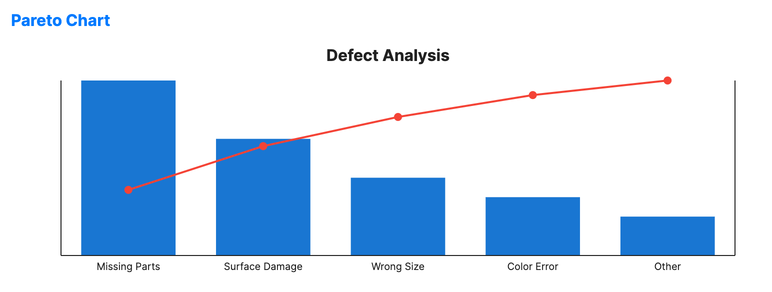
A Pareto chart contains both bars and a line graph, where individual values are represented in descending order by bars, and the cumulative total is represented by the line.
When to use
- Quality control: Identifying the "vital few" causes of defects (80/20 rule).
- Resource management: Pinpointing which categories account for most costs.
- Customer service: Analyzing which complaints are most frequent.
Code example
XAML
<ParetoChart xmlns="https://github.com/avaloniaui" Name="ParetoChartSample"
                                          Title="Defect Analysis"
                                          Height="250"
                                          ValuePath="Count"
                                          LabelPath="Defect"
                                          ItemsSource="{Binding ParetoData}" />
Data model (C#)
public record ParetoItem(string Defect, int Count);

public ObservableCollection<ParetoItem> ParetoData { get; } = new()
{
    new("Missing Parts", 45),
    new("Surface Damage", 30),
    new("Wrong Size", 20),
    new("Color Error", 15),
    new("Other", 10)
};
Common properties
| Property | Description | Default |
|---|---|---|
ItemsSource | The collection of categories. | null |
ValuePath | Property determining bar height. | null |
LabelPath | Property for the category names. | null |
BarBrush | Brush for the descending bars. | #1976D2 |
LineBrush | Brush for the cumulative percentage line. | #F44336 |
BarWidth | Width of each bar as a fraction of the category width. | 0.7 |
ShowCumulativeLine | Toggles the cumulative percentage line and markers. | true |
IsHighlightEnabled | Enables hover highlighting for Pareto bars. | false |