Radial bar chart
info
Charts are available with Avalonia Pro.
Radial bar charts use a polar coordinate system. They are essentially bar charts plotted on a circular grid, offering a distinctive and space-efficient way to compare categories.
When to use
- Circular comparisons: Showing data that has a cyclical nature (e.g., hours in a day).
- Dashboard infographics: Creating compact visual summaries for ranked categories.
- Progress tracking: Visualizing multiple goal tracks in a consolidated radial form.
Code example
XAML
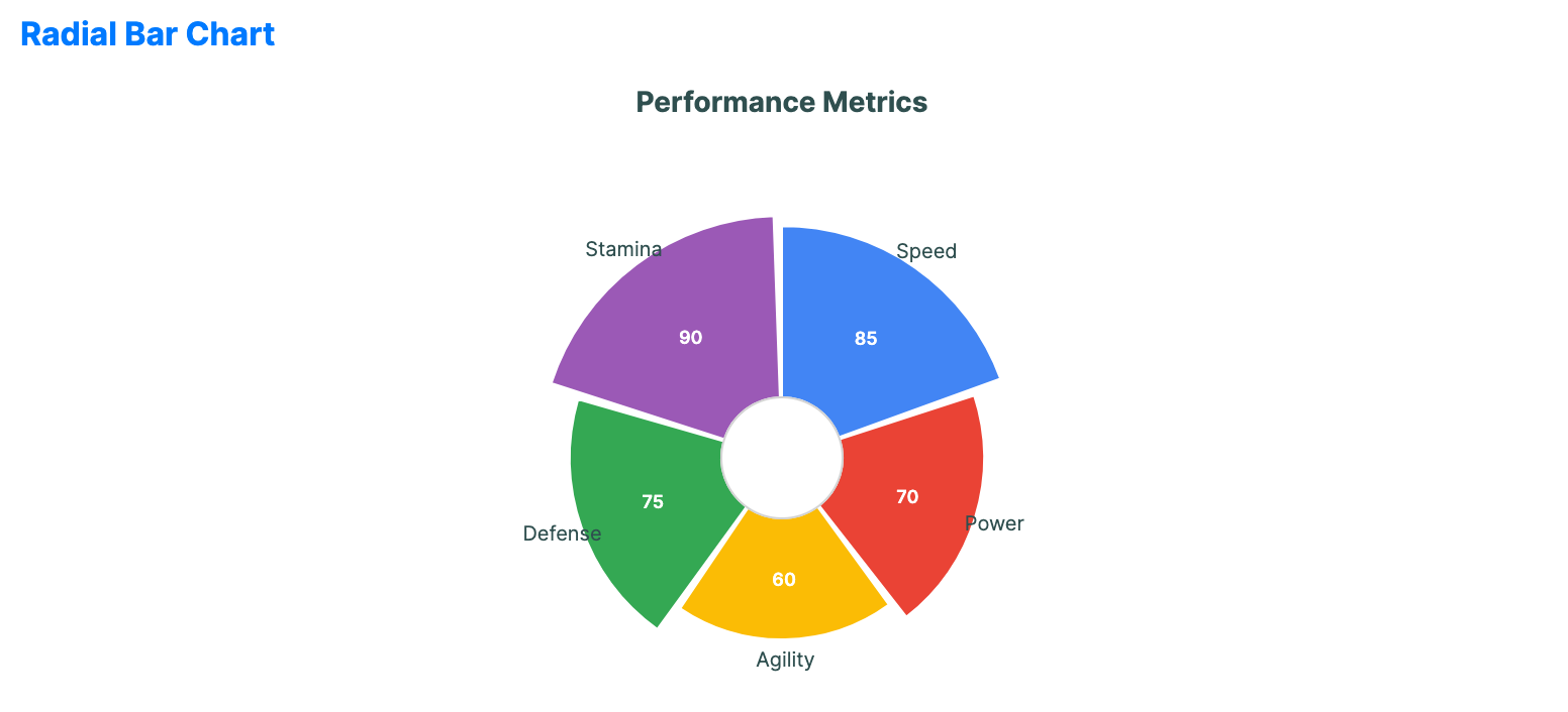
<RadialBarChart xmlns="https://github.com/avaloniaui" Name="RadialBarChartSample" Title="Performance Metrics" Height="350"
                                             ItemsSource="{Binding RadialBarData}"
                                             CategoryPath="Label" ValuePath="Value" />
Data model (C#)
public record RadialPoint(string Label, double Value);

public ObservableCollection<RadialPoint> RadialBarData { get; } = new()
{
    new("Speed", 85),
    new("Power", 70),
    new("Agility", 60),
    new("Defense", 75),
    new("Stamina", 90)
};
Common properties
| Property | Description | Default |
|---|---|---|
ItemsSource | The collection of categorical items. | null |
ValuePath | Numerical property for bar length. | null |
CategoryPath | Property name for category labels. | null |
InnerRadiusFactor | Relative size of the center hole from 0.0 to 1.0. | 0.2 |
StartAngle | The start angle in degrees. | -90.0 |
GapAngle | Angle gap between bars. | 2.0 |
ShowLabels | Whether labels are visible. | true |
ShowValues | Whether values are visible. | true |
LabelFontSize | Font size used for category labels. Value labels render one pixel smaller. | 10.0 |
LabelForeground | Brush used for category labels. When null, the chart uses the effective label foreground. | null |
IsHighlightEnabled | Enables hover highlighting for radial bars. | false |