Sankey chart
info
Charts are available with Avalonia Pro.
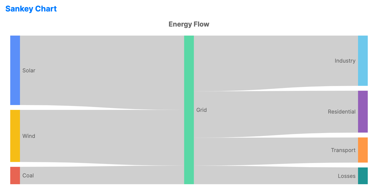
Sankey charts visualize the flow of data, energy, or materials between stages. The width of the connecting links is proportional to the quantity of the flow.
When to use
- Energy audit: Showing how energy is distributed from source to consumption.
- Web analytics: Visualizing the path users take through a website (user journey).
- Budgeting: Tracking how funds flow from income sources to various expenses.
Code example
XAML
<SankeyChart xmlns="https://github.com/avaloniaui" Name="SankeySample" Title="Energy Flow" Height="350"
                      ItemsSource="{Binding SankeyData}"
                      SourcePath="Source"
                      TargetPath="Target"
                      ValuePath="Value" />
Data model (C#)
public record FlowItem(string Source, string Target, double Value);

public ObservableCollection<FlowItem> SankeyData { get; } = new()
{
    new("Solar", "Grid", 40),
    new("Wind", "Grid", 30),
    new("Coal", "Grid", 10),
    new("Grid", "Industry", 30),
    new("Grid", "Residential", 25),
    new("Grid", "Transport", 15),
    new("Grid", "Losses", 10)
};
Common properties
| Property | Description | Default |
|---|---|---|
ItemsSource | The collection of flow data. | null |
SourcePath | Property name for the starting node. | null |
TargetPath | Property name for the ending node. | null |
ValuePath | Property name for the flow magnitude. | null |
NodeWidth | The width of each node column. | 20 |
NodePadding | The vertical space between nodes in a column. | 10 |