Indented tree chart
info
Charts are available with Avalonia Pro.
Indented tree charts represent hierarchies using a layout similar to a standard file explorer or tree view, but within a charting container for advanced styling and interactions.
When to use
- File system explorer: Building custom navigators for local or cloud storage.
- Bill of materials (BOM): Showing a multi-level product structure in manufacturing.
- Settings/config: Grouping complex nested configuration options visually.
Code example
XAML
<IndentedTreeChart xmlns="https://github.com/avaloniaui" Name="IndentedTreeChartSample" Height="320"
                            ItemsSource="{Binding IndentedTreeData}"
                            LabelPath="Name"
                            ChildrenPath="Children" />
Data model (C#)
public class TreeNode
{
public string Name { get; set; } = string.Empty;
public ObservableCollection<TreeNode> Children { get; set; } = new();
}
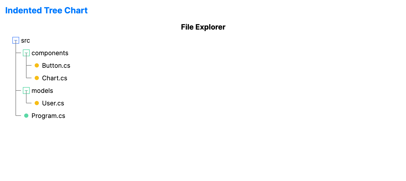
public ObservableCollection<TreeNode> IndentedTreeData { get; } = new()
{
new TreeNode { Name = "src", Children = {
new TreeNode { Name = "components", Children = {
new TreeNode { Name = "Button.cs" },
new TreeNode { Name = "Chart.cs" }
}},
new TreeNode { Name = "models", Children = {
new TreeNode { Name = "User.cs" }
}},
new TreeNode { Name = "Program.cs" }
}},
};
Common properties
| Property | Description | Default |
|---|---|---|
ItemsSource | The root level nodes. | null |
ValuePath | Optional numeric value displayed next to each label. | null |
LabelPath | The property name for the item text. | null |
ChildrenPath | The property name for child collections. | null |
IndentSize | The horizontal offset for each hierarchy level. | 20.0 |
RowHeight | The height of each rendered row. | 24.0 |
ShowLines | Whether to display connector lines between nodes. | true |
ShowIcons | Whether to display folder and leaf icons. | true |