Waffle chart
info
Charts are available with Avalonia Pro.
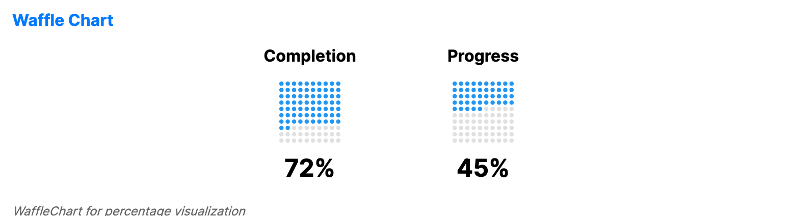
Waffle charts (square pie charts) visualize percentages or proportions using a grid of squares. They show part-to-whole relationships in a grid-based format.
When to use
- Goal completion: Visualizing how close a project is to its 100% target.
- Demographic proportions: Showing the distribution of different groups in a population.
- Project tracking: Displaying the percentage of completed tasks in a sprint.
Code example
XAML
<WrapPanel HorizontalAlignment="Center">
    <WaffleChart xmlns="https://github.com/avaloniaui" Title="Completion" Value="72" Width="150" Height="150" Rows="10" Columns="10" Margin="0,0,20,8" />
    <WaffleChart Title="Progress" Value="45" Width="150" Height="150" Rows="10" Columns="10" Margin="0,0,0,8" />
</WrapPanel>
Common properties
| Property | Description | Default |
|---|---|---|
Value | The current value to display. | 0 |
MaxValue | The maximum value for percentage calculation. | 100 |
Rows | Number of rows in the waffle grid. | 10 |
Columns | Number of columns in the waffle grid. | 10 |
FilledBrush | Brush used for the active squares. | Theme-dependent |
EmptyBrush | Brush used for the inactive squares. | Theme-dependent |
CellGap | Gap between waffle cells. | 2.0 |
CellCornerRadius | Corner radius of waffle cells. | 2.0 |
ShowPercentage | Whether to display the percentage text. | true |
Label | Optional label displayed below the percentage text. | null |