KPI cards
info
Charts are available with Avalonia Pro.
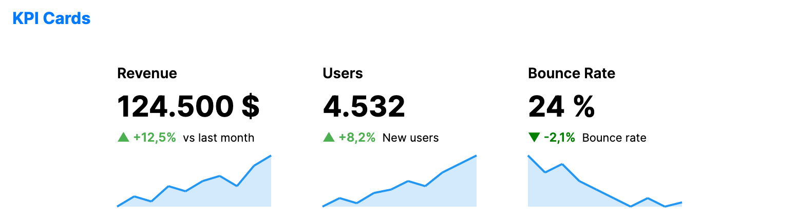
KPI cards display critical business metrics in a focused format. They typically combine a large value with a trend indicator and a mini sparkline for context.
When to use
- Executive dashboards: Providing at-a-glance status of main business goals.
- Performance monitoring: Tracking real-time metrics like active users or server load.
- Financial overviews: Showing revenue, expenses, and growth at the top of a report.
Code example
XAML
<WrapPanel Orientation="Horizontal" HorizontalAlignment="Center">
    <KpiCard xmlns="https://github.com/avaloniaui" Title="Revenue" Width="180" Height="160" Margin="10"
                    Value="{Binding Kpi1.Value}" Unit="{Binding Kpi1.Unit}"
                    Delta="{Binding Kpi1.Delta}" Subtitle="{Binding Kpi1.Subtitle}"
                    SparklineData="{Binding Kpi1.SparklineData}" />
    <KpiCard Title="Users" Width="180" Height="160" Margin="10"
                    Value="{Binding Kpi2.Value}" Unit="{Binding Kpi2.Unit}"
                    Delta="{Binding Kpi2.Delta}" Subtitle="{Binding Kpi2.Subtitle}"
                    SparklineData="{Binding Kpi2.SparklineData}" />
    <KpiCard Title="Bounce Rate" Width="180" Height="160" Margin="10"
                    Value="{Binding Kpi3.Value}" Unit="{Binding Kpi3.Unit}"
                    Delta="{Binding Kpi3.Delta}" Subtitle="{Binding Kpi3.Subtitle}"
                    SparklineData="{Binding Kpi3.SparklineData}"
                    NegativeBrush="{Binding Kpi3.NegativeBrush}" />
</WrapPanel>
Data model (C#)
using Avalonia.Media;

public record KpiItem(
    double Value,
    string? Unit,
    double Delta,
    string Subtitle,
    double[] SparklineData,
    IBrush? NegativeBrush = null);

public KpiItem Kpi1 { get; } = new(
    124500,
    "$",
    12.5,
    "vs last month",
    [10.0, 12, 11, 14, 13, 15, 16, 14, 18, 20.0]);

public KpiItem Kpi2 { get; } = new(
    4532,
    null,
    8.2,
    "New users",
    [50.0, 55, 52, 58, 60, 65, 62, 70, 75, 80.0]);

public KpiItem Kpi3 { get; } = new(
    24.5,
    "%",
    -2.1,
    "Bounce rate",
    [30.0, 28, 29, 27, 26, 25, 24, 25, 24, 24.5],
    Brushes.Green);
Common properties
| Property | Description | Default |
|---|---|---|
Value | The main numerical value to display. | 0 |
Delta | The change value (positive or negative) from the previous period. | 0 |
DeltaType | How the delta is displayed: Percentage or Absolute. | Percentage |
SparklineData | Array of values for the mini-chart. | null |
Unit | Suffix for the value (e.g., "$", "%", "pts"). | null |
Subtitle | Text displayed below the delta. | null |
ValueFormat | Numeric format string used for the main value. | "N0" |
PositiveBrush | Brush used when the delta is positive. | null (green, see Note below) |
NegativeBrush | Brush used when the delta is negative. | null (red, see Note below) |
SparklineBrush | Brush used for the sparkline mini-chart. | null (blue, see Note below) |
ShowSparkline | Whether to display the sparkline mini-chart. | true |
note
When PositiveBrush, NegativeBrush, or SparklineBrush is null, the card falls back to built-in accent colors: green for positive deltas, red for negative deltas, and blue for the sparkline.