Table chart
info
Charts are available with Avalonia Pro.
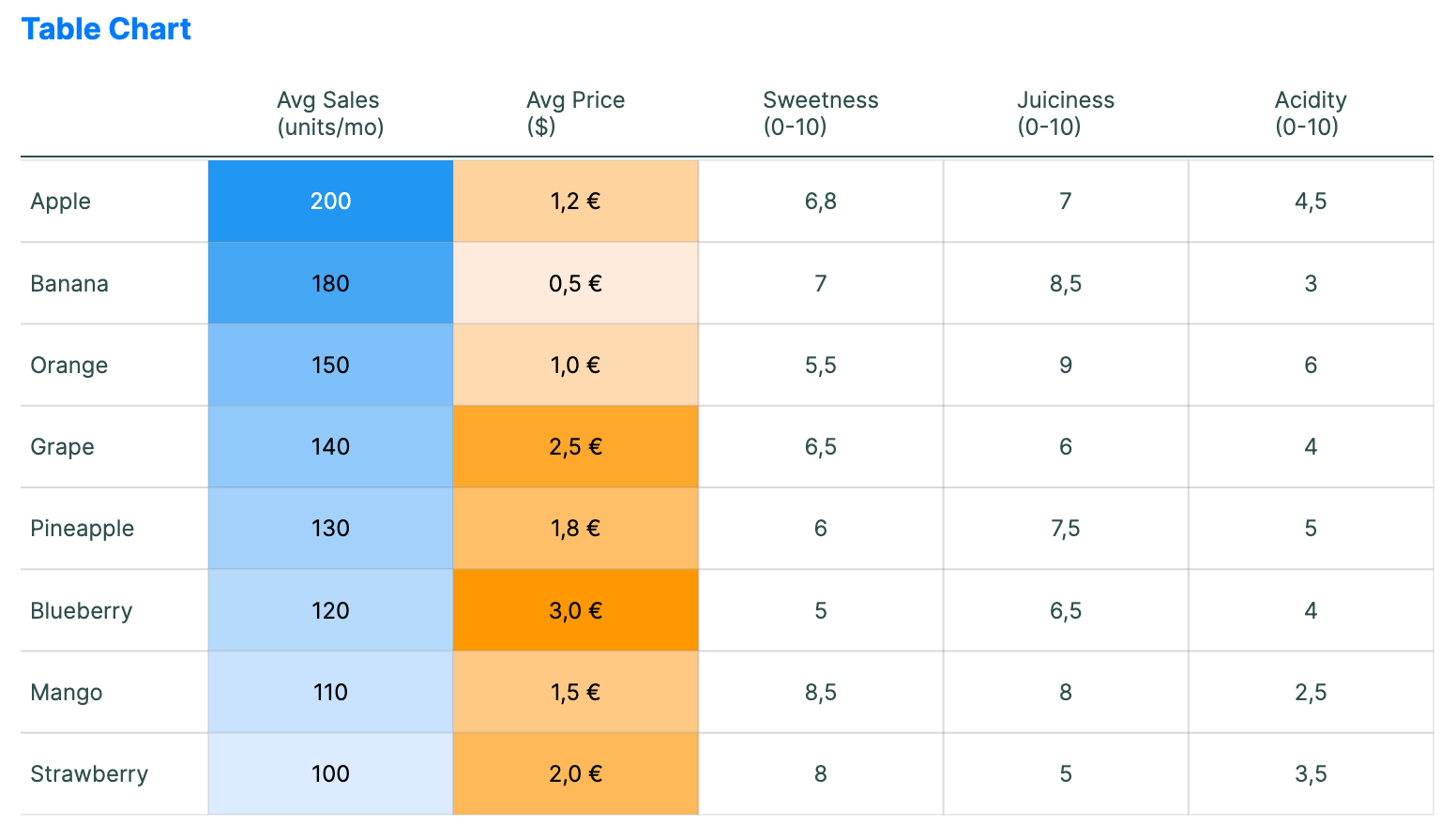
Table charts combine traditional tabular data with embedded visual cues. They are useful for dense reports where users need exact values and quick visual comparison.
When to use
- Product comparisons: Showing features across many items in a grid.
- Financial status: Displaying accounts with color-coded "health" indicators.
- Multi-metric reports: When users need to compare several metrics in a compact layout.
Code example
XAML
<TableChart xmlns="https://github.com/avaloniaui" Title="Product Comparison" Height="400"
                                         ItemsSource="{Binding TableData}"
                                         Columns="{Binding TableColumns}"
                                         RowLabelPath="Product" />
Data model (C#)
using Avalonia.Controls.Charts;
using Avalonia.Media;

public record TableItem(
    string Product,
    double Sales,
    double Price,
    double Sweetness,
    double Juiciness,
    double Acidity);

public ObservableCollection<TableItem> TableData { get; } = new()
{
    new("Apple", 200, 1.2, 6.8, 7.0, 4.5),
    new("Banana", 180, 0.5, 7.0, 8.5, 3.0),
    new("Orange", 150, 1.0, 5.5, 9.0, 6.0),
    new("Grape", 140, 2.5, 6.5, 6.0, 4.0),
    new("Pineapple", 130, 1.8, 6.0, 7.5, 5.0),
    new("Blueberry", 120, 3.0, 5.0, 6.5, 4.0),
    new("Mango", 110, 1.5, 8.5, 8.0, 2.5),
    new("Strawberry", 100, 2.0, 8.0, 5.0, 3.5)
};

public ObservableCollection<TableChartColumn> TableColumns { get; } = new()
{
    new()
    {
        Header = "Avg Sales\n(units/mo)",
        ValuePath = "Sales",
        UseColorScale = true,
        MinValue = 100,
        MaxValue = 200,
        LowBrush = new SolidColorBrush(Color.FromRgb(220, 235, 255)),
        HighBrush = new SolidColorBrush(Color.FromRgb(33, 150, 243))
    },
    new()
    {
        Header = "Avg Price\n($)",
        ValuePath = "Price",
        Format = "C1",
        UseColorScale = true,
        MinValue = 0.5,
        MaxValue = 3.0,
        LowBrush = new SolidColorBrush(Color.FromRgb(255, 235, 220)),
        HighBrush = new SolidColorBrush(Color.FromRgb(255, 152, 0))
    },
    new() { Header = "Sweetness\n(0-10)", ValuePath = "Sweetness" },
    new() { Header = "Juiciness\n(0-10)", ValuePath = "Juiciness" },
    new() { Header = "Acidity\n(0-10)", ValuePath = "Acidity" }
};
Columns takes TableChartColumn objects. Each column can define a Header, ValuePath, Format, and optional color-scale settings.
Common properties
| Property | Description | Default |
|---|---|---|
ItemsSource | The row data source. | null |
RowLabelPath | Path to the text displayed in the left row header column. | null |
Columns | The configuration for grid columns. | null |
RowHeight | Height of each data row. | 40.0 |
ColumnWidth | Minimum width for each metric column. | 80.0 |
RowLabelWidth | Width of the row label column. | 100.0 |
HeaderHeight | Height of the header row. | 50.0 |
ShowGridLines | Whether to show grid lines between rows and columns. | true |
CellPadding | Padding inside each table cell. | 5.0 |
LabelFontSize | Font size used for headers and cell values. | 12.0 |