Bump chart
info
Charts are available with Avalonia Pro.
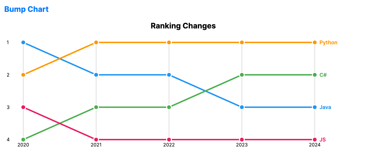
Bump charts are a variation of line charts designed to visualize changes in rank over time. They focus on the relative position of categories rather than their absolute values.
When to use
- Popularity rankings: Showing how songs or movies move up and down a top-10 list.
- Market share: Visualizing the competition between brands for the top spot.
- Tournament standings: Tracking the relative performance of teams across stages.
Code example
XAML
<BumpChart xmlns="https://github.com/avaloniaui" Name="BumpChartSample"
                                        Title="Ranking Changes"
                                        Height="300"
                                        NamePath="Name"
                                        RankingsPath="Ranks"
                                        Periods="{Binding BumpPeriods}"
                                        ItemsSource="{Binding BumpData}" />
Data model (C#)
public record BumpItem(string Name, int[] Ranks);

public ObservableCollection<BumpItem> BumpData { get; } = new()
{
    new("Java", new[] { 1, 2, 2, 3, 3 }),
    new("C#", new[] { 4, 3, 3, 2, 2 }),
    new("Python", new[] { 2, 1, 1, 1, 1 }),
    new("JS", new[] { 3, 4, 4, 4, 4 })
};

public ObservableCollection<string> BumpPeriods { get; } = new()
{
    "2020", "2021", "2022", "2023", "2024"
};
Common properties
| Property | Description | Default |
|---|---|---|
ItemsSource | The collection of ranked entities. | null |
NamePath | Property representing the entity name. | null |
RankingsPath | Property representing the rank sequence for each entity. | null |
Periods | Labels displayed across the horizontal axis. | null |
StrokeThickness | Width of the ranking lines. | 3.0 |
MarkerSize | Size of the markers drawn at each period. | 10.0 |
ShowLabels | Whether to display entity labels at the end of each line. | true |
ShowRankNumbers | Whether to display rank numbers on the vertical axis. | true |