Pyramid chart
info
Charts are available with Avalonia Pro.
Pyramid charts are a type of stacked area or bar graph that emphasizes both hierarchy and volume. They are the classic choice for population and sales pipeline visualization.
When to use
- Population pyramids: Showing age and gender distribution in a region.
- Sales pipelines: Visualizing the funnel from leads to closed deals.
- Biological hierarchies: Showing energy flow or species distribution in an ecosystem.
Code example
XAML
<PyramidChart xmlns="https://github.com/avaloniaui" Title="Population Distribution" Height="300"
                       ItemsSource="{Binding PyramidData}"
                       LabelPath="Age" ValuePath="Value"/>
Data model (C#)
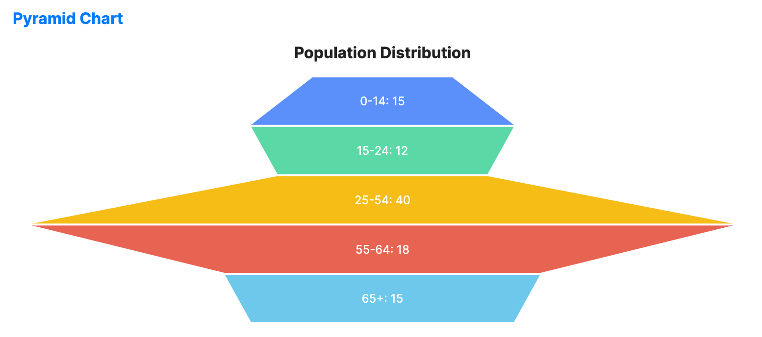
public record PyramidItem(string Age, double Value);

public ObservableCollection<PyramidItem> PyramidData { get; } = new()
{
    new("0-14", 15),
    new("15-24", 12),
    new("25-54", 40),
    new("55-64", 18),
    new("65+", 15)
};
Common properties
| Property | Description | Default |
|---|---|---|
ItemsSource | The collection of data layers. | null |
ValuePath | Magnitude of each layer. | null |
LabelPath | Text description for each layer. | null |
SegmentGap | Vertical distance between levels. | 2.0 |
ShowLabels | Whether to display labels on segments. | true |
ShowValues | Whether to display numeric values on the chart. | true |
IsHighlightEnabled | Enables hover highlighting for pyramid segments. | false |