Pictorial bar chart
info
Charts are available with Avalonia Pro.
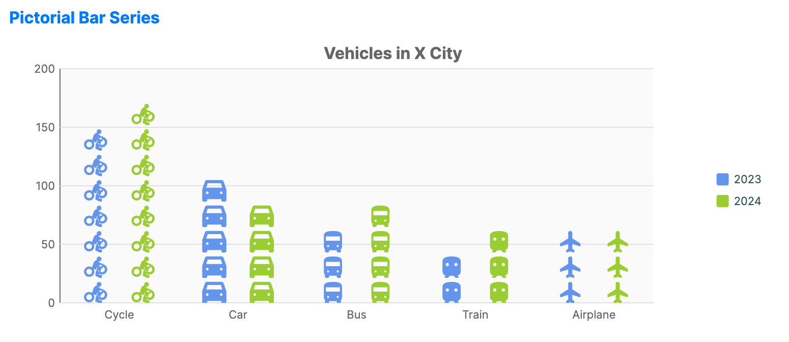
Pictorial bar charts use recognizable icons or symbols instead of plain bars. They are suited to infographics where the subject matter (for example, people, cars, or buildings) can be visually reinforced.
When to use
- Infographics: Creating high-engagement, thematic reports.
- Demographic reports: Using gender or professional icons to represent counts.
- Public data presentation: Making dry statistics more accessible through familiar symbols.
Code example
XAML
<CartesianChart xmlns="https://github.com/avaloniaui" Name="PictorialBarChart" Title="Vehicles in X City" Height="300" ShowLegend="True" LegendPosition="Right">
    <CartesianChart.HorizontalAxis>
        <CategoryAxis />
    </CartesianChart.HorizontalAxis>
    <CartesianChart.VerticalAxis>
        <NumericalAxis />
    </CartesianChart.VerticalAxis>
    <CartesianChart.Series>
        <PictorialBarSeries Title="2023"
                                   ItemsSource="{Binding PictorialBarData}"
                                   ValuePath="Value2023"
                                   CategoryPath="Category"
                                   Geometry="Icon"
                                   RenderMode="Repeat"
                                   SymbolSize="20"
                                   SymbolSpacing="5"
                                   Fill="#6495ED" />
        <PictorialBarSeries Title="2024"
                                   ItemsSource="{Binding PictorialBarData}"
                                   ValuePath="Value2024"
                                   CategoryPath="Category"
                                   Geometry="Icon"
                                   RenderMode="Repeat"
                                   SymbolSize="20"
                                   SymbolSpacing="5"
                                   Fill="#9ACD32" />
    </CartesianChart.Series>
</CartesianChart>
Data model (C#)
public record VehicleItem(string Category, double Value2023, double Value2024, string Icon);

public ObservableCollection<VehicleItem> PictorialBarData { get; } = new()
{
    new("Cycle", 157, 184, CycleIcon),
    new("Car", 123, 95, CarIcon),
    new("Bus", 78, 91, BusIcon),
    new("Train", 45, 66, TrainIcon),
    new("Airplane", 66, 73, AirplaneIcon)
};

private const string CycleIcon = "M15.5,5.5C16.6,5.5 17.5,4.6 17.5,3.5C17.5,2.4 16.6,1.5 15.5,1.5C14.4,1.5 13.5,2.4 13.5,3.5C13.5,4.6 14.4,5.5 15.5,5.5M5,12C2.2,12 0,14.2 0,17C0,19.8 2.2,22 5,22C7.8,22 10,19.8 10,17C10,14.2 7.8,12 5,12M5,20.5C3.1,20.5 1.5,18.9 1.5,17C1.5,15.1 3.1,13.5 5,13.5C6.9,13.5 8.5,15.1 8.5,17C8.5,18.9 6.9,20.5 5,20.5M10.8,12L13.2,9.6L14,10.4C15.3,11.7 17,12.5 19.1,12.5V9C17.6,9 16.4,8.4 15.5,7.5L13.6,5.6C13.1,5.2 12.4,5.2 12,5.6L10.4,7.2L8.3,13.2L12,14.3L13.6,10.9L14.5,12.7L12.5,17.1L12,21L16,23L18,23V21H16.5L14.5,20L18,12.5C18.2,12.7 18.4,12.9 18.6,13V11C20.7,11 22.3,12.9 22,15.1C21.7,16.7 20.3,18 18.6,18C16.7,18 15.1,16.4 15.1,14.5H13.6C13.6,17.3 15.8,19.5 18.6,19.5C21.2,19.5 23.4,17.5 23.6,15C23.8,12 21.4,9.5 18.4,9.5H16.3L10.8,12Z";
private const string CarIcon = "M18.92,6.01C18.72,5.42 18.16,5 17.5,5h-11c-0.66,0-1.21,0.42-1.42,1.01L3,12v8c0,0.55,0.45,1,1,1h1c0.55,0,1-0.45,1-1v-1h12v1 c0,0.55,0.45,1,1,1h1c0.55,0,1-0.45,1-1v-8L18.92,6.01z M6.5,16c-0.83,0-1.5-0.67-1.5-1.5S5.67,13,6.5,13S8,13.67,8,14.5 S7.33,16,6.5,16z M17.5,16c-0.83,0-1.5-0.67-1.5-1.5s0.67-1.5,1.5-1.5s1.5,0.67,1.5,1.5S18.33,16,17.5,16z M5,11l1.5-4.5h11L19,11H5z";
private const string BusIcon = "M4,16c0,0.88,0.39,1.67,1,2.22V20c0,0.55,0.45,1,1,1h1c0.55,0,1-0.45,1-1v-1h8v1c0,0.55,0.45,1,1,1h1c0.55,0,1-0.45,1-1 v-1.78c0.61-0.55,1-1.34,1-2.22V6c0-3.5-3.58-4-8-4S4,2.5,4,6V16z M7.5,17c-0.83,0-1.5-0.67-1.5-1.5S6.67,14,7.5,14S9,14.67,9,15.5 S8.33,17,7.5,17z M16.5,17c-0.83,0-1.5-0.67-1.5-1.5s0.67-1.5,1.5-1.5s1.5,0.67,1.5,1.5S17.33,17,16.5,17z M5,6h14v5H5V6z";
private const string TrainIcon = "M12,2c-4,0-8,0.5-8,4v9.5C4,17.43,5.57,19,7.5,19L6,20.5v0.5h2.23l2-2H14l2,2h2v-0.5L16.5,19c1.93,0,3.5-1.57,3.5-3.5V6 C20,2.5,16,2,12,2z M8,11c-1.1,0-2-0.9-2-2s0.9-2,2-2s2,0.9,2,2S9.1,11,8,11z M16,11c-1.1,0-2-0.9-2-2s0.9-2,2-2s2,0.9,2,2 S17.1,11,16,11z";
private const string AirplaneIcon = "M21,16v-2l-8-5V3.5C13,2.67,12.33,2,11.5,2S10,2.67,10,3.5V9l-8,5v2l8-2.5V19l-2,1.5V22l3.5-1l3.5,1v-1.5L13,19v-5.5L21,16z";
Common properties (PictorialBarSeries)
| Property | Description | Default |
|---|---|---|
Geometry | The SVG/XAML path data for the icon. | null |
RenderMode | Stretch, Clip, or Repeat. | Stretch |
SymbolSize | The size of the icon in pixels. | 20.0 |
SymbolSpacing | Padding between repeated icons. | 5.0 |
Fill | Brush used to paint the icons. | Theme-dependent |