Tooltips
info
Charts are available with Avalonia Pro.
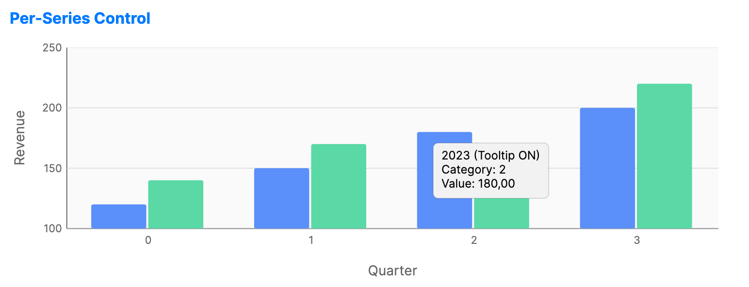
Tooltips provide detailed information about data points when the user hovers over them. They add precision and context without cluttering the main chart area.
Default Cartesian and financial chart tooltips format category and date values through the chart's horizontal axis formatting.
When to use
- High-density data: Pinpointing values in a crowded line or scatter chart.
- Additional context: Showing metadata (e.g., "Update Date") that isn't mapped to an axis.
- Hover interactions: Showing focused details while the pointer is over a data point.
Code example
XAML
<CartesianChart xmlns="https://github.com/avaloniaui" Name="PerSeriesTooltipsChart" Height="250" IsTooltipEnabled="True">
    <CartesianChart.HorizontalAxis>
        <CategoryAxis Title="Quarter" />
    </CartesianChart.HorizontalAxis>
    <CartesianChart.VerticalAxis>
        <NumericalAxis Title="Revenue" />
    </CartesianChart.VerticalAxis>
    <CartesianChart.Series>
        <BarSeries Title="2023 (Tooltip ON)"
                          ItemsSource="{Binding Series1Data}"
                          IsTooltipEnabled="True" />
        <BarSeries Title="2024 (Tooltip OFF)"
                          ItemsSource="{Binding Series2Data}"
                          IsTooltipEnabled="False" />
    </CartesianChart.Series>
</CartesianChart>
Data model (C#)
public ObservableCollection<double> Series1Data { get; } = new()
{
    120, 150, 180, 200
};

public ObservableCollection<double> Series2Data { get; } = new()
{
    140, 170, 160, 220
};
Common properties
| Property | Description | Default |
|---|---|---|
IsTooltipEnabled | Global toggle for tooltip visibility. | true |
TooltipTemplate | Custom DataTemplate for the tooltip UI (on series). | System default |
Data item conventions
If the hit data item has a non-empty string property named TooltipText, the default tooltip displays that text instead of generated series, category, and value content.
Use TooltipTemplate on a series when the tooltip needs custom layout, controls, or multiple bound fields.