Interactions
Charts are available with Avalonia Pro.
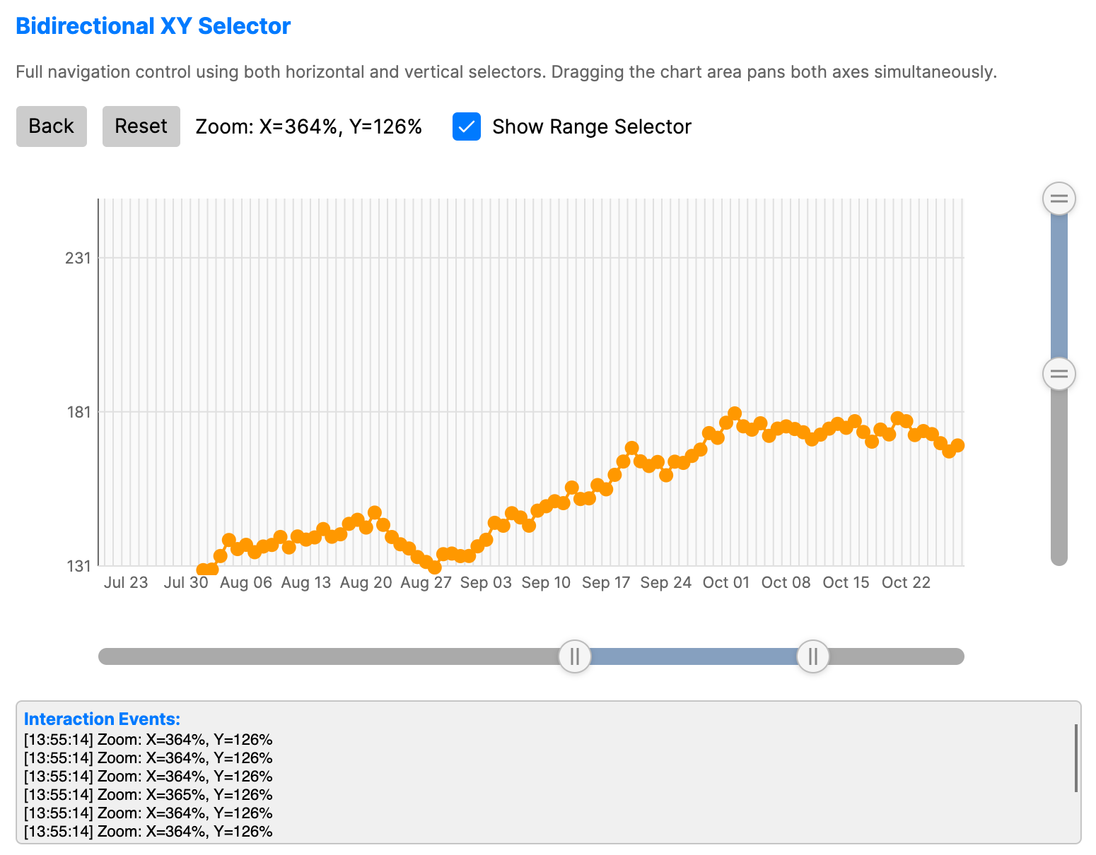
Chart interactions allow users to explore data dynamically with zooming, panning, selection, hover highlighting, and trackball inspection.
When to use
- Big data visualization: Exploring line charts with thousands of points.
- Deep-dive analysis: Zooming into a specific time window for detailed study.
- Interactive reports: Giving users agency to focus on areas of interest.
- Hover inspection: Dimming non-hovered items so the active data point or segment is easier to identify.
Code example
XAML
<StackPanel Spacing="15">
    <WrapPanel Orientation="Horizontal">
        <Button Content="Back" Margin="0,0,10,10" />
        <Button Content="Reset" Margin="0,0,10,10" />
        <TextBlock Text="Zoom: X=100%, Y=100%"
                   VerticalAlignment="Center"
                   Margin="0,0,20,10" />
        <CheckBox Name="ShowRangeSelectorCheckBox"
                  Content="Show Range Selector"
                  IsChecked="True"
                  VerticalAlignment="Center"
                  Margin="0,0,0,10" />
    </WrapPanel>

    <CartesianChart xmlns="https://github.com/avaloniaui" Name="ChartXY"
                           Height="350"
                           ZoomMode="XY"
                           IsZoomEnabled="True"
                           IsPanEnabled="True"
                           ShowRangeSelector="{Binding #ShowRangeSelectorCheckBox.IsChecked}">
        <CartesianChart.HorizontalAxis>
            <DateTimeAxis LabelFormat="MMM dd" ShowGridLines="True" />
        </CartesianChart.HorizontalAxis>
        <CartesianChart.VerticalAxis>
            <NumericalAxis LabelFormat="N0" ShowGridLines="True" />
        </CartesianChart.VerticalAxis>
        <CartesianChart.Series>
            <LineSeries ItemsSource="{Binding ZoomData}"
                               CategoryPath="Date"
                               ValuePath="Value"
                               Stroke="#FF9800"
                               StrokeThickness="2" />
        </CartesianChart.Series>
    </CartesianChart>

    <Border BorderBrush="{DynamicResource CardBorderBrush}"
            BorderThickness="1"
            CornerRadius="4"
            Background="{DynamicResource CardBackgroundBrush}">
        <ScrollViewer Height="100">
            <StackPanel Spacing="2" Margin="5">
                <TextBlock Text="Interaction Events:"
                           FontWeight="Bold"
                           FontSize="12"
                           Foreground="{DynamicResource AccentBrush}" />
            </StackPanel>
        </ScrollViewer>
    </Border>
</StackPanel>
Data model (C#)
using System;

public class DateTimePoint
{
    public DateTime Date { get; set; }
    public double Value { get; set; }
}

public ObservableCollection<DateTimePoint> ZoomData { get; } = CreateZoomData();

private static ObservableCollection<DateTimePoint> CreateZoomData()
{
    var data = new ObservableCollection<DateTimePoint>();
    var date = new DateTime(2023, 1, 1);
    var random = new Random(42);
    var value = 100.0;

    for (var i = 0; i < 365; i++)
    {
        value += random.NextDouble() * 10 - 4.5;
        value = Math.Max(50, Math.Min(200, value));
        data.Add(new DateTimePoint { Date = date, Value = value });
        date = date.AddDays(1);
    }

    return data;
}
Common properties
Zoom and pan
| Property | Description | Default |
|---|---|---|
IsZoomEnabled | Enables the ability to zoom into the chart. | false |
IsPanEnabled | Enables the ability to pan (scroll) the chart view. | false |
ZoomMode | X, Y, or XY axis zooming. | XY |
ZoomSensitivity | Non-negative mouse wheel zoom sensitivity. 0 disables wheel zoom; invalid values are coerced to 0. | 0.1 |
ShowRangeSelector | Show a range selector control for zooming. | true |
ZoomHistoryLimit | Maximum number of viewport states kept for zoom-back navigation. Set to 0 to keep all pushed states. | 20 |
CanGoBackZoom | Read-only state indicating whether GoBackZoom() can restore a previous viewport. | false |
Range selector
CartesianChart creates embedded ChartRangeSelector controls when IsZoomEnabled, ShowRangeSelector, and the current ZoomMode require them. Use ChartRangeSelector directly when a separate range selection surface is needed.
| Property | Description | Default |
|---|---|---|
Orientation | Selector orientation, Horizontal or Vertical. | Horizontal |
Minimum | Minimum data value represented by the selector. | 0.0 |
Maximum | Maximum data value represented by the selector. | 100.0 |
SelectedMinimum | Selected range start value. This property binds two-way by default. | 0.0 |
SelectedMaximum | Selected range end value. This property binds two-way by default. | 100.0 |
GripSize | Size of the draggable range handles in pixels. | 24.0 |
PlotAreaOffset | Offset used to align the selector track with a chart plot area. | 0.0 |
SmallChange | Keyboard navigation increment. | 1.0 |
KeyboardStepRatio | Optional keyboard movement step in normalized selector space when ratio converters are set. 1.0 represents the full track length. When unset, keyboard movement uses SmallChange. | null |
ValueToRatio | Optional converter from data values to normalized selector positions. Used for non-linear axes and scale breaks. | null |
RatioToValue | Optional converter from normalized selector positions back to data values. | null |
| Event | Description |
|---|---|
RangeDragStarted | Raised when the user starts dragging the selector thumb or a grip. |
RangeDragCompleted | Raised when the active range drag completes. |
Hover highlighting
| Property | Description | Default |
|---|---|---|
IsHighlightEnabled | Enables hover highlighting. On series, hovering a data point dims other items in that series. On supported standalone charts, hovering a segment or cell dims the other items in that chart. | false |
Supported standalone charts include BubbleCloud, PackedBubbleChart, NightingaleRoseChart, RadialBarChart, SemiDonutChart, SunburstChart, comparison charts, funnel charts, grid charts, TreeMapChart, FinancialChart, PolarAreaChart, PolarChart, and RadarChart.
Trackball
CartesianChart can display a trackball guide line and value tooltips while the pointer moves over the plot area.
| Property | Description | Default |
|---|---|---|
TrackballMode | Trackball line mode: None, Vertical, or Horizontal. | None |
TrackballDisplayMode | Tooltip display mode: FloatAllPoints or GroupAllPoints. | FloatAllPoints |
TrackballLineStroke | Brush used for the trackball guide line. When null, DimGray is used. | null |
TrackballLineStrokeThickness | Thickness of the trackball guide line. | 1.0 |
Selection
| Property | Description | Default |
|---|---|---|
IsSelectionEnabled | Enables pointer selection for supported series or chart items. | false |
SelectionMode | Selection behavior, such as None, Single, SingleDeselect, or Multiple. | SingleDeselect |
SelectedIndex | Two-way index of the primary selected item, or -1 when nothing is selected. | -1 |
SelectedIndexes | Read-only snapshot of selected indexes for multi-selection scenarios. | Empty collection |
SelectionBrush | Brush used for selected items. | #314A6E |
SelectionStroke | Optional outline brush for selected items. | null |
SelectionStrokeThickness | Outline thickness for selected items. | 2.0 |
Selection APIs are available on selectable chart controls and selectable series. SelectionChanging is raised before a selection is committed and can be canceled or edited by updating the event data. SelectionChanged is raised after the applied selection changes.
Events and methods
| Member | Description |
|---|---|
DataPointClicked | Raised when a data point is clicked. Event data exposes the Series, DataPointIndex, Category, Value, and original DataItem when available. |
DataPointHovered | Raised after the hover debounce when the pointer moves over a data point or leaves all data points. This event does not require IsHighlightEnabled; that property only controls highlight visuals. Event data exposes Source and DataPointIndex. |
GoBackZoom() | Restores the previous zoom viewport and returns true when a history entry was applied. |
ResetZoom() | Clears the active viewport and zoom history. |
ClearSelection() | Clears the current selection on selectable charts, series, or layers. |
TrySelectDataPoint(index) | Attempts to select a data point by index on selectable charts or series. |
IsDataPointSelected(index) | Returns whether a data point index is currently selected. |
TrySelectItem(item) | Attempts to select a data item on item-selectable controls such as ShapeLayer. |
IsItemSelected(item) | Returns whether a data item is selected on item-selectable controls. |
SelectionChanging | Raised before selection changes. Event data exposes editable NewSelection and NewIndexes, previous OldSelection and OldIndexes, and Cancel. |
SelectionChanged | Raised after selection changes. Event data exposes snapshots of NewSelection, OldSelection, NewIndexes, and OldIndexes. |
ZoomChanged | Raised when the zoom viewport changes. Event data exposes Axis, previous and current zoom factor, previous and current zoom position, and visible viewport bounds. |
ZoomReset | Raised after zoom is reset. Event data exposes previous viewport bounds and the previous zoom factor. |
SeriesAdded | Raised by CartesianChart after a series is added to its Series collection. |
SeriesRemoved | Raised by CartesianChart after a series is removed from its Series collection. |
Interaction controls
- Mouse Wheel: Zoom in/out at the cursor position.
- Ctrl + Drag: Pan across the chart area.
- Shift + Drag: Draw a rectangle to zoom into a specific region.
- Hover: Highlights the active data point or segment when
IsHighlightEnabledistrue. - Double Click: Reset zoom and pan to default view.
Charts also support pinch-to-zoom, mouse wheel zoom, and selection zoom.