Legend
info
Charts are available with Avalonia Pro.
The Legend component helps users identify different data series within a chart. It can be positioned around the chart area and styled to match your application's theme.
When to use
- Multi-series charts: Indispensable when more than one series is displayed.
- Interactive toggling: When users need to show/hide series by clicking legend items.
- Complex visuals: Helping to explain color or pattern coding (e.g., in a Pie or Map chart).
Code example
XAML
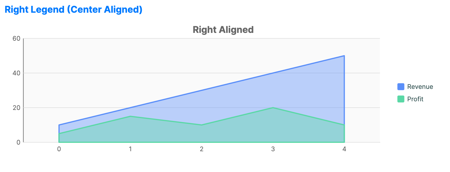
<CartesianChart xmlns="https://github.com/avaloniaui" Name="RightLegendSample"
                        IsTooltipEnabled="True"
                        Title="Right Aligned"
                        Height="250"
                        ShowLegend="True"
                        LegendPosition="Right"
                        LegendAlignment="Center"
                        ToggleSeriesVisibility="True">
    <CartesianChart.HorizontalAxis>
        <CategoryAxis />
    </CartesianChart.HorizontalAxis>
    <CartesianChart.VerticalAxis>
        <NumericalAxis />
    </CartesianChart.VerticalAxis>
    <CartesianChart.Series>
        <AreaSeries Title="Revenue"
                           ItemsSource="{Binding Data1}" />
        <AreaSeries Title="Profit"
                           ItemsSource="{Binding Data3}" />
    </CartesianChart.Series>
</CartesianChart>
Data model (C#)
public ObservableCollection<int> Data1 { get; } = new()
{
    10, 20, 30, 40, 50
};

public ObservableCollection<int> Data3 { get; } = new()
{
    5, 15, 10, 20, 10
};
Common properties
| Property | Description | Default |
|---|---|---|
ShowLegend | Toggles the visibility of the legend. | false |
LegendPosition | None, Top, Bottom, Left, Right, or Floating. | None |
LegendAlignment | Near, Center, or Far. | Center |
LegendOffset | Pixel offset applied to a floating legend. | 0,0 |
ToggleSeriesVisibility | Allows legend clicks to toggle series or category visibility. Scale legends such as ShapeMap, CalendarHeatmapChart, and WaffleChart coerce this value to false. | true |
Legend control properties
ChartLegend is the reusable legend control used by charts.
| Property | Description | Default |
|---|---|---|
Items | Legend item collection to display. | null |
Orientation | Layout direction for legend entries, Horizontal or Vertical. | Vertical |
MarkerSize | Size of each legend marker in pixels. | 12.0 |
ItemSpacing | Spacing between legend items in pixels. | 8.0 |
Legend item model
Legend entries are represented by ChartLegendItem. Built-in series create legend items automatically and choose marker shapes that match the rendered series style, such as line, band, candlestick, radar, OHLC, or point-and-figure markers. Custom series can override CreateLegendItem to change the marker, source, or toggle behavior.
| Property | Description | Default |
|---|---|---|
Text | Display text for the legend item. | null |
Fill | Fill brush for the marker. | null |
Stroke | Stroke brush for the marker. | null |
SecondaryFill | Secondary fill brush for composite markers such as financial markers or bands. | null |
SecondaryStroke | Secondary stroke brush for composite markers such as financial markers or bands. | null |
MarkerShape | Marker shape: Rectangle, Circle, Line, Candlestick, Band, Radar, Ohlc, or PointAndFigure. | Rectangle |
IsVisible | Visibility state represented by the legend item. | true |
SeriesIndex | Associated series index. | 0 |
Source | Series, technical indicator, or chart item represented by the legend item. | null |
ToggleAction | Optional action invoked when the legend item is toggled. | null |
Events
| Event | Description |
|---|---|
LegendItemClicked | Raised after a legend item toggles the visibility of its associated source. Event data exposes the clicked Item and IsNowVisible. |