ScrollBar
The ScrollBar control provides a draggable thumb and track that you can use to scroll through content. You can display it in a horizontal or vertical orientation. By default, the value range is 0 to 100 (as a double).
You can configure the range by setting the Minimum and Maximum properties, and control how the value changes through small and large steps. Small steps are triggered by the keyboard arrow keys, while large steps are triggered by clicking in the scroll bar track or pressing the Page Up and Page Down keys.
In most cases, you will not need to use ScrollBar directly. The ScrollViewer control manages scroll bars automatically. Use ScrollBar only when you need a standalone slider-style input or custom scrolling behavior.
Common properties
| Property | Type | Description |
|---|---|---|
Orientation | Orientation | Sets the orientation of the scroll bar. Use Horizontal or Vertical. The default is Vertical. |
Minimum | double | The smallest value the scroll bar can represent. The default is 0. |
Maximum | double | The largest value the scroll bar can represent. The default is 100. |
Value | double | The current value of the scroll bar. |
ViewportSize | double | The size of the visible area (viewport) relative to the extent. This determines the thumb size. |
SmallChange | double | The amount the value changes on a small step (arrow key press). The default is 1. |
LargeChange | double | The amount the value changes on a large step (track click or Page Up/Page Down). The default is 10. |
Visibility | ScrollBarVisibility | Controls when the scroll bar is visible. Choose from Disabled, Auto, Visible, or Hidden. |
VerticalAlignment | VerticalAlignment | The vertical alignment of the scroll bar in its container. Choose from Top, Bottom, Center, or Stretch. |
HorizontalAlignment | HorizontalAlignment | The horizontal alignment of the scroll bar in its container. Choose from Left, Right, Center, or Stretch. |
To create a meaningful layout, you need to pair the orientation and alignment properties correctly. For example, a Vertical scroll bar typically uses HorizontalAlignment to position itself (such as Left or Right), while a Horizontal scroll bar uses VerticalAlignment.
Orientation
Set the Orientation property to control the direction of the scroll bar.
<!-- Vertical scroll bar (default) -->
<ScrollBar Orientation="Vertical" HorizontalAlignment="Left" />

<!-- Horizontal scroll bar -->
<ScrollBar Orientation="Horizontal" VerticalAlignment="Bottom" />
Configuring the range
You can customize the value range and step sizes to suit your needs.
<ScrollBar Minimum="0"
           Maximum="500"
           SmallChange="5"
           LargeChange="50"
           Value="100" />
Example
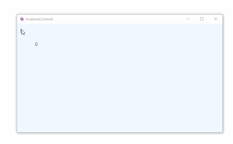
The following example places a vertical scroll bar inside a panel and updates a text block with the current value as you scroll.
<Panel>
  <Border Background="AliceBlue">
    <ScrollBar Visibility="Auto"
               HorizontalAlignment="Left"
               Scroll="ScrollHandler" />
  </Border>
  <TextBlock Name="valueText" Margin="60">0</TextBlock>
</Panel>
using Avalonia.Controls;
using Avalonia.Controls.Primitives;

namespace AvaloniaControls.Views
{
    public partial class MainWindow : Window
    {
        public MainWindow()
        {
            InitializeComponent();
        }

        public void ScrollHandler(object source, ScrollEventArgs args)
        {
            valueText.Text = args.NewValue.ToString();
        }
    }
}
With this code-behind, the text block displays the current value of the scroll bar as you drag it.