ToolTip
The ToolTip is a popup that shows its content when the user hovers over the 'host' control to which it is attached.
Useful properties
You will probably use these properties most often:
| Property | Description |
|---|---|
ToolTip.Tip | Attached property for the tooltip contents. |
ToolTip.Placement | Defines the placement for the tooltip relative to the host or the pointer. Choose from top, bottom, left, right, anchor and gravity, pointer. The default value is pointer which places the tip content at the position where the pointer stops moving. |
ToolTip.HorizontalOffset | The tooltip horizontal offset from the placement (default 0). |
ToolTip.VerticalOffset | The tooltip vertical offset from the placement (default 20). |
ToolTip.ShowDelay | The amount of time the pointer has to be still before the tooltip appears, in milliseconds (default 400). |
ToolTip.BetweenShowDelay | The amount of time the tooltip will not show up for after last show, in milliseconds (default 100). |
ToolTip.ShowOnDisabled | Determines whether the tooltip should be shown for disabled elements (default false). |
ToolTip.ServiceEnabled | Determines whether the tooltip service is enabled (default true). |
Events
| Event | Type | Description |
|---|---|---|
ToolTip.ToolTipOpening | CancelRoutedEventArgs | Raised when a tooltip is about to open. Set Cancel = true to prevent the tooltip from showing. |
ToolTip.ToolTipClosing | RoutedEventArgs | Raised when a tooltip is about to close. |
These are attached routed events. Subscribe in XAML or code:
<Button Content="Hover me"
        ToolTip.Tip="Dynamic tooltip"
        ToolTip.ToolTipOpening="OnToolTipOpening" />
private void OnToolTipOpening(object? sender, CancelRoutedEventArgs e)
{
    // Optionally prevent the tooltip from showing
    if (ShouldSuppressTooltip)
    {
        e.Cancel = true;
    }
}
Examples
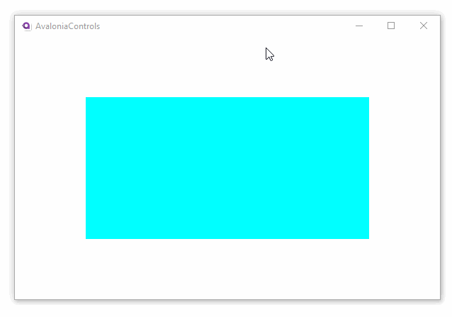
This is a simple text-based tooltip, using default values for the placement and delay properties. Hover over the rectangle in the preview to see the tooltip.
- XAML
<UserControl xmlns="https://github.com/avaloniaui">
  <Rectangle Fill="Aqua" Height="150" Width="200"
             ToolTip.Tip="This is a rectangle" />
</UserControl>
Preview
Loading Avalonia Preview...

To provide a richer presentation for a tooltip, use a <ToolTip.Tip> element. Hover over the rectangle in the preview to see the tooltip.
- XAML
<UserControl xmlns="https://github.com/avaloniaui">
  <Rectangle Fill="Aqua" Height="150" Width="200"
             ToolTip.Placement="Bottom">
      <ToolTip.Tip>
        <StackPanel>
          <TextBlock FontSize="16">Rectangle</TextBlock>
          <TextBlock>Some explanation here.</TextBlock>
        </StackPanel>
      </ToolTip.Tip>
  </Rectangle>
</UserControl>
Preview
Loading Avalonia Preview...