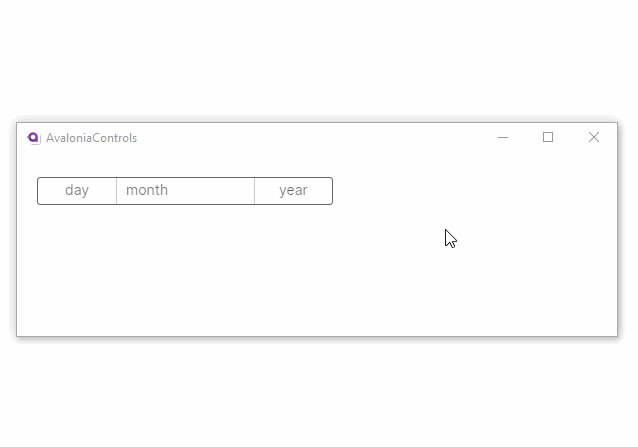
DatePicker
The DatePicker control presents three spinner columns that let your users pick a date value. The spinners display when you click the control.
Useful properties
You will probably use these properties most often:
| Property | Description |
|---|---|
SelectedDate | The selected date as a DateTimeOffset? (null when there is no selection). |
DayVisible | Sets whether the day column is visible. |
MonthVisible | Sets whether the month column is visible. |
YearVisible | Sets whether the year column is visible. |
DayFormat | Format string for the day part of the date. |
MonthFormat | Format string for the month part of the date. |
YearFormat | Format string for the year part of the date. |
MinYear | The earliest selectable year. |
MaxYear | The latest selectable year. |
Example
This example uses the DayFormat attribute to display the name of the day as well as the number:
<StackPanel Margin="20">
  <DatePicker DayFormat="ddd dd"/>
</StackPanel>
Hiding date parts
You can show only the date components you need by setting the visibility properties to False:
<!-- Month and year only -->
<DatePicker DayVisible="False" />

<!-- Year only -->
<DatePicker DayVisible="False" MonthVisible="False" />
Constraining the date range
Use MinYear and MaxYear to restrict the range of years your users can choose from. This is useful when you need to keep the selection within a known valid range, such as for a birth date or an expiry date.
<DatePicker MinYear="2000/01/01" MaxYear="2030/12/31" />
You can also set these values in code-behind:
datePicker.MinYear = new DateTimeOffset(new DateTime(2000, 1, 1));
datePicker.MaxYear = new DateTimeOffset(new DateTime(2030, 12, 31));
Customizing the display format
Each column in the picker supports standard .NET date format strings. You can combine them to control exactly what your users see:
<!-- Full month name, abbreviated day name, four-digit year -->
<DatePicker MonthFormat="MMMM" DayFormat="ddd dd" YearFormat="yyyy" />

<!-- Numeric month, day number only, two-digit year -->
<DatePicker MonthFormat="MM" DayFormat="dd" YearFormat="yy" />
Initializing the date
The date properties of this control cannot be set in AXAML using a string attribute because there is no built-in conversion from strings to DateTimeOffset.
You can set the value in code-behind:
datePicker.SelectedDate = new DateTimeOffset(new DateTime(1950, 1, 1));
Binding to a view model
In most applications you will bind SelectedDate to a property on your view model. The property should be a nullable DateTimeOffset so that it can represent the "no selection" state.
public class MyViewModel : ObservableObject
{
    [ObservableProperty]
    private DateTimeOffset? _selectedDate;
}
<DatePicker SelectedDate="{Binding SelectedDate}" />
If you need to react when the user changes the date, subscribe to the SelectedDateChanged event or use a property-changed callback in your view model:
public partial class MyViewModel : ObservableObject
{
    [ObservableProperty]
    private DateTimeOffset? _selectedDate;

    partial void OnSelectedDateChanged(DateTimeOffset? value)
    {
        // Respond to the new date value here.
    }
}