ListBox
The ListBox displays items from an items source collection, on multiple lines, and allows individual or multiple selection.
The items in the list can be composed, bound and templated.
The list height expands to fit all the items unless set specifically (using the height attribute), or set by a containing control, such as the dock panel.
When the height is constrained, and the total item height is larger, then the built-in scroll viewer in the list box will display a vertical scrollbar.
Similarly when the width of any item exceeds the width of the list box, then the built-in scroll viewer in the list box will display a horizontal scrollbar (unless prevented - see below).
Useful properties
You will probably use these properties most often:
| Property | Description |
|---|---|
Items | |
SelectedIndex | The (zero-based) index of the selected item, or in the case of multiple selection the first selected item. |
SelectedItem | The selected item (object) from the items collection, or in the case of multiple selection the first selected item. |
SelectedItems | The selected items in a list. |
Selection | An ISelectionModel object with various methods to track multiple selected items. This is is optimized for a large items collection. |
SelectionMode | The mode of selection, see table below. |
| The horizontal scrollbar visibility for the built-in scroll viewer. Options are 'Disabled' (default), 'Auto', 'Hidden' and 'Visible'. When disabled, overflow is hidden. |
| The vertical scrollbar visibility for the built-in scroll viewer. Options are 'Disabled', 'Auto' (default), 'Hidden' and 'Visible'. When disabled, overflow is hidden. |
ItemsPanel | The container panel to place items in. See this page to customise the ItemsPanel. |
Styles | The style that is applied to any child element of the ItemControl. |
To optimize performance when the items collection is large, use of the ISelectionModel is recommended.
Selection mode
On touch and pen devices, selection occurs on pointer release rather than press. This allows swipe and scroll gestures to start on an item without changing the selection.
The following selection modes are available for the list box:
| Selection Mode | Description |
|---|---|
Single | Only a single item can be selected (default). |
Multiple | Multiple items can be selected. |
Toggle | Item selection can be toggled by tapping/spacebar. When not enabled, shift or ctrl must be used to select multiple items. |
AlwaysSelected | An item will always be selected as long as there are items to select. |
These values can be combined, for example:
<ListBox SelectionMode="Multiple,Toggle">
Example
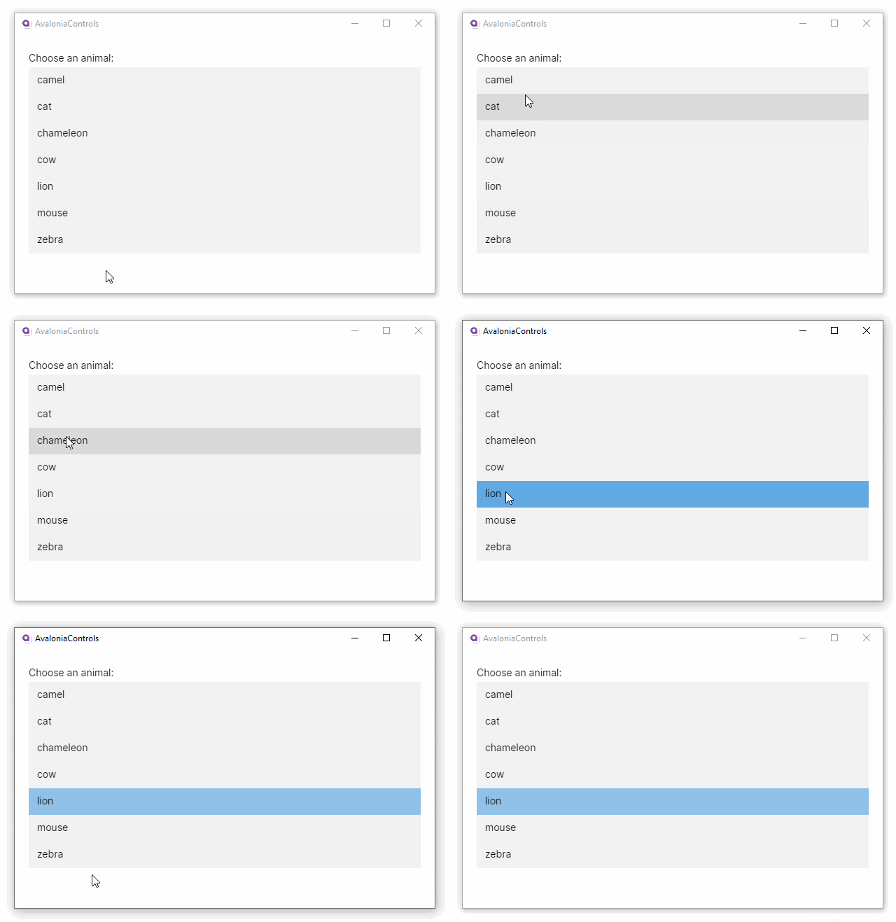
This example has the ItemsSource property set to an array in the C# code-behind.
<StackPanel Margin="20">
  <TextBlock Margin="0 5">Choose an animal:</TextBlock>
  <ListBox x:Name="animals"/>
</StackPanel>
using Avalonia.Controls;
using System.Linq;

namespace AvaloniaControls.Views
{
    public partial class MainWindow : Window
    {
        public MainWindow()
        {
            InitializeComponent();
            animals.ItemsSource = new string[]
                {"cat", "camel", "cow", "chameleon", "mouse", "lion", "zebra" }
            .OrderBy(x => x);
        }
    }
}

Item template
You can customize how an item is displayed by using an data template inside the list box ItemTemplate element.
To review the concepts behind data template, see Introduction to data templates.
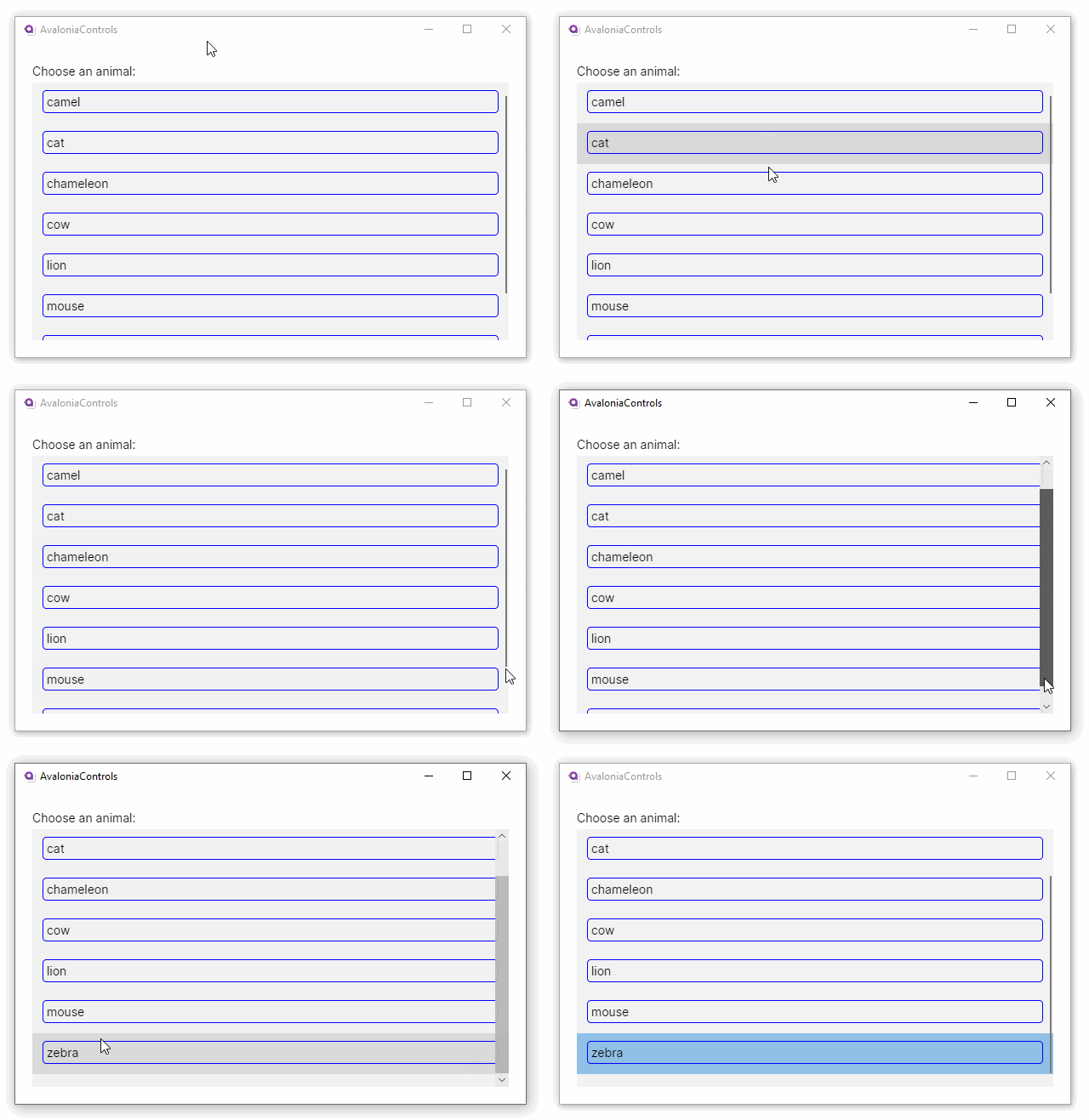
This example displays each item inside a blue border with rounded corners. The C# code-behind is the same as before:
<DockPanel Margin="20">
  <TextBlock Margin="0 5" DockPanel.Dock="Top">Choose an animal:</TextBlock>
  <ListBox x:Name="animals">
    <ListBox.ItemTemplate>
      <DataTemplate>
        <Border BorderBrush="Blue" BorderThickness="1"
                CornerRadius="4" Padding="4">
          <TextBlock Text="{Binding}"/>
        </Border>
      </DataTemplate>
    </ListBox.ItemTemplate>
  </ListBox>
</DockPanel>
using Avalonia.Controls;
using System.Linq;

namespace AvaloniaControls.Views
{
    public partial class MainWindow : Window
    {
        public MainWindow()
        {
            InitializeComponent();
            animals.ItemsSource = new string[]
                {"cat", "camel", "cow", "chameleon", "mouse", "lion", "zebra" }
            .OrderBy(x => x);
        }
    }
}
The list is the fill area of the dock panel here, so its height is set to the remaining. This shows the scrollbar in the list box.

Item styling
Each item displayed in a list box is drawn inside a ListBoxItem element. You can see this using the Avalonia Dev Tools (F12), using the Visual Tools tab. For example:
The ListBoxItem element acts as a container for the content specified in a ListBox.ItemTemplate element; but it is not ever defined in the XAML, instead it is generated by Avalonia.
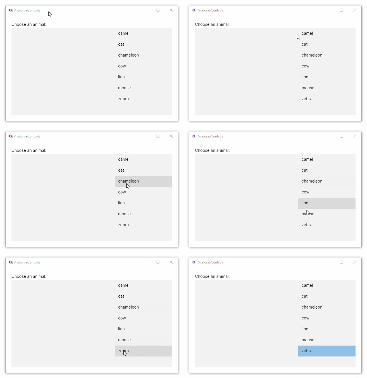
This means you can target a style to customize the ListBoxItem elements in a list box. For example, to give the list items a fixed width of 200 and then right-align them:
<DockPanel Margin="20">
  <TextBlock Margin="0 5" DockPanel.Dock="Top">Choose an animal:</TextBlock>
  <ListBox x:Name="animals">
    <ListBox.Styles>
      <Style Selector="ListBoxItem">
        <Setter Property="Width" Value="200"/>
        <Setter Property="HorizontalAlignment" Value="Right"/>
      </Style>
    </ListBox.Styles>
  </ListBox>
</DockPanel>
using Avalonia.Controls;
using System.Linq;

namespace AvaloniaControls.Views
{
    public partial class MainWindow : Window
    {
        public MainWindow()
        {
            InitializeComponent();
            animals.ItemsSource = new string[]
                {"cat", "camel", "cow", "chameleon", "mouse", "lion", "zebra" }
            .OrderBy(x => x);
        }
    }
}
