Carousel
The Carousel has an items collection and displays each item as a page, in sequence, so that it fills the control. You can use it to build slide shows, onboarding flows, or any UI where your users step through content one page at a time.
Useful properties
You will probably use these properties most often:
| Property | Type | Default | Description |
|---|---|---|---|
PageTransition | IPageTransition? | null | Transition animation played when the selected item changes. Built-in options include PageSlide, CrossFade, Rotate3DTransition, and CompositePageTransition. |
IsSwipeEnabled | bool | false | Enables swipe and pointer-drag gestures to navigate between pages. |
ViewportFraction | double | 1.0 | Fraction of the viewport occupied by each page. Values below 1.0 reveal adjacent pages (e.g., 0.8 peeks at neighbors, 0.33 shows three items). |
IsSwiping | bool | false | Read-only. true while a swipe gesture is in progress. |
WrapSelection | bool | false | When true, Next() wraps from the last item to the first, and Previous() wraps from the first to the last. |
SelectedIndex | int | -1 | Zero-based index of the currently displayed item. |
SelectedItem | object? | null | The currently displayed item from the bound collection. |
ItemsSource | IEnumerable? | null | The bound collection used as the data source. |
ItemTemplate | IDataTemplate? | null | A DataTemplate applied to each item, allowing you to control how items look. |
ItemsPanel | ITemplate<Panel?> | VirtualizingCarouselPanel | The container panel used to arrange items. See ItemsControl for details on customizing the items panel. |
AutoScrollToSelectedItem | bool | true | Automatically scrolls to bring the selected item into view. |
Examples
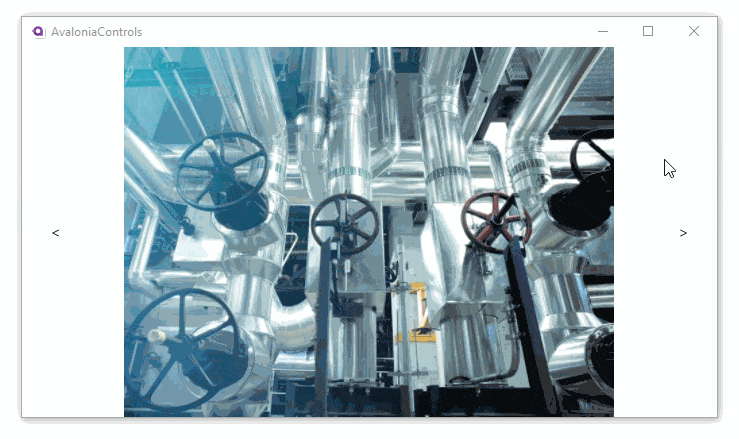
This example has three images in the items collection, with buttons to move the display forwards and back. The buttons have click event handlers in the C# code-behind.
<Panel>
<Carousel Name="slides">
<Carousel.PageTransition>
<CompositePageTransition>
<PageSlide Duration="0:00:01.500" Orientation="Horizontal" />
</CompositePageTransition>
</Carousel.PageTransition>
<Carousel.Items>
<Image Source="avares://AvaloniaControls/Assets/pipes.jpg" />
<Image Source="avares://AvaloniaControls/Assets/controls.jpg" />
<Image Source="avares://AvaloniaControls/Assets/vault.jpg" />
</Carousel.Items>
</Carousel>
<Panel Margin="20">
<Button Background="White" Click="Previous"><</Button>
<Button Background="White" Click="Next"
HorizontalAlignment="Right">></Button>
</Panel>
</Panel>
using Avalonia.Controls;
using Avalonia.Interactivity;

namespace AvaloniaControls.Views
{
    public partial class MainWindow : Window
    {
        public MainWindow()
        {
            InitializeComponent();
        }

        public void Next(object source, RoutedEventArgs args)
        {
            slides.Next();
        }

        public void Previous(object source, RoutedEventArgs args)
        {
            slides.Previous();
        }
    }
}
Binding to a collection
Use ItemsSource to bind the Carousel to a data collection and provide a custom DataTemplate:
<Carousel ItemsSource="{Binding Slides}" SelectedIndex="{Binding CurrentSlide}">
    <Carousel.PageTransition>
        <CrossFade Duration="0:00:00.300" />
    </Carousel.PageTransition>
    <Carousel.ItemTemplate>
        <DataTemplate>
            <StackPanel HorizontalAlignment="Center" VerticalAlignment="Center">
                <TextBlock Text="{Binding Title}" FontSize="24" FontWeight="Bold" />
                <TextBlock Text="{Binding Description}" TextWrapping="Wrap" />
            </StackPanel>
        </DataTemplate>
    </Carousel.ItemTemplate>
</Carousel>
The view model exposes the collection and the current index:
public class SlidesViewModel : ViewModelBase
{
    public ObservableCollection<Slide> Slides { get; } = new()
    {
        new Slide("Welcome",   "Get started with Avalonia."),
        new Slide("Features",  "Cross-platform, high-performance UI."),
        new Slide("Community", "Join the Avalonia community today."),
    };

    private int _currentSlide;
    public int CurrentSlide
    {
        get => _currentSlide;
        set => this.RaiseAndSetIfChanged(ref _currentSlide, value);
    }
}
Because SelectedIndex is bound two-way by default, you can advance the carousel from your view model by changing CurrentSlide, or let the control update the property when the user navigates with buttons.
Page transitions
You set the animation that plays between items by assigning a transition to the PageTransition property. Avalonia ships with several built-in transitions:
| Transition | Description |
|---|---|
PageSlide | Slides content in from a specified direction. You can set Orientation to Horizontal (default) or Vertical. |
CrossFade | Fades out the current item and fades in the new item by animating opacity. |
Rotate3DTransition | Rotates the current and incoming items in 3D space. Supports horizontal and vertical axes. |
CompositePageTransition | Combines multiple transitions so they run together. |
PageSlide example
<Carousel.PageTransition>
    <PageSlide Duration="0:00:00.500" Orientation="Horizontal" />
</Carousel.PageTransition>
CrossFade example
<Carousel.PageTransition>
    <CrossFade Duration="0:00:00.300" />
</Carousel.PageTransition>
Composite transition example
You can layer transitions together using CompositePageTransition:
<Carousel.PageTransition>
    <CompositePageTransition>
        <CrossFade Duration="0:00:00.500" />
        <PageSlide Duration="0:00:00.500" Orientation="Horizontal" />
    </CompositePageTransition>
</Carousel.PageTransition>
Disabling transitions
To switch items without any animation, set PageTransition to {x:Null}:
<Carousel PageTransition="{x:Null}" />
For a full guide on page transitions (including how to create custom transitions), see Setting page transitions.
Navigation
You can change the displayed item in several ways:
| Technique | Description |
|---|---|
Next() | Advance to the next item in the collection. |
Previous() | Move back to the previous item. |
SelectedIndex | Set or bind the zero-based index of the item to display. |
SelectedItem | Set or bind the item object directly. |
Navigating with buttons (code-behind)
The simplest approach is to call Next() and Previous() from button click handlers, as shown in the example above.
Navigating with data binding
Bind SelectedIndex to a property on your view model so you can control navigation from application logic:
<Carousel ItemsSource="{Binding Pages}" SelectedIndex="{Binding PageIndex}" />
public int PageIndex
{
    get => _pageIndex;
    set => this.RaiseAndSetIfChanged(ref _pageIndex, value);
}

public void GoToNext()
{
    if (PageIndex < Pages.Count - 1)
        PageIndex++;
}

public void GoToPrevious()
{
    if (PageIndex > 0)
        PageIndex--;
}
Swipe gestures
Enable swipe and pointer-drag navigation by setting IsSwipeEnabled:
<Carousel IsSwipeEnabled="True">
    <!-- items -->
</Carousel>
When enabled, users can drag between pages with visual feedback. Flick gestures are supported, requiring a threshold swipe velocity to determine whether the transition completes. The IsSwiping property is true while a gesture is in progress.
Wrap selection (looping)
Enable looping so Next() on the last item wraps to the first and Previous() on the first wraps to the last:
<Carousel WrapSelection="True">
    <!-- items -->
</Carousel>
Viewport fraction
Set ViewportFraction below 1.0 to reveal adjacent pages alongside the selected page:
<Carousel ViewportFraction="0.8">
    <!-- items -->
</Carousel>
A value of 1.0 (default) shows a single full page. Values like 0.8 create a "peeking" effect where edges of adjacent pages are visible. A value of 0.33 fits roughly three items in view.
Keyboard navigation
The Carousel supports keyboard navigation when focused:
| Key | Action |
|---|---|
| Left / Up arrow | Moves to the previous item. |
| Right / Down arrow | Moves to the next item. |
| Home | Jumps to the first item. |
| End | Jumps to the last item. |
See also
- PipsPager for dot-based page indicators
- CarouselPage for page-based carousel navigation
- Setting page transitions
- TransitioningContentControl
- ItemsControl
- ListBox
- Carousel API reference
Carousel.cssource code on GitHub