TreeView
The TreeView control can present hierarchical data and allows item selection. The items are templated so you can customise how they are displayed.
There are two data sources: the main items source for the control, this gives the root of the hierarchical data. Then there is the items source in the item template which allows the control to list the next level in the hierarchical data.
Useful properties
You will probably use these properties most often:
| Property | Description |
|---|---|
ItemsSource | The bound collection that is used as the data source for the control. |
ItemsControl.ItemTemplate | The item template, contains a DataTemplate which will be applied to individual items and can be used to change how items look. |
ItemsControl.ItemsPanel | The container panel to place items in. By default, this is a StackPanel. See this page to customise the ItemsPanel. |
ItemsControl.Styles | The style that is applied to any child element of the ItemControl. |
Example
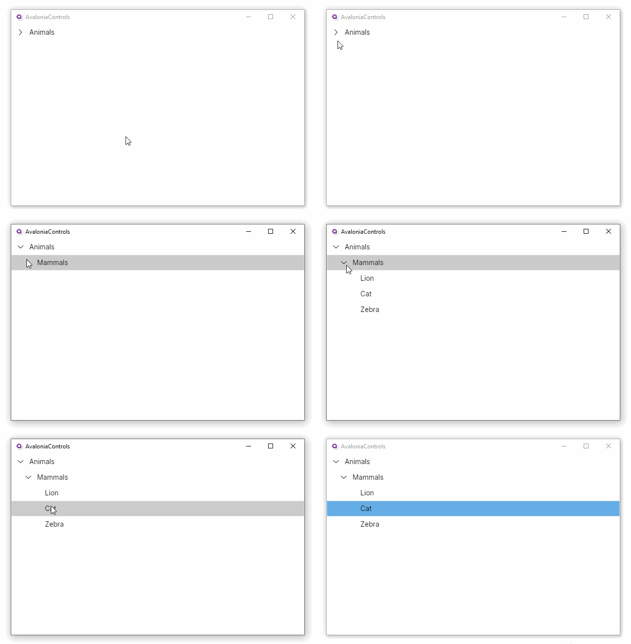
This example uses a MVVM pattern view model to hold some hierarchical data based on a C# node class. In this example, there is a single root node in the Nodes collection of the view model:
<TreeView ItemsSource="{Binding Nodes}">
  <TreeView.ItemTemplate>
    <TreeDataTemplate ItemsSource="{Binding SubNodes}">
      <TextBlock Text="{Binding Title}"/>
    </TreeDataTemplate>
  </TreeView.ItemTemplate>
</TreeView>
using AvaloniaControls.Models;
using System.Collections.ObjectModel;

namespace AvaloniaControls.ViewModels
{
    public class MainWindowViewModel : ViewModelBase
    {
        public ObservableCollection<Node> Nodes{ get; }

        public MainWindowViewModel()
        {
            Nodes = new ObservableCollection<Node>
            {
                new Node("Animals", new ObservableCollection<Node>
                {
                    new Node("Mammals", new ObservableCollection<Node>
                    {
                        new Node("Lion"), new Node("Cat"), new Node("Zebra")
                    })
                })
            };
        }
    }
}
using System.Collections.ObjectModel;

namespace AvaloniaControls.Models
{
    public class Node
    {
        public ObservableCollection<Node>? SubNodes { get; }
        public string Title { get; }

        public Node(string title)
        {
            Title = title;
        }

        public Node(string title, ObservableCollection<Node> subNodes)
        {
            Title = title;
            SubNodes = subNodes;
        }
    }
}
By default the root node (or nodes) is shown. The user can expand or contract each node by clicking on the adjacent arrow. Clicking on the node title selects the item. On touch and pen devices, selection occurs on pointer release rather than press, allowing scroll gestures to start on a node without changing the selection.

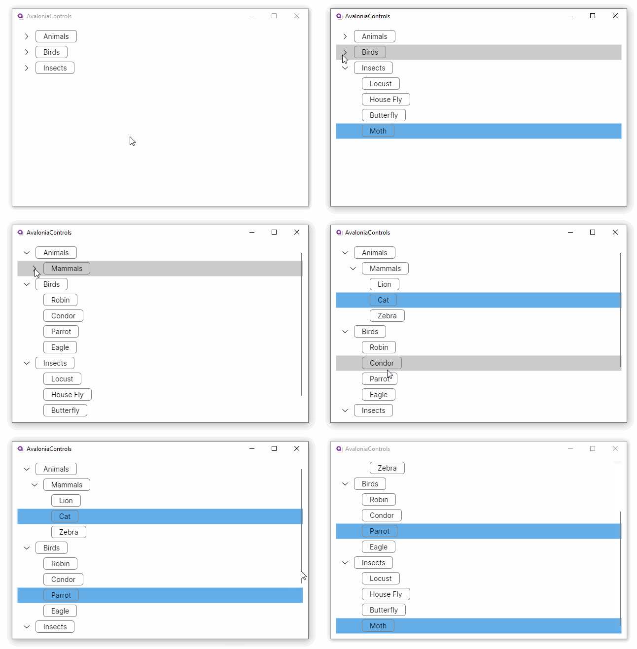
This is a development of the previous example with multiple root nodes, a revised item template, and an initial selection made in the view model code:
<TreeView Margin="10"
          ItemsSource="{Binding Nodes}"
          SelectedItems="{Binding SelectedNodes}"
          SelectionMode="Multiple">
  <TreeView.ItemTemplate>
    <TreeDataTemplate ItemsSource="{Binding SubNodes}">
      <Border HorizontalAlignment="Left"
              BorderBrush="Gray" BorderThickness="1"
              CornerRadius="5" Padding="15 3">
        <TextBlock Text="{Binding Title}" />
      </Border>
    </TreeDataTemplate>
  </TreeView.ItemTemplate>
</TreeView>
using AvaloniaControls.Models;
using System.Collections.ObjectModel;
using System.Linq;

namespace AvaloniaControls.ViewModels
{
    public class MainWindowViewModel : ViewModelBase
    {
        public ObservableCollection<Node> Nodes { get; }
        public ObservableCollection<Node> SelectedNodes { get; }

        public MainWindowViewModel()
        {
            SelectedNodes = new ObservableCollection<Node>();
            Nodes = new ObservableCollection<Node>
            {
                new Node("Animals", new ObservableCollection<Node>
                {
                    new Node("Mammals", new ObservableCollection<Node>
                    {
                        new Node("Lion"), new Node("Cat"), new Node("Zebra")
                    })
                }),
                new Node("Birds", new ObservableCollection<Node>
                {
                    new Node("Robin"), new Node("Condor"),
                    new Node("Parrot"), new Node("Eagle")
                }),
                new Node("Insects", new ObservableCollection<Node>
                {
                    new Node("Locust"), new Node("House Fly"),
                    new Node("Butterfly"), new Node("Moth")
                }),
            };

            var moth = Nodes.Last().SubNodes?.Last();
            if (moth!=null) SelectedNodes.Add(moth);
        }
    }
}
using System.Collections.ObjectModel;

namespace AvaloniaControls.Models
{
    public class Node
    {
        public ObservableCollection<Node>? SubNodes { get; }
        public string Title { get; }

        public Node(string title)
        {
            Title = title;
        }

        public Node(string title, ObservableCollection<Node> subNodes)
        {
            Title = title;
            SubNodes = subNodes;
        }
    }
}
The tree view adds a scroll bar when it is needed. The selection can be extended by holding down the Ctrl key.

Expansion events
TreeViewItem raises Expanded and Collapsed routed events when items are expanded or collapsed. These events bubble up, so you can handle them at the TreeView level:
treeView.AddHandler(TreeViewItem.ExpandedEvent, (sender, args) =>
{
    var item = (TreeViewItem)args.Source!;
    // React to expansion, e.g., load child data on demand
});

treeView.AddHandler(TreeViewItem.CollapsedEvent, (sender, args) =>
{
    var item = (TreeViewItem)args.Source!;
    // React to collapse
});