DataGrid
The DataGrid displays repeating data in a customizable grid. The control can be styled, templated and bound.
The DataGrid needs to be bound to an observable collection in a view model that can be found in a related data context.
DataGrid is deprecated!
For read-only tabular data, we recommend using TableView.
For advanced editing, we recommend using TreeDataGrid.
To review the concept behind the data context, see Data context.
The DataGrid is in an additional Avalonia package. To use the DataGrid in your project, you must reference the Avalonia.Controls.DataGrid NuGet package, and reference the styles that it uses, see below.
NuGet package reference
You must install the NuGet package for the DataGrid. You can do this using one of the following methods. You can use Manage NuGet Packages from the project menu of your IDE:

Alternatively, you can run this instruction from the command line:
dotnet add package Avalonia.Controls.DataGrid
Or add package reference directly to the project (.csproj) file:
<PackageReference Include="Avalonia.Controls.DataGrid" Version="11.0.0" />
Note you must always install the data grid version that matches the Avalonia version you are using.
Include DataGrid styles
You must reference the DataGrid themes to include the additional styles that the DataGrid uses. You can do this by adding a <StyleInclude> element to the application (App.axaml file).
For example (In case you use FluentTheme):
<Application.Styles>
    <FluentTheme />
    <StyleInclude Source="avares://Avalonia.Controls.DataGrid/Themes/Fluent.xaml"/>
</Application.Styles>
The DataGrid-styles need to match the overall theme you use, otherwise you will get conflicts and unresolved resources. For third party themes, please lookup their docs and samples.
Useful properties
You will probably use these properties most often:
| Property | Description |
|---|---|
AutoGenerateColumns | Whether the columns will automatically generate from the bound items data source property names. (Default is false.) |
ItemsSource | The bound collection that is used as the data source for the control. |
IsReadOnly | Sets the binding direction to one-way when true. The default is false - the grid will accept changes to the bound data. |
CanUserReorderColumns | Indicates whether the user can change the column display order by dragging column headers with the pointer. (Default is false.) |
CanUserResizeColumns | Indicates whether the user can adjust column widths using the pointer. (Default is false.) |
CanUserSortColumns | Indicates whether the user can sort columns by clicking the column header. (Default is true.) |
Examples
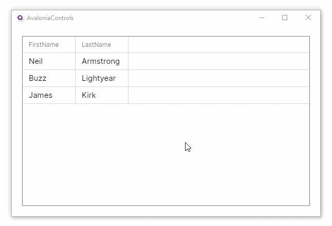
This example will generate a basic DataGrid, with column header names auto-generated from the item class. The items data source is bound to the main window view model.
<DataGrid Margin="20" ItemsSource="{Binding People}"
          AutoGenerateColumns="True" IsReadOnly="True"
          GridLinesVisibility="All"
          BorderThickness="1" BorderBrush="Gray">
</DataGrid>
using AvaloniaControls.Models;
using System.Collections.Generic;
using System.Collections.ObjectModel;

namespace AvaloniaControls.ViewModels
{
    public class MainWindowViewModel : ViewModelBase
    {
        public ObservableCollection<Person> People { get; }

        public MainWindowViewModel()
        {
            var people = new List<Person>
            {
                new Person("Neil", "Armstrong"),
                new Person("Buzz", "Lightyear"),
                new Person("James", "Kirk")
            };
            People = new ObservableCollection<Person>(people);
        }
    }
}
public class Person
{
    public string FirstName { get; set; }
    public string LastName { get; set; }

    public Person(string firstName , string lastName)
    {
        FirstName = firstName;
        LastName = lastName;
    }
}
These examples use the MVVM pattern with data binding to an ObservableCollection. For more information on the concepts behind data binding, see Introduction to data binding.
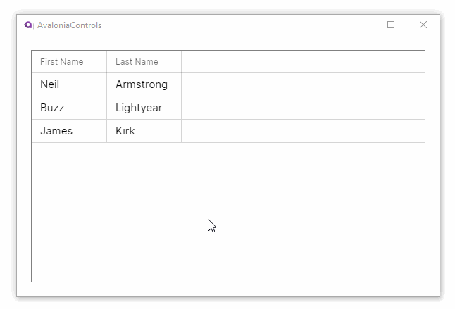
Property names from the item class will generally not make good column names. This example adds custom header names to the grid. It also allows column reordering and resizing and disallows the default column sorting option:
<DataGrid Margin="20" ItemsSource="{Binding People}"
          IsReadOnly="True"
          CanUserReorderColumns="True"
          CanUserResizeColumns="True"
          CanUserSortColumns="False"
          GridLinesVisibility="All"
          BorderThickness="1" BorderBrush="Gray">
  <DataGrid.Columns>
     <DataGridTextColumn Header="First Name"  Binding="{Binding FirstName}"/>
     <DataGridTextColumn Header="Last Name" Binding="{Binding LastName}" />
  </DataGrid.Columns>
</DataGrid>
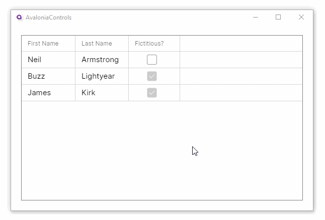
This example shows how the DataGrid can accept changes and update the underlying collection, and use different column types to edit the data:
<DataGrid Margin="20" ItemsSource="{Binding People}"
          GridLinesVisibility="All"
          BorderThickness="1" BorderBrush="Gray">
  <DataGrid.Columns>
     <DataGridTextColumn Header="First Name"  Binding="{Binding FirstName}"/>
     <DataGridTextColumn Header="Last Name" Binding="{Binding LastName}" />
     <DataGridCheckBoxColumn Header="Fictitious?" Binding="{Binding IsFictitious}" />
  </DataGrid.Columns>
</DataGrid>
using AvaloniaControls.Models;
using System.Collections.Generic;
using System.Collections.ObjectModel;

namespace AvaloniaControls.ViewModels
{
    public class MainWindowViewModel : ViewModelBase
    {
        public ObservableCollection<Person> People { get; }

        public MainWindowViewModel()
        {
            var people = new List<Person>
            {
                new Person("Neil", "Armstrong", false),
                new Person("Buzz", "Lightyear", true),
                new Person("James", "Kirk", true)
            };
            People = new ObservableCollection<Person>(people);
        }
    }
}
public class Person
{
    public string FirstName { get; set; }
    public string LastName { get; set; }
    public bool IsFictitious { get; set; }

    public Person(string firstName , string lastName, bool isFictitious)
    {
        FirstName = firstName;
        LastName = lastName;
        IsFictitious = isFictitious;
    }
}
DataGridTemplateColumn
You can use this column type to customise the display and editing for a data grid column.
There are two data templates which you define as attached properties:
| Data Template | Description |
|---|---|
CellTemplate | The display (not being edited) presentation of the column value. |
CellEditingTemplate | The editing template for the column value. |
If you do not set a editing template, the column will stay read-only.
Example
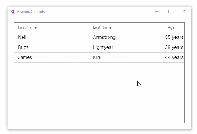
This example adds a numeric up-down control when the age property for a person is being edited:
<Window ...
  xmlns:model="using:AvaloniaControls.Models">

  <DataGrid Margin="20" ItemsSource="{Binding People}"
          GridLinesVisibility="All"
          BorderThickness="1" BorderBrush="Gray">
    <DataGrid.Columns>
      <DataGridTextColumn Header="First Name" Width="2*"
         Binding="{Binding FirstName}" />
      <DataGridTextColumn Header="Last Name" Width="2*"
         Binding="{Binding LastName}" />

      <DataGridTemplateColumn Header="Age" SortMemberPath="AgeInYears">
        <DataGridTemplateColumn.CellTemplate>
          <DataTemplate DataType="model:Person">
            <TextBlock Text="{Binding AgeInYears, StringFormat='{}{0} years'}"
              VerticalAlignment="Center" HorizontalAlignment="Center" />
          </DataTemplate>
        </DataGridTemplateColumn.CellTemplate>
        <DataGridTemplateColumn.CellEditingTemplate>
          <DataTemplate DataType="model:Person">
            <NumericUpDown Value="{Binding AgeInYears}"
               FormatString="N0" Minimum="0" Maximum="120"
               HorizontalAlignment="Stretch"/>
          </DataTemplate>
        </DataGridTemplateColumn.CellEditingTemplate>
      </DataGridTemplateColumn>

    </DataGrid.Columns>
  </DataGrid>
</Window>
using AvaloniaControls.Models;
using System.Collections.Generic;
using System.Collections.ObjectModel;

namespace AvaloniaControls.ViewModels
{
    public class MainWindowViewModel : ViewModelBase
    {
        public ObservableCollection<Person> People { get; }

        public MainWindowViewModel()
        {
            var people = new List<Person>
            {
                new Person("Neil", "Armstrong",  55),
                new Person("Buzz", "Lightyear", 38),
                new Person("James", "Kirk", 44)
            };
            People = new ObservableCollection<Person>(people);
        }
    }
}
public class Person
{
    public string FirstName { get; set; }
    public string LastName { get; set; }
    public int AgeInYears { get; set; }

    public Person(string firstName, string lastName, int ageInYears)
    {
        FirstName = firstName;
        LastName = lastName;
        AgeInYears = ageInYears;
    }
}
DataGridColumn
A DataGrid can contain multiple data grid columns and Avalonia has two built-in column types which can be used to display a different data types, and a template type that can customise the column appearance.
| Column Type | Description |
|---|---|
DataGridTextColumn | Presents a text box for display and editing of the column data. You can control font properties like family and size in this column type. |
DataGridCheckBoxColumn | Presents a check box for display and editing of the column data, when it is Boolean. This column type also supports the three-state check box when the value is nullable. |
DataGridTemplateColumn | Can be used to customise the presentation of column data, for both display and editing. |
Displaying row numbers
Bind to DataGridRow.Index to show row numbers in a column:
<DataGridTextColumn Header="#"
    Binding="{Binding $parent[DataGridRow].Index}"
    Width="60" IsReadOnly="True" />
Useful properties
Most of these properties are common to all three column types:
| Property | Description |
|---|---|
Header | The header content of the column. |
HeaderTemplate | Uses a data template for the column. |
IsReadOnly | Whether the column is read-only. If the data grid itself is read-only, then the column is also read-only, whatever the value of this property. |
IsThreeState | Check box column only. Enables the third (filled) state when a nullable Boolean value is null. |
Width | The column width can be given in absolute or relative size (see below). |
Column width
If you do not set the width for a column, it will be resized to fit the contents, and a horizontal scrollbar will be added to the grid if necessary.
You can set the width of a column absolutely, for example:
<DataGridTextColumn Width="200" />
This will cause the column content that does not fit to be hidden.
Alternatively, you can specify relative automatic sizes. This uses * to represent an equal division of the available width, and then multiples like 2*. Any columns without a width specified are sized to their content.
For example to divide a data grid into 3 equal columns:
<DataGridTextColumn Width="*" />
<DataGridTextColumn Width="*" />
<DataGridTextColumn Width="*" />
Example
This example improves a data grid by expanding two columns equally across the width:
<Window ... >
   <Design.DataContext>
       <vm:MainWindowViewModel/>
  </Design.DataContext>
  <DataGrid Margin="20" ItemsSource="{Binding People}"
          IsReadOnly="True"
          GridLinesVisibility="All"
          BorderThickness="1" BorderBrush="Gray">
    <DataGrid.Columns>
      <DataGridTextColumn Header="First Name" Width="*"
              Binding="{Binding FirstName}"/>
      <DataGridTextColumn Header="Last Name" Width="*"
              Binding="{Binding LastName}" />
    </DataGrid.Columns>
  </DataGrid>
</Window>
using AvaloniaControls.Models;
using System.Collections.Generic;
using System.Collections.ObjectModel;

namespace AvaloniaControls.ViewModels
{
    public class MainWindowViewModel : ViewModelBase
    {
        public ObservableCollection<Person> People { get; }

        public MainWindowViewModel()
        {
            var people = new List<Person>
            {
                new Person("Neil", "Armstrong"),
                new Person("Buzz", "Lightyear"),
                new Person("James", "Kirk")
            };
            People = new ObservableCollection<Person>(people);
        }
    }
}
public class Person
{
    public string FirstName { get; set; }
    public string LastName { get; set; }

    public Person(string firstName , string lastName)
    {
        FirstName = firstName;
        LastName = lastName;
    }
}
It works in the preview pane because the <Design.DataContext> element creates a view model to bind to:
