AutoCompleteBox
The AutoCompleteBox presents a text box for user input and a drop-down that contains possible matches from an items source collection, for the text typed in. The drop-down shows when the user starts to type, and the match is updated for each character typed. The user can select from the drop-down.
The way in which the text is matched to possible items in the items source is configurable.
Useful properties
You will probably use these properties most often:
| Property | Description |
|---|---|
ItemsSource | The list of items to match from. |
FilterMode | Option for how the matching is to be done. See table below. |
AsyncPopulator | An asynchronous function that can provide the list of matches for a given (string) criteria. |
MaxLength | The maximum number of characters the user can type. 0 means no limit. |
InnerLeftContent | Content displayed inside the text area on the left (e.g., a search icon). |
InnerRightContent | Content displayed inside the text area on the right (e.g., a clear button). |
These are the options for the filter mode property:
| Filter Mode | Description |
|---|---|
StartsWith | A culture-sensitive, case-insensitive filter where the returned items start with the specified text. |
StartsWithCaseSensitive | A culture-sensitive, case-sensitive filter where the returned items start with the specified text. |
StartsWithOrdinal | An ordinal, case-insensitive filter where the returned items start with the specified text. |
StartsWithOrdinalCaseSensitive | An ordinal, case-sensitive filter where the returned items start with the specified text. |
Contains | A culture-sensitive, case-insensitive filter where the returned items contain the specified text. |
ContainsCaseSensitive | A culture-sensitive, case-sensitive filter where the returned items contain the specified text. |
ContainsOrdinal | An ordinal, case-insensitive filter where the returned items contain the specified text. |
ContainsOrdinalCaseSensitive | An ordinal, case-sensitive filter where the returned items contain the specified text. |
Equals | A culture-sensitive, case-insensitive filter where the returned items equal the specified text. |
EqualsCaseSensitive | A culture-sensitive, case-sensitive filter where the returned items equal the specified text. |
EqualsOrdinal | An ordinal, case-insensitive filter where the returned items equal the specified text. |
EqualsOrdinalCaseSensitive | An ordinal, case-sensitive filter where the returned items equal the specified text. |
In an ordinal string comparison, each character is compared using its simple byte value (independent of language).
culture-sensitive refers to considering the needs of users from different cultural backgrounds in design and technology implementations. This includes using different string processing and sorting patterns based on language. For example, English is typically sorted alphabetically from A-Z, Chinese may be sorted based on pinyin or stroke order, and other languages may have different sorting rules.
Examples
This example has a fixed items source (array) that is set in the C# code-behind.
<StackPanel Margin="20">
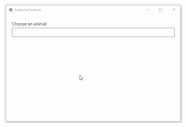
<TextBlock Margin="0 5">Choose an animal:</TextBlock>
<AutoCompleteBox x:Name="animals" FilterMode="StartsWith" />
</StackPanel>
using Avalonia.Controls;
using System.Linq;

namespace AvaloniaControls.Views
{
    public partial class MainWindow : Window
    {
        public MainWindow()
        {
            InitializeComponent();
            animals.ItemsSource = new string[]
                {"cat", "camel", "cow", "chameleon", "mouse", "lion", "zebra" }
            .OrderBy(x=>x);
        }
    }
}
Using AutoCompleteBox with objects
When working with complex objects instead of simple strings, specify which property should be shown and how the control should filter the underlying data. The sections below cover display binding, custom filtering, and formatting the presented text.
Filtering Objects Using ValueMemberBinding
ValueMemberBinding tells the control which property of your object is displayed in the text box and used for built-in filtering.
<Window xmlns="https://github.com/avaloniaui"
        xmlns:x="http://schemas.microsoft.com/winfx/2006/xaml"
        xmlns:vm="using:YourNamespace.ViewModels"
        x:Class="YourNamespace.MainWindow"
        x:DataType="vm:MainViewModel">

    <StackPanel Margin="20">
        <TextBlock Margin="0 5">Select a product:</TextBlock>

        <AutoCompleteBox ItemsSource="{Binding Products}"
                         SelectedItem="{Binding SelectedProduct}"
                         ValueMemberBinding="{Binding Name}"
                         FilterMode="Contains"
                         MinimumPrefixLength="0" />

        <TextBlock Margin="0 10"
                   Text="{Binding SelectedProduct.Price,
                                  StringFormat='Price: ${0:F2}'}" />
    </StackPanel>
</Window>
using System.Collections.ObjectModel;
using System.ComponentModel;

public class Product : INotifyPropertyChanged
{
    private int id;
    private string name = string.Empty;
    private decimal price;

    public int Id
    {
        get => id;
        set
        {
            if (id != value)
            {
                id = value;
                OnPropertyChanged(nameof(Id));
            }
        }
    }

    public string Name
    {
        get => name;
        set
        {
            if (name != value)
            {
                name = value;
                OnPropertyChanged(nameof(Name));
            }
        }
    }

    public decimal Price
    {
        get => price;
        set
        {
            if (price != value)
            {
                price = value;
                OnPropertyChanged(nameof(Price));
            }
        }
    }

    public event PropertyChangedEventHandler? PropertyChanged;
    private void OnPropertyChanged(string propertyName) =>
        PropertyChanged?.Invoke(this, new PropertyChangedEventArgs(propertyName));
}

public class MainViewModel : INotifyPropertyChanged
{
    private Product? selectedProduct;

    public ObservableCollection<Product> Products { get; } = new()
    {
        new Product { Id = 1, Name = "Laptop", Price = 999.99m },
        new Product { Id = 2, Name = "Mouse", Price = 29.99m },
        new Product { Id = 3, Name = "Keyboard", Price = 79.99m },
        new Product { Id = 4, Name = "Monitor", Price = 299.99m },
        new Product { Id = 5, Name = "Headphones", Price = 149.99m }
    };

    public Product? SelectedProduct
    {
        get => selectedProduct;
        set
        {
            if (selectedProduct != value)
            {
                selectedProduct = value;
                OnPropertyChanged(nameof(SelectedProduct));
            }
        }
    }

    public event PropertyChangedEventHandler? PropertyChanged;
    private void OnPropertyChanged(string propertyName) =>
        PropertyChanged?.Invoke(this, new PropertyChangedEventArgs(propertyName));
}
Implementing custom filtering using ItemFilter
If you need to search across multiple properties such as both Name and Id, provide a custom filter function.
<AutoCompleteBox x:Name="ProductAutoComplete"
                 ItemsSource="{Binding Products}"
                 SelectedItem="{Binding SelectedProduct}"
                 ValueMemberBinding="{Binding Name}"
                 MinimumPrefixLength="1" />
public partial class MainWindow : Window
{
    public MainWindow()
    {
        InitializeComponent();

        // Custom filter searching both Name and Id
        ProductAutoComplete.ItemFilter = (search, item) =>
        {
            if (item is Product product && !string.IsNullOrWhiteSpace(search))
            {
                return product.Name.Contains(search, StringComparison.OrdinalIgnoreCase)
                    || product.Id.ToString().Contains(search);
            }
            return true;
        };
    }
}
Customizing text using a value converter
You can control the text displayed in the drop-down by using a value converter. This is helpful when you want to show a combination of fields, for example, a product’s name and price. Keep in mind that this also affects how filtering works: if you display both name and price, the control will allow filtering by either value.
If you only want to change how the item appears visually (without affecting filtering), use the standard ItemTemplate property instead.
<Window xmlns="https://github.com/avaloniaui"
        xmlns:x="http://schemas.microsoft.com/winfx/2006/xaml"
        xmlns:converters="using:YourNamespace.Converters"
        xmlns:vm="clr-namespace:YourNamespace.ViewModels;assembly=YourNamespace"
        x:DataType="vm:MainViewModel">

    <Window.Resources>
        <converters:ProductDisplayConverter x:Key="ProductDisplayConverter" />
    </Window.Resources>

    <StackPanel Margin="20">
        <TextBlock Margin="0 5">Select a product:</TextBlock>

        <AutoCompleteBox ItemsSource="{Binding Products}"
                         SelectedItem="{Binding SelectedProduct}"
                         ValueMemberBinding="{Binding ., Converter={StaticResource ProductDisplayConverter}}"
                         FilterMode="Contains" />
    </StackPanel>
</Window>
using Avalonia.Data.Converters;
using System;
using System.Globalization;

namespace YourNamespace.Converters
{
    public class ProductDisplayConverter : IValueConverter
    {
        public object? Convert(object? value, Type targetType,
                               object? parameter, CultureInfo culture)
        {
            if (value is Product product)
                return $"{product.Name} (${product.Price:F2})";

            return value?.ToString();
        }

        public object? ConvertBack(object? value, Type targetType,
                                   object? parameter, CultureInfo culture)
            => throw new NotSupportedException();
    }
}