Image
The image can display raster images from a specified image source. The source can be:
- a string constant naming an application asset,
- loaded as a bitmap from the bound name of an asset (by using a binding converter),
- or can be loaded directly as a bitmap from a memory stream.
Images can be used to compose the content of another control. For example, you can create a graphical button using image controls.
The image can be rendered in a few different blend modes, which changes the way the image interacts with what's behind it. see the Bitmap Blend Modes page for a list of all supported blend modes and an example gallery.
The image displayed can be resized and scaled. The default settings for scaling (uniform stretch in both directions) will result in the image being fitted to the size (width and/or height) given.
The scaling settings for an image are the same as for the Viewbox.
Common properties
| Property | Type | Description |
|---|---|---|
Source | IImage | The image to display. Can be set from an asset URI string, a Bitmap, or a DrawingImage. |
Stretch | Stretch | How the image is resized to fill its bounds. See table below. |
StretchDirection | StretchDirection | Controls whether the image can scale up, down, or both. |
BlendMode | BitmapBlendingMode | The blend mode used when compositing the image. |
Stretch modes
| Value | Behavior |
|---|---|
None | The image is displayed at its original size. |
Fill | The image is resized to fill the bounds. Aspect ratio is not preserved. |
Uniform | The image is resized to fit within the bounds while preserving aspect ratio (default). |
UniformToFill | The image is resized to fill the bounds while preserving aspect ratio. Parts may be clipped. |
Examples
Basic
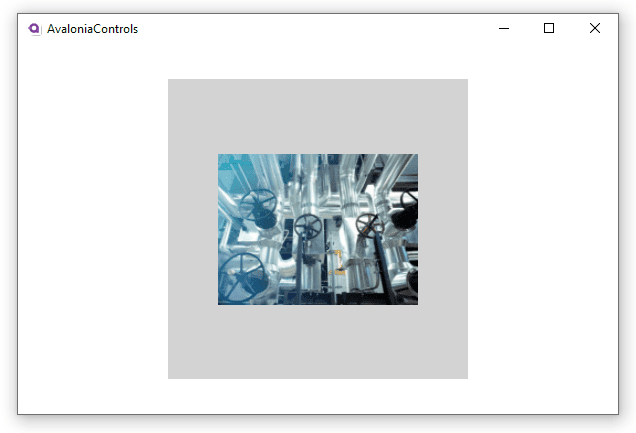
This example shows a bitmap asset loaded into an image control where the height and width have been restricted, but the scaling settings remain defaulted. The image itself is not square, but the image width and height are set to the same value. The rectangle is included to give an idea of how the image has been scaled:
<Panel>
  <Rectangle Height="300" Width="300" Fill="LightGray"/>
  <Image Margin="20" Height="200" Width="200"
         Source="avares://AvaloniaControls/Assets/pipes.jpg"/>
</Panel>
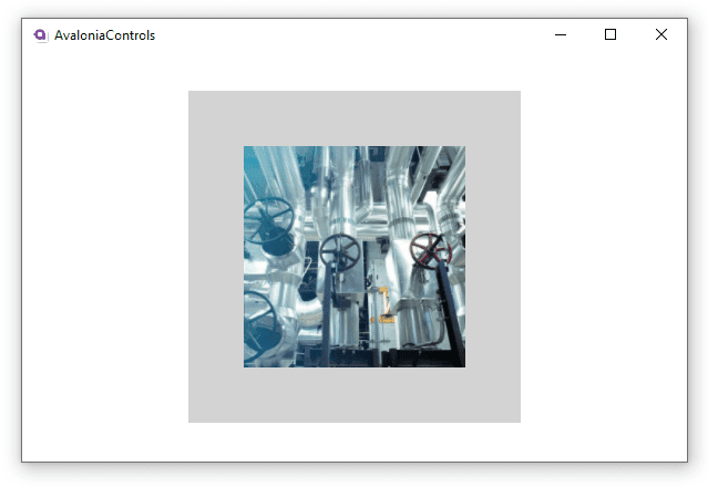
Stretch
In this next example, introducing the stretch setting UniformToFill fits in all the height of the image, but crops the width because it would otherwise be wider than specified. The image is not distorted by this treatment.
<Panel>
  <Rectangle Height="300" Width="300" Fill="LightGray"></Rectangle>
  <Image Margin="20" Height="200" Width="200"
         Stretch="UniformToFill"
         Source="avares://AvaloniaControls/Assets/pipes.jpg"/>
</Panel>
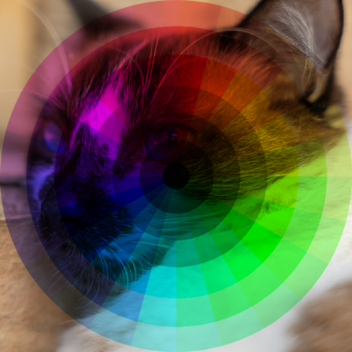
BlendMode
This example is using two images, where the second image is using the Multiply Blend mode. For more information, read the Bitmap Blend Modes page.
<Panel>
    <Image Source="./Cat.jpg"/>
    <Image Source="./Overlay-Color.png" BlendMode="Multiply"/>
</Panel>