Image
The image can display raster images from a specified image source. The source can be:
- a string constant naming an application asset,
- loaded as a bitmap from the bound name of an asset (by using a binding converter),
- or can be loaded directly as a bitmap from a memory stream.
Images can be used to compose the content of another control. For example, you can create a graphical button using image controls.
The image displayed can be resized and scaled. The default settings for scaling (uniform stretch in both directions) will result in the image being fitted to the size (width and/or height) given.
The scaling settings for an image are the same as for the view box, see the reference here.
Example
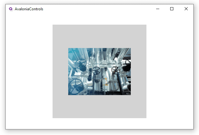
This example shows a bitmap asset loaded into an image control where the height and width have been restricted, but the scaling settings remain defaulted. The image itself is not square, but the image width and height are set to the same value. The rectangle is included to give an idea of how the image has been scaled:
<Panel>
  <Rectangle Height="300" Width="300" Fill="LightGray"/>
  <Image Margin="20" Height="200" Width="200"
         Source="avares://AvaloniaControls/Assets/pipes.jpg"/>
</Panel>

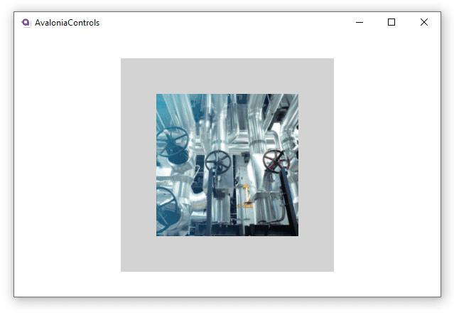
In this next example, introducing the stretch setting UniformToFill fits in all the height of the image, but crops the width because it would otherwise be wider than specified. The image is not distorted by this treatment.
<Panel>
  <Rectangle Height="300" Width="300" Fill="LightGray"></Rectangle>
  <Image Margin="20" Height="200" Width="200"
         Stretch="UniformToFill"
         Source="avares://AvaloniaControls/Assets/pipes.jpg"/>
</Panel>

More Information
For the complete API documentation about this control, see here.
View the source code on GitHub Image.cs