ToolTip
The ToolTip is a popup that shows its content when the user hovers over the 'host' control to which it is attached.
Useful Properties
You will probably use these properties most often:
| Property | Description |
|---|---|
ToolTip.Tip | Attached property for the tooltip contents. |
ToolTip.Placement | Defines the placement for the tooltip relative to the host or the pointer. Choose from top, bottom, left, right, anchor and gravity, pointer. The default value is pointer which places the tip content at the position where the pointer stops moving. |
ToolTip.HorizontalOffset | The tooltip horizontal offset from the placement (default 0). |
ToolTip.VerticalOffset | The tooltip vertical offset from the placement (default 20). |
ToolTip.ShowDelay | The amount of time the pointer has to be still before the tooltip appears, in milliseconds (default 400). |
ToolTip.BetweenShowDelay | The amount of time the tooltip will not show up for after last show, in milliseconds (default 100). |
ToolTip.ShowOnDisabled | Determines whether the tooltip should be shown for disabled elements (default false). |
ToolTip.ServiceEnabled | Determines whether the tooltip service is enabled (default true). |
Examples
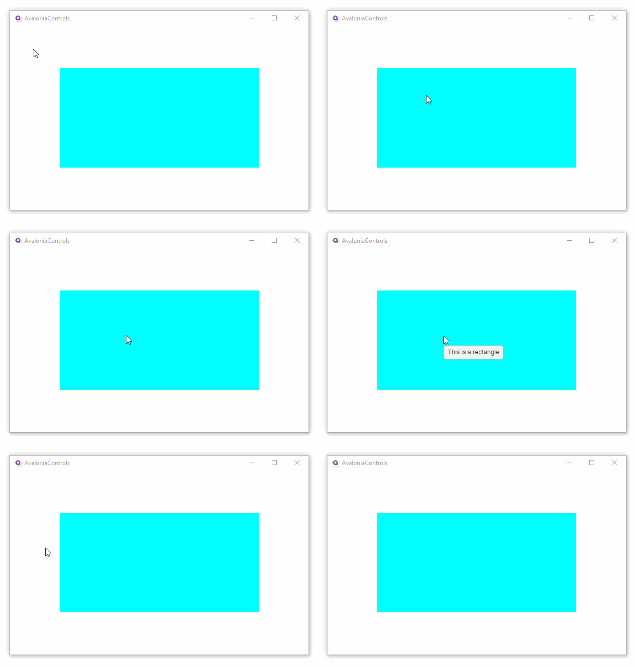
This is a simple text-based tooltip, using default values for the placement and delay properties; this rectangle is placed in a window with larger dimensions:
<Rectangle Fill="Aqua" Height="200" Width="400"
            ToolTip.Tip="This is a rectangle" />

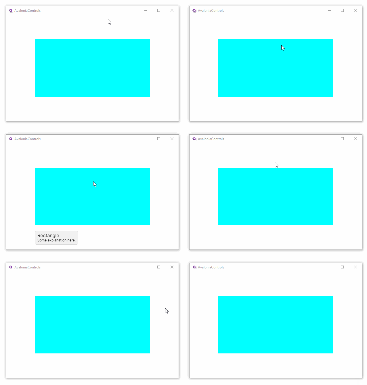
To provide a richer presentation for a tooltip, use a <ToolTip.Tip> element. For example:
<Rectangle Fill="Aqua" Height="200" Width="400"
    ToolTip.Placement="Bottom">
    <ToolTip.Tip>
      <StackPanel>
        <TextBlock FontSize="16">Rectangle</TextBlock>
        <TextBlock>Some explanation here.</TextBlock>
      </StackPanel>
    </ToolTip.Tip>
</Rectangle>

More Information
к сведению
For the complete API documentation about this control, see here.
к сведению
View the source code on GitHub ToolTip.cs