TabStrip
Displays a strip of tab headers. You can use this control as a horizontal menu.
The TabStrip is composed of TabStripItem children. TabStripItems are displayed in order of appearance and can be created by either: 1. a collection of TabStripItems or 2. generated by ItemsSource.
Unlike TabControl, TabStrip is not responsible for presenting the content of the selected tab. Instead, TabStrip requires developers to respond to SelectionChanged events or SelectedItem property changes and then present the desired content with a separate control, such as ContentControl. This gives developers full control over the displayed content and enables use cases such as custom view caching.
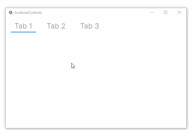
Example: TabStrip with TabStripItem
<TabStrip Margin="5">
  <TabStripItem>Tab 1</TabStripItem>
  <TabStripItem>Tab 2</TabStripItem>
  <TabStripItem>Tab 3</TabStripItem>
</TabStrip>
It looks like this running on Windows:
Example: TabStrip with ItemsSource
<TabStrip ItemsSource="{Binding MyTabs}" SelectedItem="{Binding MySelectedItem}">
    <TabStrip.ItemTemplate>
        <DataTemplate x:DataType="vm:MyViewModel">
            <TextBlock Text="{Binding Header}"/>
        </DataTemplate>
    </TabStrip.ItemTemplate>
</TabStrip>
More Information
For the complete API documentation about this control, see here.
View the source code on GitHub TabStrip.cs