Slider
The slider control presents its numerical value as the relative position of a slider button along the length of a track. The position is relative to maximum and minimum values.
Drag interaction on the slider button can alter the value between the maximum and minimum values. Keyboard and click interactions can also nudge the value.
Useful Properties
You will probably use these properties most often:
| Property | Description |
|---|---|
| Maximum | Sets the maximum value. |
| Minimum | Sets the minimum value. |
Example
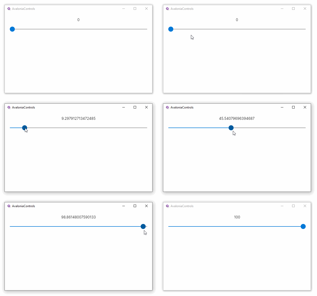
In this example the slider value is displayed in the text block below, using binding to a control.
To review how to bind one control to another, see the guide here.
Here the maximum and minimum values are default (0 and 100 respectively).
<StackPanel Margin="20">
  <TextBlock Text="{Binding #slider.Value}"
              HorizontalAlignment="Center"/>
  <Slider x:Name="slider" />
</StackPanel>
The slider looks like this on Windows:

More Information
For the complete API documentation about this control, see here.
View the source code on GitHub Slider.cs