TabControl
The TabControl allows you to sub-divide a view into tab items.
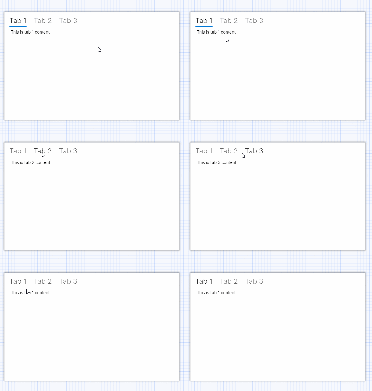
Each tab item has a header and a content zone. The headers are presented in a strip, in the sequence they occur in the XAML. When the user clicks on a tab header, its content becomes visible, and is placed below the tab strip in the content zone of the tab control.
You can compose the UI in both the header and content zones to suit the UI requirements of your Avalonia UI app.
If you only need the function of the tab headers part of this control, consider using the tab strip instead. See here.
Examples
This is simple tab example. The tab content is just some text:
<TabControl Margin="5">
  <TabItem Header="Tab 1">
    <TextBlock Margin="5">This is tab 1 content</TextBlock>
  </TabItem>
  <TabItem Header="Tab 2">
    <TextBlock Margin="5">This is tab 2 content</TextBlock>
  </TabItem>
  <TabItem Header="Tab 3">
    <TextBlock Margin="5">This is tab 3 content</TextBlock>
  </TabItem>
</TabControl>
The tab control even works in the preview pane!

More Information
For the complete API documentation about this control, see here.
View the source code on GitHub TabControl.cs