Flyout
Flyouts are dismissible containers that can be attached to some classes of 'host' control; although flyouts themselves are not controls. They show when their host control receives the focus, and are hidden again in a number of different ways.
A flyout can contain simple or richer, composed, UI content.
Flyouts can be declared as a resource and shared between two or more host controls in an Avalonia UI app.
Examples
A flyout is attached to a host control using the host's Flyout property. For example:
<Button Content="Button with Flyout">
  <Button.Flyout >
    <Flyout>This is the button flyout.</Flyout>
  </Button.Flyout>
</Button>
Only the button and split button controls support the Flyout property. You can attach a flyout to other Avalonia UI built-in controls using the AttachedFlyout property instead.
For controls that do not have the Flyout property, use the AttachedFlyout property like this:
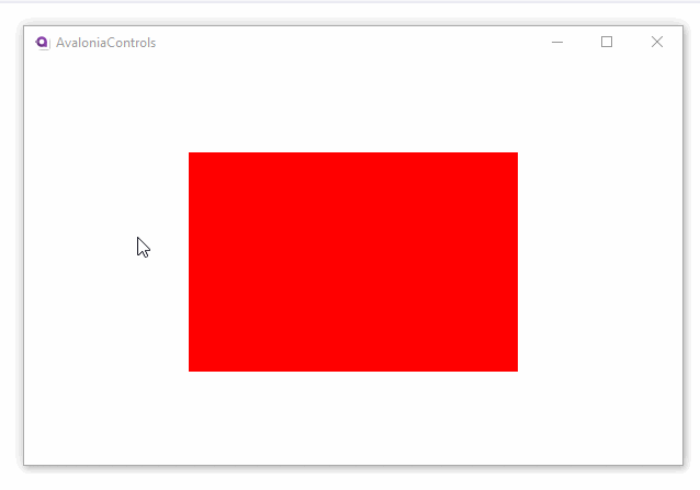
<Border Background="Red" PointerPressed="Border_PointerPressed">
    <FlyoutBase.AttachedFlyout>
        <Flyout>
            <TextBlock Text="Red Rectangle Flyout." />
        </Flyout>
    </FlyoutBase.AttachedFlyout>
</Border>
The flyout will not show automatically, it has to be shown from code-behind. For example:
public void Border_PointerPressed(object sender, PointerPressedEventArgs args)
{
    var ctl = sender as Control;
    if (ctl != null)
    {
        FlyoutBase.ShowAttachedFlyout(ctl);
    }
}
Useful Properties
You will probably use these properties most often:
| Property | Description |
|---|---|
Placement | The position where the flyout opens relative to the control to which it is attached. |
ShowMode | This describes how the flyout shows and hides. See the options below. |
Show Mode
This setting describes how the flyout shows and hides:
| Mode | Description |
|---|---|
Standard | The flyout shows when the control to which it is attached gets the focus. The flyout hides when the control to which it is attached loses the focus (the user either tabs away or clicks elsewhere). |
Transient | |
TransientWithDismiss OnPointerMoveAway |
Common Methods for all Flyouts
| Property | Description |
|---|---|
ShowAt(Control) | Shows the Flyout at the specified target |
ShowAt(Control, bool) | Shows the Flyout at the specified target, but places it at the current pointer position |
Hide | Hides the Flyout |
Sharing Flyouts
You can share flyouts between two or more elements in your app. For example, to share a flyout from the resources collection of a window:
<Window.Resources>
    <Flyout x:Key="MySharedFlyout">
        <!-- Flyout content here -->
    </Flyout>
</Window.Resources>

<Button Content="Click me!" Flyout="{StaticResource MySharedFlyout}" />

<Button Content="Now click me!" Flyout="{StaticResource MySharedFlyout}" />
Styling Flyouts
Although flyouts are not themselves controls, their general appearance can be customized by targeting the presenter the Flyout uses to display its content. For a normal Flyout this is FlyoutPresenter and for MenuFlyout this is MenuFlyoutPresenter. Because flyout presenters are not exposed, special style classes that should pertain to specific flyouts can be passed using the FlyoutPresenterClasses property on FlyoutBase
<Style Selector="FlyoutPresenter.mySpecialClass">
    <Setter Property="Background" Value="Red" />
</Style>

<Flyout FlyoutPresenterClasses="mySpecialClass">
    <!-- Flyout content here -->
</Flyout>
More Information
For the complete API documentation about this control, see here.
View the source code on GitHub Flyout.cs