Sparkline charts
info
Charts are available with Avalonia Pro.
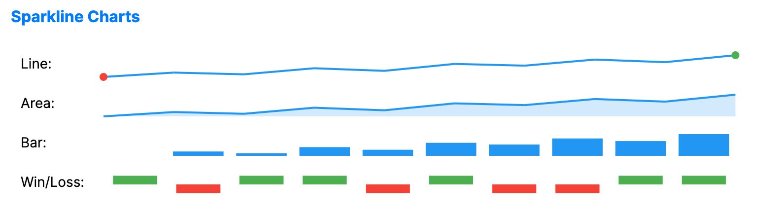
Sparklines are compact charts without axes or coordinates, designed to show trends in a series of values in a small space such as a card, table cell, or dashboard tile.
When to use
- In-line trends: Showing data trends inside data grids or text paragraphs.
- Dashboard summaries: Providing high-density visual context for many metrics on one screen.
- Compact visualizations: When the general shape of a trend is more important than specific values.
Code example
XAML
<Grid ColumnDefinitions="Auto,*" RowDefinitions="Auto,Auto,Auto,Auto" Margin="10">
    <TextBlock Text="Line:" VerticalAlignment="Center" Margin="0,0,10,5" />
    <SparklineChart xmlns="https://github.com/avaloniaui" Grid.Column="1" Height="40" SparklineType="Line" ItemsSource="{Binding SparklineData}"/>
    <TextBlock Grid.Row="1" Text="Area:" VerticalAlignment="Center" Margin="0,0,10,5" />
    <SparklineChart Grid.Row="1" Grid.Column="1" Height="40" SparklineType="Area" ItemsSource="{Binding SparklineData}"/>
    <TextBlock Grid.Row="2" Text="Bar:" VerticalAlignment="Center" Margin="0,0,10,5" />
    <SparklineChart Grid.Row="2" Grid.Column="1" Height="40" SparklineType="Bar" ItemsSource="{Binding SparklineData}"/>
    <TextBlock Grid.Row="3" Text="Win/Loss:" VerticalAlignment="Center" Margin="0,0,10,5" />
    <SparklineChart Grid.Row="3" Grid.Column="1" Height="40" SparklineType="WinLoss" ItemsSource="{Binding SparklineWinLossData}"/>
</Grid>
Data model (C#)
public ObservableCollection<double> SparklineData { get; } = new()
{
    5, 10, 8, 15, 12, 20, 18, 25, 22, 30
};

public ObservableCollection<double> SparklineWinLossData { get; } = new()
{
    1, -1, 1, 1, -1, 1, -1, -1, 1, 1
};
Common properties
| Property | Description | Default |
|---|---|---|
ItemsSource | The collection of trend data. | null |
ValuePath | Property path used when ItemsSource contains objects instead of raw numbers. | null |
SparklineType | Style of the sparkline: Line, Area, Bar, or WinLoss. | Line |
LineBrush | Brush used for Line and Area sparklines. | null (blue, see Note below) |
AreaFill | Brush used to fill the area for Area sparklines. | null (transparent blue, see Note below) |
BarBrush | Brush used for bars for Bar sparklines. | null (blue, see Note below) |
WinBrush | Brush used for positive values in WinLoss sparklines. | null (green, see Note below) |
LossBrush | Brush used for negative values in WinLoss sparklines. | null (red, see Note below) |
ShowMarkers | Toggles rendering of individual data point markers. | false |
ShowMinMax | Highlights the minimum and maximum values. | true |
StrokeThickness | Width of the line stroke for Line and Area sparklines. | 2.0 |
note
The Brush-type properties default to these colors when set to null:
LineBrush: BlueAreaFill: Blue, at reduced opacityBarBrush: Same asLineBrush, i.e. blue if both arenullWinBrush: GreenLossBrush: Red