Mosaic chart
info
Charts are available with Avalonia Pro.
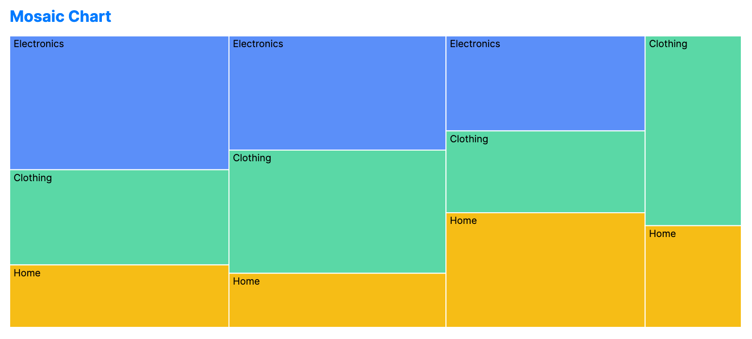
Mosaic charts (Marimekko) visualize relationships between categories using area. Both the width and height of segments are scaled to represent percentages of the total.
When to use
- Market segmentation: Showing sales by region (width) and by product category (height).
- Resource expenditure: Visualizing budget allocation across departments and cost types.
- Multi-factor analysis: Understanding how two different qualitative variables interact.
Code example
XAML
<MosaicChart xmlns="https://github.com/avaloniaui" Title="Sales by Region" Height="300"
                      ItemsSource="{Binding MosaicData}"
                      GroupPath="Region"
                      SubGroupPath="Category"
                      ValuePath="Sales" />
Data model (C#)
public record MosaicItem(string Region, string Category, double Sales);

public ObservableCollection<MosaicItem> MosaicData { get; } = new()
{
    new("North", "Electronics", 450),
    new("North", "Clothing", 320),
    new("North", "Home", 210),
    new("South", "Electronics", 380),
    new("South", "Clothing", 410),
    new("South", "Home", 180),
    new("East", "Electronics", 290),
    new("East", "Clothing", 250),
    new("East", "Home", 350),
    new("West", "Clothing", 280),
    new("West", "Home", 150)
};
Common properties
| Property | Description | Default |
|---|---|---|
ItemsSource | The collection of data segments. | null |
GroupPath | Primary category (determines width). | null |
SubGroupPath | Secondary category (determines height). | null |
ValuePath | Numerical value for scaling. | null |