Progress donut chart
info
Charts are available with Avalonia Pro.
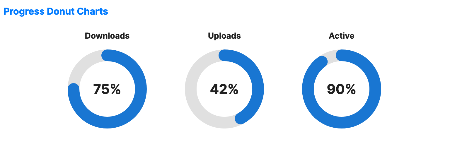
Progress donut charts are a specialized variation of donut charts designed to show progress toward a single 100% goal. They are often used in fitness apps or system dashboards.
When to use
- Goal completion: Showing how close a user is to a target.
- Metric summaries: Visualizing percentage-based data (e.g., Disk Space used).
- KPI dashboards: Providing a quick visual check for key performance indicators.
Code example
XAML
<WrapPanel Orientation="Horizontal" HorizontalAlignment="Center">
    <ProgressDonutChart xmlns="https://github.com/avaloniaui" Value="75" Width="180" Height="180" IsTooltipEnabled="True" Title="Downloads" Margin="10" />
    <ProgressDonutChart Value="42" Width="180" Height="180" IsTooltipEnabled="True" Title="Uploads" Margin="10" />
    <ProgressDonutChart Value="90" Width="180" Height="180" IsTooltipEnabled="True" Title="Active" Margin="10" />
</WrapPanel>
Common properties
| Property | Description | Default |
|---|---|---|
Value | The current value (0 to MaxValue). | 0 |
MaxValue | The maximum value. | 100.0 |
ValueBrush | Brush for the progress arc. | Theme-dependent |
TrackBrush | Brush for the empty part of the ring. | Theme-dependent |
RingThickness | Width of the ring. | 20.0 |
StartAngle | Start angle in degrees (-90 = top). | -90.0 |
ShowPercentage | Whether to show percentage in center. | true |
CenterLabel | Custom center label (overrides percentage). | null |
IsValueAnimationEnabled | Whether to animate changes to the value arc. | false |
ShowGlow | Whether to draw a glow effect around the animated value arc. | false |