Linear gauge chart
info
Charts are available with Avalonia Pro.
Linear gauge charts visualize a value along a horizontal or vertical bar. They are suited to comparing metrics side by side or showing progress in a linear, space-efficient format.
When to use
- Performance bars: Comparing multiple metrics in a condensed dashboard.
- Volume indicators: Showing storage levels, audio levels, or tank capacity.
- Progress tracking: Visualizing a sequence of targets in a straight line.
Code example
XAML
<StackPanel Spacing="15" Margin="10">
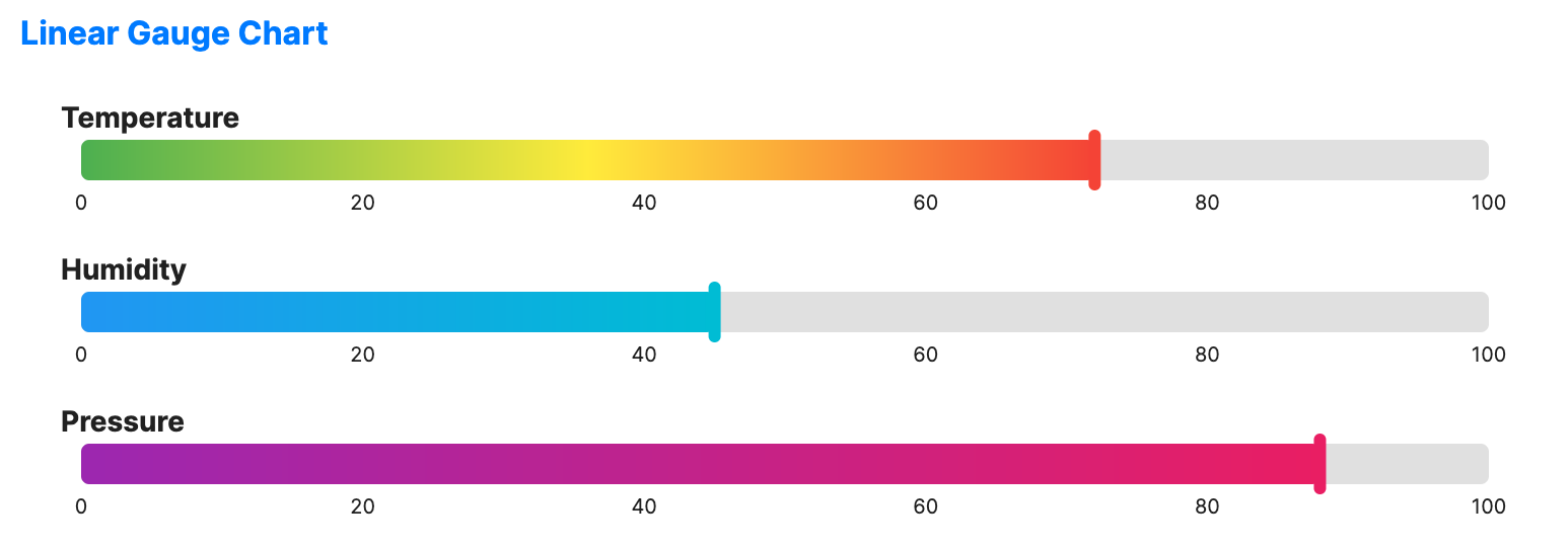
<LinearGaugeChart xmlns="https://github.com/avaloniaui" Title="Temperature" Value="72" MinValue="0" MaxValue="100" Height="60"
NeedleBrush="#F44336">
<LinearGaugeChart.ValueBrush>
<LinearGradientBrush StartPoint="0%,0%" EndPoint="100%,0%">
<GradientStop Offset="0" Color="#4CAF50" />
<GradientStop Offset="0.5" Color="#FFEB3B" />
<GradientStop Offset="1" Color="#F44336" />
</LinearGradientBrush>
</LinearGaugeChart.ValueBrush>
</LinearGaugeChart>
<LinearGaugeChart Title="Humidity" Value="45" MinValue="0" MaxValue="100" Height="60"
NeedleBrush="#00BCD4">
<LinearGaugeChart.ValueBrush>
<LinearGradientBrush StartPoint="0%,0%" EndPoint="100%,0%">
<GradientStop Offset="0" Color="#2196F3" />
<GradientStop Offset="1" Color="#00BCD4" />
</LinearGradientBrush>
</LinearGaugeChart.ValueBrush>
</LinearGaugeChart>
<LinearGaugeChart Title="Pressure" Value="88" MinValue="0" MaxValue="100" Height="60"
NeedleBrush="#E91E63">
<LinearGaugeChart.ValueBrush>
<LinearGradientBrush StartPoint="0%,0%" EndPoint="100%,0%">
<GradientStop Offset="0" Color="#9C27B0" />
<GradientStop Offset="1" Color="#E91E63" />
</LinearGradientBrush>
</LinearGaugeChart.ValueBrush>
</LinearGaugeChart>
</StackPanel>
Common properties
| Property | Description | Default |
|---|---|---|
Value | The current value to display. | 50.0 |
MinValue | Minimum value of the scale. | 0.0 |
MaxValue | Maximum value of the scale. | 100.0 |
Orientation | Orientation of the gauge, Horizontal or Vertical. | Horizontal |
ShowScale | Whether to display the scale. | true |
TrackBrush | Color of the track. | Uses theme default. |
NeedleBrush | Color of the needle indicator. | Uses theme default. |
ValueBrush | Color of the value. | Uses theme default. |
TrackThickness | Thickness of the track. | 20.0 |
Ranges | Optional collection of colored ranges drawn behind the indicator. | null |
ShowMajorTicks | Whether to display major ticks. | false |
ShowMinorTicks | Whether to display minor ticks. | false |
MajorTickInterval | Interval between major ticks. | 20.0 |
MinorTickCount | Number of minor ticks between two major ticks. | 4 |