Toggle Button
The toggle button can present a Boolean value by using styles and a pseudo class that is either present (true) or absent (false).
This allows a wide range of possible graphical presentations for the control in each of the pseudo class states.
Example
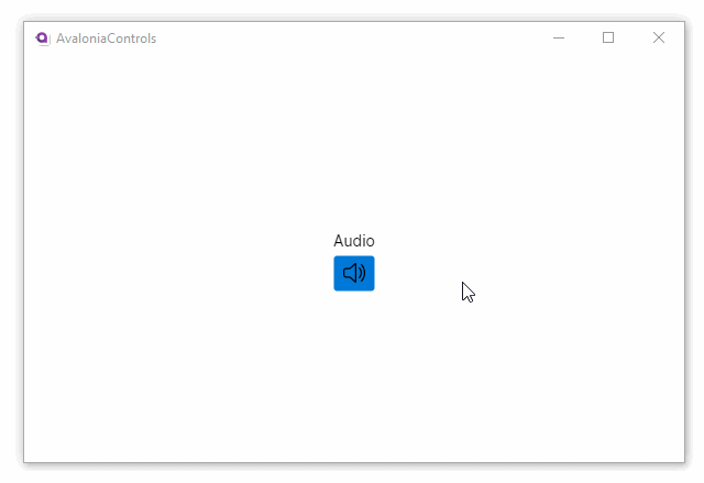
This example shows a toggle button containing a speaker icon, or a muted speaker icon, depending on whether the button has the checked pseudo class or not.
<StackPanel HorizontalAlignment="Center" VerticalAlignment="Center">
  <TextBlock Margin="0 5">Audio</TextBlock>
  <ToggleButton IsChecked="True">
    <Panel>
      <PathIcon Classes="audio-on"
                Data="{StaticResource speaker_regular}" />
      <PathIcon Classes="audio-mute"
                Data="{StaticResource speaker_off_regular}" />
    </Panel>
  </ToggleButton>
</StackPanel>
<Window.Styles>
  <Style Selector="ToggleButton PathIcon.audio-on">
    <Setter Property="IsVisible" Value="False"/>
  </Style>
  <Style Selector="ToggleButton:checked PathIcon.audio-on">
    <Setter Property="IsVisible" Value="True"/>
  </Style>
  <Style Selector="ToggleButton PathIcon.audio-mute">
    <Setter Property="IsVisible" Value="True"/>
  </Style>
  <Style Selector="ToggleButton:checked PathIcon.audio-mute">
    <Setter Property="IsVisible" Value="False"/>
  </Style>
</Window.Styles>
<Styles xmlns="https://github.com/avaloniaui"
        xmlns:x="http://schemas.microsoft.com/winfx/2006/xaml">
  <Style>
    <Style.Resources>
      <StreamGeometry x:Key="speaker_off_regular">M28 29.7678L41.8661 43.6339C42.3543 44.122 43.1457 44.122 43.6339 43.6339C44.122 43.1457 44.122 42.3543 43.6339 41.8661L6.13388 4.36612C5.64573 3.87796 4.85427 3.87796 4.36611 4.36612C3.87796 4.85427 3.87796 5.64573 4.36611 6.13388L13.2322 15H9C6.10051 15 3.75 17.3505 3.75 20.25V27.75C3.75 30.6495 6.10051 33 9 33H13.702C14.8734 33 16.0034 33.4328 16.875 34.2153L25.081 41.5815C26.2077 42.5929 28 41.7933 28 40.2793V29.7678ZM25.5 27.2678V38.5981L18.5451 32.3549C17.2146 31.1606 15.4898 30.5 13.702 30.5H9C7.48122 30.5 6.25 29.2688 6.25 27.75V20.25C6.25 18.7312 7.48122 17.5 9 17.5H13.702C14.3147 17.5 14.92 17.4224 15.5046 17.2723L25.5 27.2678Z M19.8115 14.5082L18.0412 12.7379L25.081 6.41847C26.2076 5.40709 28 6.20669 28 7.72074V22.6967L25.5 20.1967V9.40185L19.8115 14.5082Z M36.1857 30.8824L34.335 29.0317C34.966 27.7376 35.5 26.0404 35.5 24C35.5 21.5224 34.7127 19.5507 33.9203 18.1923C33.5242 17.5133 33.1298 16.9931 32.8397 16.6477C32.695 16.4754 32.577 16.3476 32.499 16.2664C32.46 16.2259 32.4311 16.197 32.414 16.1802L32.3972 16.164L32.398 16.1646C31.8935 15.6947 31.8647 14.9048 32.334 14.3994C32.8038 13.8935 33.5947 13.8642 34.1006 14.334L33.25 15.25C34.1006 14.334 34.1014 14.3347 34.1014 14.3347L34.1022 14.3356L34.1042 14.3374L34.1092 14.3421L34.1228 14.355C34.1336 14.3653 34.1476 14.3788 34.1646 14.3955C34.1987 14.4289 34.245 14.4753 34.3018 14.5343C34.4152 14.6524 34.5707 14.8215 34.754 15.0398C35.1202 15.4757 35.6008 16.1117 36.0797 16.9327C37.0373 18.5743 38 20.9776 38 24C38 26.9108 37.1071 29.2474 36.1857 30.8824Z M41.0185 35.7152L39.1733 33.87C40.3712 31.5479 41.5 28.2383 41.5 24C41.5 19.4474 40.1976 15.9662 38.906 13.6297C38.2594 12.46 37.6157 11.5776 37.1403 10.9943C36.9028 10.7028 36.708 10.4867 36.5767 10.3474C36.511 10.2777 36.4614 10.2274 36.4303 10.1965C36.4148 10.181 36.4039 10.1704 36.398 10.1648L36.3949 10.1617L36.393 10.16C35.8916 9.68785 35.8665 8.89867 36.3376 8.39562C36.8094 7.89169 37.6004 7.8657 38.1044 8.33755L37.2501 9.24987C38.1044 8.33755 38.1053 8.33839 38.1053 8.33839L38.1063 8.33935L38.1087 8.34162L38.115 8.34761L38.1336 8.36536C38.1485 8.37975 38.1685 8.39926 38.1932 8.42388C38.2427 8.4731 38.3112 8.54276 38.396 8.6327C38.5655 8.81253 38.8003 9.07375 39.0784 9.41509C39.6343 10.0974 40.3656 11.1025 41.094 12.4203C42.5524 15.0587 44 18.9526 44 24C44 29.0474 42.5524 32.9412 41.094 35.5797L41.0739 35.6159L41.0185 35.7152Z</StreamGeometry>
      <StreamGeometry x:Key="speaker_regular">M25.081 6.41848C26.2076 5.4071 28 6.2067 28 7.72074V40.2793C28 41.7933 26.2077 42.5929 25.081 41.5815L16.875 34.2153C16.0034 33.4328 14.8734 33 13.702 33H9C6.10051 33 3.75 30.6495 3.75 27.75V20.25C3.75 17.3505 6.10051 15 9 15H13.702C14.8734 15 16.0034 14.5672 16.875 13.7847L25.081 6.41848ZM25.5 9.40186L18.5451 15.6451C17.2146 16.8394 15.4898 17.5 13.702 17.5H9C7.48122 17.5 6.25 18.7312 6.25 20.25V27.75C6.25 29.2688 7.48122 30.5 9 30.5H13.702C15.4898 30.5 17.2146 31.1606 18.5451 32.3549L25.5 38.5982V9.40186Z M36.3376 8.39563C36.8095 7.8917 37.6005 7.86571 38.1044 8.33757L38.1053 8.3384C38.1053 8.3384 37.7675 8 38.1151 8.34762L38.1336 8.36537C38.1485 8.37976 38.1685 8.39927 38.1933 8.42389C38.2428 8.47311 38.3113 8.54277 38.396 8.63271C38.5655 8.81254 38.8004 9.07377 39.0785 9.4151C39.6344 10.0974 40.3656 11.1025 41.094 12.4203C42.5525 15.0588 44.0001 18.9526 44.0001 24C44.0001 29.0474 42.5525 32.9413 41.094 35.5797C40.3656 36.8975 39.6344 37.9027 39.0785 38.5849C38.8004 38.9262 38.5655 39.1875 38.396 39.3673C38.3714 39.3935 38.3481 39.4179 38.3262 39.4407C38.273 39.4961 38.2284 39.5412 38.1933 39.5761C38.1685 39.6007 38.1485 39.6202 38.1336 39.6346L38.1151 39.6524L38.1088 39.6584L38.1063 39.6607L38.1053 39.6616C38.1053 39.6616 38.2392 39.5277 38.3262 39.4407C38.4326 39.3343 38.4688 39.298 38.1044 39.6624C37.6005 40.1343 36.8095 40.1083 36.3376 39.6044C35.8666 39.1013 35.8917 38.3122 36.3931 37.84L36.3949 37.8383L36.3981 37.8352C36.404 37.8296 36.4148 37.819 36.4304 37.8035C36.4614 37.7726 36.5111 37.7223 36.5767 37.6526C36.708 37.5133 36.9029 37.2972 37.1404 37.0057C37.6157 36.4224 38.2595 35.54 38.9061 34.3703C40.1976 32.0338 41.5001 28.5526 41.5001 24C41.5001 19.4474 40.1976 15.9663 38.9061 13.6297C38.2595 12.46 37.6157 11.5776 37.1404 10.9943C36.9029 10.7028 36.708 10.4867 36.5767 10.3474C36.5111 10.2777 36.4614 10.2274 36.4304 10.1965C36.4148 10.181 36.404 10.1705 36.3981 10.1648L36.3949 10.1617L36.3931 10.16C35.8917 9.68786 35.8666 8.89869 36.3376 8.39563Z M32.3341 14.3994C32.8038 13.8936 33.5947 13.8643 34.1006 14.334C34.1008 14.3342 34.1014 14.3348 34.1014 14.3348L34.1023 14.3356L34.1043 14.3374L34.1092 14.3421L34.1229 14.355C34.1336 14.3653 34.1477 14.3788 34.1647 14.3955C34.1988 14.429 34.2451 14.4753 34.3018 14.5344C34.4152 14.6524 34.5707 14.8215 34.7541 15.0398C35.1202 15.4757 35.6009 16.1117 36.0798 16.9327C37.0374 18.5743 38.0001 20.9776 38.0001 24C38.0001 27.0224 37.0374 29.4257 36.0798 31.0673C35.6009 31.8883 35.1202 32.5243 34.7541 32.9602C34.5707 33.1785 34.4152 33.3476 34.3018 33.4656C34.2451 33.5247 34.1988 33.5711 34.1647 33.6045L34.1452 33.6235L34.1229 33.645L34.1092 33.6579L34.1043 33.6626L34.1015 33.6652L34.1006 33.666C33.5947 34.1357 32.8038 34.1065 32.3341 33.6006C31.8653 33.0958 31.8935 32.3072 32.3962 31.8371L32.3979 31.8355L32.414 31.8198C32.4312 31.803 32.4601 31.7741 32.4991 31.7336C32.5771 31.6524 32.695 31.5246 32.8398 31.3523C33.1299 31.0069 33.5242 30.4867 33.9203 29.8077C34.7127 28.4493 35.5001 26.4776 35.5001 24C35.5001 21.5224 34.7127 19.5507 33.9203 18.1923C33.5242 17.5133 33.1299 16.9931 32.8398 16.6477C32.695 16.4754 32.5771 16.3476 32.4991 16.2664C32.4601 16.2259 32.4312 16.197 32.414 16.1802L32.3973 16.164L32.3981 16.1647C31.8929 15.6949 31.8645 14.9051 32.3341 14.3994Z</StreamGeometry>
      </Style.Resources>
  </Style>
</Styles>
<Application xmlns="https://github.com/avaloniaui"
             xmlns:x="http://schemas.microsoft.com/winfx/2006/xaml"
             xmlns:local="using:AvaloniaControls"
             x:Class="AvaloniaControls.App">
    <Application.Styles>
        <FluentTheme Mode="Light"/>
        <StyleInclude Source="avares://AvaloniaControls/Icons.axaml" />
    </Application.Styles>
</Application>
The content zone of the toggle button contains two path icon elements, only one of which is visible at a time. The path icons get their graphics from an assets file which is referenced as an included style set in the App.xaml file. The icon geometries are from the Avalonia UI Fluent icons resource.
To see the full list of Fluent icons available with Avalonia UI, see https://avaloniaui.github.io/icons.html
The visibility of the path icons is set by the window styles, and these use the :checked pseudo class to determine when the toggle button is in its checked state. So, when the toggle button is checked, then the audio-on path icon is visible, and the audio-mute path icon is hidden. And conversely, when the toggle button is not checked, then the audio-mute path icon is visible, and the audio-on path icon is hidden.
More Information
For the complete API documentation about this control, see here.
View the source code on GitHub ToggleButton.cs