Semi-donut chart
info
Charts are available with Avalonia Pro.
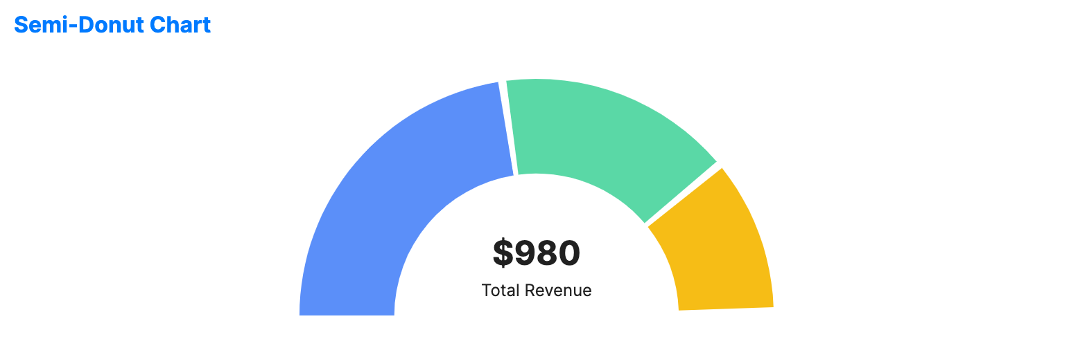
Semi-donut charts display data in a 180-degree arc. They are particularly popular in dashboard designs for gauging progress or displaying summary metrics in a space-constrained area.
When to use
- KPI gauges: Visualizing a single metric against a target or total.
- Dashboard headers: Providing a quick summary of a category at the top of a page.
- Angular comparison: Comparing parts of a whole where a full circle isn't needed or desired.
Code example
XAML
<SemiDonutChart xmlns="https://github.com/avaloniaui" Name="SemiDonutChartSample" Height="200"
                         ItemsSource="{Binding SemiDonutChartData}"
                         ValuePath="Value"
                         LabelPath="Label"
                         CenterValue="$980"
                         CenterLabel="Total Revenue" />
Data model (C#)
public record SemiDonutPoint(string Label, double Value);

public ObservableCollection<SemiDonutPoint> SemiDonutChartData { get; } = new()
{
    new("Product A", 450),
    new("Product B", 320),
    new("Product C", 210)
};
Common properties
| Property | Description | Default |
|---|---|---|
ItemsSource | The data source for the segments. | null |
ValuePath | Property path for values. | null |
LabelPath | Property path for labels. | null |
InnerRadiusFactor | The ratio of the inner radius (hole size) to the outer radius (0.0 to 1.0). | 0.6 |
CenterLabel | Label text displayed in the center of the arc. | null |
CenterValue | Value text displayed in the center. | null |
GapAngle | Gap angle between segments in degrees. | 2.0 |
IsHighlightEnabled | Enables hover highlighting for segments. | false |