Pie chart
info
Charts are available with Avalonia Pro.
Pie charts are circular charts divided into sectors to illustrate numerical proportion. They are most effective when showing part-to-whole relationships.
When to use
- Proportions: Visualizing the relative size of categories compared to the total.
- Limited categories: Best used with 2-6 categories to maintain readability.
- Composition: Showing how a total amount is divided among different segments.
Code example
XAML
<PieChart xmlns="https://github.com/avaloniaui" Name="PieChartSample" IsTooltipEnabled="True" Title="Market Share" Height="300">
                        <PieChart.Series>
                            <PieSeries ItemsSource="{Binding PieChartData}" LabelPath="Value" />
                        </PieChart.Series>
                    </PieChart>
Data model (C#)
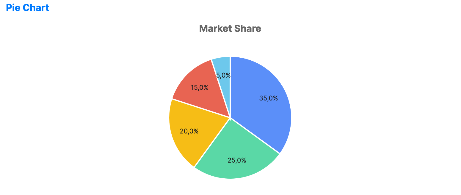
public ObservableCollection<double> PieChartData { get; } = new()
{
    35, 25, 20, 15, 5
};
Common properties
PieChart
| Property | Description | Default |
|---|---|---|
InnerRadiusFactor | Center-hole size applied when a PieSeries does not set its own inner radius. Set a value greater than 0.0 to create a donut. | 0.0 |
Palette | Custom brush collection for the segments. | Auto-generated |
PieSeries
| Property | Description | Default |
|---|---|---|
ItemsSource | The collection of data items. | null |
ValuePath | Path to the property used for the segment values. | null |
LabelPath | Path to the property used for segment labels. | null |
RadiusFactor | Outer radius factor for the series, from 0.0 to 1.0. | 0.9 |
InnerRadiusFactor | Optional inner radius factor for the series. When null, the chart-level value is used. | null |
StartAngle | Start angle in degrees for the first slice. | -90.0 |
ShowLabels | Whether to display labels on the slices. | true |
LabelPosition | Position of slice labels, Inside or Outside. | Inside |
SliceLabelFormat | Format used for slice labels. | Percentage |
LabelFontSize | Font size used for slice labels. | 11.0 |
LabelForeground | Brush used for slice labels. | null |