Data Grid
The data grid displays repeating data in a customizable grid. The control can be styled, templated and bound.
The data grid needs to be bound to an observable collection in a view model that can be found in a related data context.
To review the concept behind the data context, see here.
The data grid is in an additional Avalonia UI package. To use the data grid in your project, you must reference the Avalonia.Controls.DataGrid NuGet package, and reference the styles that it uses, see below.
NuGet Package Reference
You must install the NuGet package for the data grid, there are several ways of doing this. You can use Manage NuGet Packages from the project menu of your IDE:
Alternatively, you can run this instruction from the command line:
dotnet add package Avalonia.Controls.DataGrid
Or add package reference directly to the project (.csproj) file:
<PackageReference Include="Avalonia.Controls.DataGrid" Version="11.0.0" />
Note you must always install the data grid version that matches the Avalonia UI version you are using.
Include Data Grid Styles
You must reference the data grid themes to include the additional styles that the data grid uses. You can do this by adding a <StyleInclude> element to the application (App.axaml file).
For example:
<Application.Styles>
    <FluentTheme />
    <StyleInclude Source="avares://Avalonia.Controls.DataGrid/Themes/Fluent.xaml"/>
</Application.Styles>
Useful Properties
You will probably use these properties most often:
| Property | Description |
|---|---|
AutoGenerateColumns | Whether the columns will automatically generate from the bound items data source property names. (Default is false.) |
ItemsSource | The bound collection that is used as the data source for the control. |
IsReadOnly | Sets the binding direction to one-way when true. The default is false - the grid will accept changes to the bound data. |
CanUserReorderColumns | Indicates whether the user can change the column display order by dragging column headers with the pointer. (Default is false.) |
CanUserResizeColumns | Indicates whether the user can adjust column widths using the pointer. (Default is false.) |
CanUserSortColumns | Indicates whether the user can sort columns by clicking the column header. (Default is true.) |
Examples
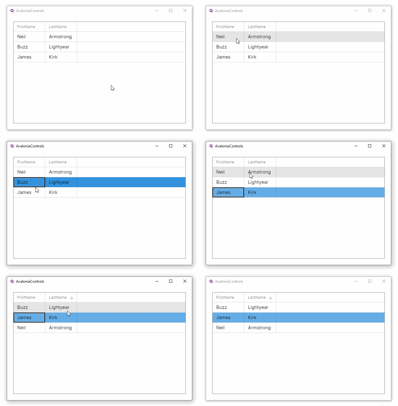
This example will generate a basic data grid, with column header names auto-generated from the item class. The items data source is bound to the main window view model.
<DataGrid Margin="20" ItemsSource="{Binding People}"
          AutoGenerateColumns="True" IsReadOnly="True"
          GridLinesVisibility="All"
          BorderThickness="1" BorderBrush="Gray">
</DataGrid>
using AvaloniaControls.Models;
using System.Collections.Generic;
using System.Collections.ObjectModel;

namespace AvaloniaControls.ViewModels
{
    public class MainWindowViewModel : ViewModelBase
    {
        public ObservableCollection<Person> People { get; }

        public MainWindowViewModel()
        {
            var people = new List<Person>
            {
                new Person("Neil", "Armstrong"),
                new Person("Buzz", "Lightyear"),
                new Person("James", "Kirk")
            };
            People = new ObservableCollection<Person>(people);
        }
    }
}
public class Person
{
    public string FirstName { get; set; }
    public string LastName { get; set; }

    public Person(string firstName , string lastName)
    {
        FirstName = firstName;
        LastName = lastName;
    }
}

These examples use the MVVM pattern with data binding to an ObservableCollection. For more information on the concepts behind data binding, see here.
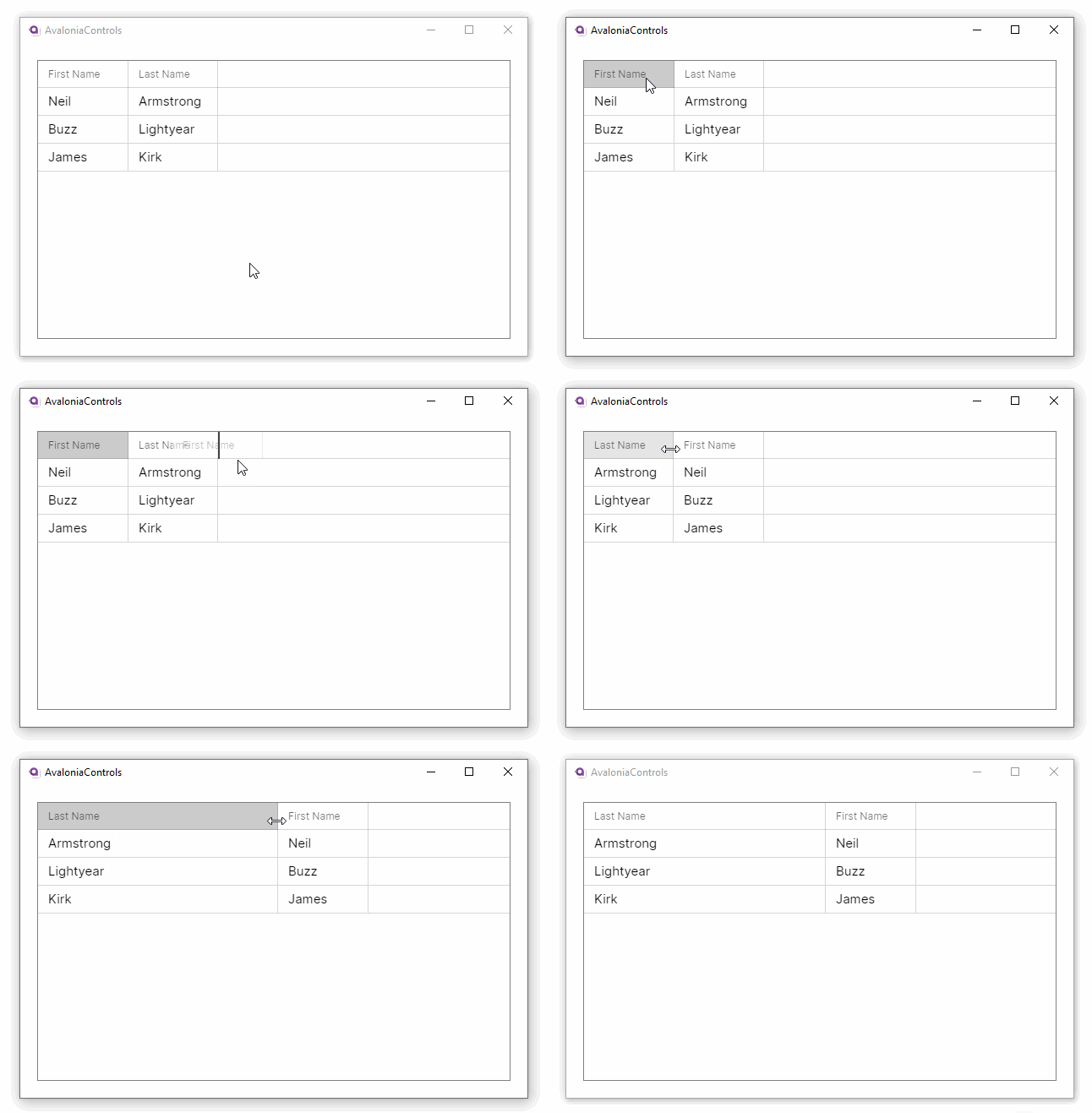
Property names from the item class will generally not make good column names. This example adds custom header names to the grid. It also allows column reordering and resizing and disallows the default column sorting option:
<DataGrid Margin="20" ItemsSource="{Binding People}"
          IsReadOnly="True"
          CanUserReorderColumns="True"
          CanUserResizeColumns="True"
          CanUserSortColumns="False"
          GridLinesVisibility="All"
          BorderThickness="1" BorderBrush="Gray">
  <DataGrid.Columns>
     <DataGridTextColumn Header="First Name"  Binding="{Binding FirstName}"/>
     <DataGridTextColumn Header="Last Name" Binding="{Binding LastName}" />
  </DataGrid.Columns>
</DataGrid>

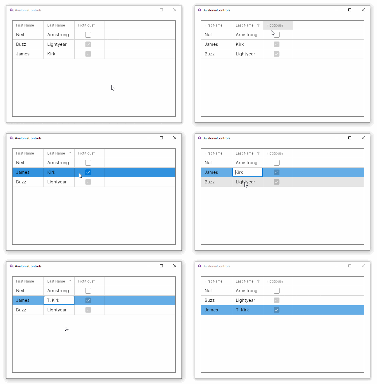
This example shows how the data grid can accept changes and update the underlying collection, and use different column types to edit the data:
<DataGrid Margin="20" ItemsSource="{Binding People}"
          GridLinesVisibility="All"
          BorderThickness="1" BorderBrush="Gray">
  <DataGrid.Columns>
     <DataGridTextColumn Header="First Name"  Binding="{Binding FirstName}"/>
     <DataGridTextColumn Header="Last Name" Binding="{Binding LastName}" />
     <DataGridCheckBoxColumn Header="Fictitious?" Binding="{Binding IsFictitious}" />
  </DataGrid.Columns>
</DataGrid>
using AvaloniaControls.Models;
using System.Collections.Generic;
using System.Collections.ObjectModel;

namespace AvaloniaControls.ViewModels
{
    public class MainWindowViewModel : ViewModelBase
    {
        public ObservableCollection<Person> People { get; }

        public MainWindowViewModel()
        {
            var people = new List<Person>
            {
                new Person("Neil", "Armstrong", false),
                new Person("Buzz", "Lightyear", true),
                new Person("James", "Kirk", true)
            };
            People = new ObservableCollection<Person>(people);
        }
    }
}
public class Person
{
    public string FirstName { get; set; }
    public string LastName { get; set; }
    public bool IsFictitious { get; set; }

    public Person(string firstName , string lastName, bool isFictitious)
    {
        FirstName = firstName;
        LastName = lastName;
        IsFictitious = isFictitious;
    }
}

More Information
For more information about the different kinds of data grid column, see the next page.
For the complete API documentation about this control, see here.
View the source code on GitHub DataGrid.cs