Adding some layout
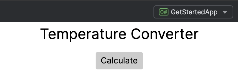
At this point, your temperature converter app has a single button in the center of the window. You cannot add any more elements, because each Avalonia window allows only one control in its content zone. (More on layout zones later, on the next page: Customizing the Avalonia window.)
To place multiple UI elements in the window, you must use a layout control.
For more information on layout controls, see Layout controls.
Inserting a stack panel
You can use the StackPanel layout control to place some text above the button.
- In the file MainWindow.axaml, enclose your
Buttonwith a<StackPanel>...</StackPanel>tag.
<StackPanel>
	<Button>Calculate</Button>
</StackPanel>
- Add a
TextBlockabove the Button. (You may recall theTextBlocktag from the default MainWindow.axaml, which prints text in the window.) Set the attributes of theTextBlockas follows:
Margin="5"FontSize="24"HorizontalAlignment="Center"Text="Temperature Converter"
<StackPanel>
    <TextBlock Margin="5"
               FontSize="24"
               HorizontalAlignment="Center"
               Text="Temperature Converter">
    </TextBlock>

    <Button HorizontalAlignment="Center">Calculate</Button>
</StackPanel>
- Run the app or check the previewer. You should see the text “Temperature Converter” positioned above the Calculate button.
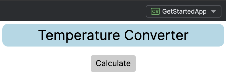
- Enclose the
TextBlockwith a<Border>...</Border>tag. Set the attributes of theBorderas follows:
Margin="5"CornerRadius="10"Background="LightBlue"
<StackPanel>
    <Border Margin="5" CornerRadius="10" Background="LightBlue">
        <TextBlock Margin="5"
                   FontSize="24"
                   HorizontalAlignment="Center"
                   Text="Temperature Converter">
        </TextBlock>
    </Border>

    <Button HorizontalAlignment="Center">Calculate</Button>
</StackPanel>
- Run the app or check the previewer. You should see that the text “Temperature Converter” is now inside a rounded blue box.
By default, StackPanel arranges elements in a vertical stack. You can change this to horizontal by setting the Orientation attribute to Horizontal.
Inserting a grid
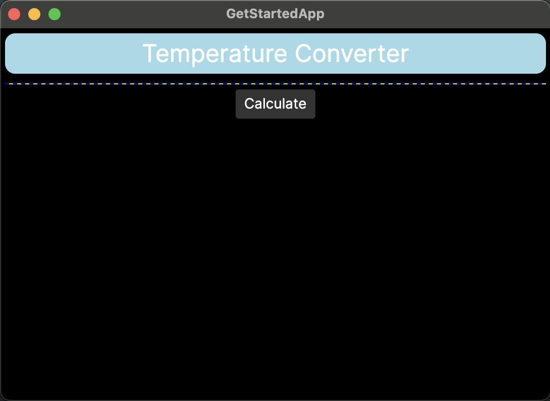
Next, add a Grid layout control to the temperature converter app. Grid creates cells in rows and columns, into which you can place more controls.
- Stop the app if it is still running.
- In the file MainWindow.axaml, insert a
<Grid>...</Grid>tag between</Border>and<Button>.
<StackPanel>
    <Border Margin="5" CornerRadius="10" Background="LightBlue">
        <TextBlock Margin="5"
            HorizontalAlignment="Center"
            FontSize="24"
            Text="Temperature Converter">
        </TextBlock>
    </Border>
    <Grid ShowGridLines="True" Margin="5"
          ColumnDefinitions="120, 100"
          RowDefinitions="Auto, Auto">
    </Grid>
    <Button HorizontalAlignment="Center">Calculate</Button>
</StackPanel>
We have specified some attributes for the Grid:
- It has two columns and two rows.
- Gridlines are visible.
- Cell height automatically scales to match the content. Because the automatic height of an empty cell is zero, the
Gridcurrently appears on your previewer as a horizontal straight line.
Inserting controls in the grid
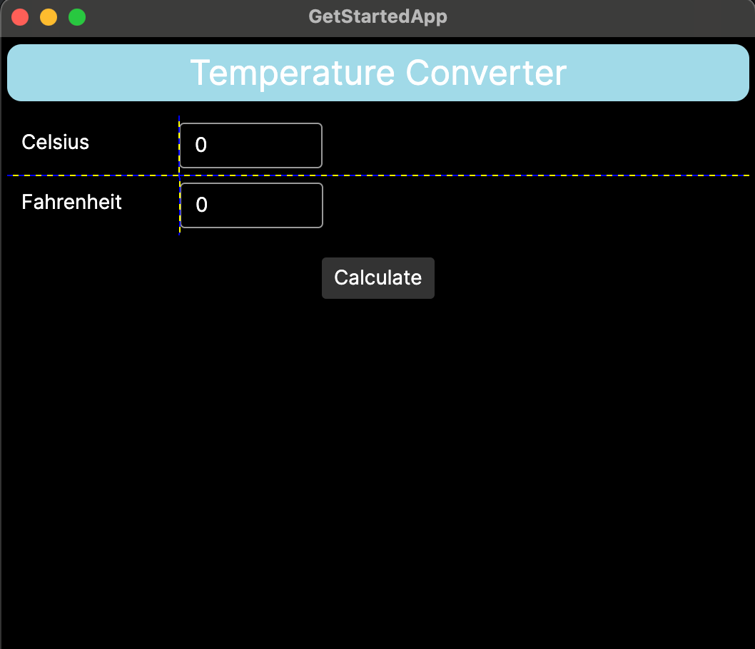
- Insert
TextBlockcontrols in the left cells of the grid, using theGrid.RowandGrid.Columnattributes to assign the target cells. Use these text blocks to fill the cells with the text “Celsius” and “Fahrenheit”.
The first cell in a row or column of a Grid is numbered 0.
        <Grid ShowGridLines="True" Margin="5"
              ColumnDefinitions="120, 100"
              RowDefinitions="Auto, Auto">
            <TextBlock Grid.Row="0" Grid.Column="0" Margin="10">Celsius</TextBlock>
            <TextBlock Grid.Row="1" Grid.Column="0" Margin="10">Fahrenheit</TextBlock>
        </Grid>
- Insert
TextBoxcontrols in the right cells of the grid, again using theGrid.RowandGrid.Columnattributes to assign the target cells.TextBoxis a control that creates an area for keyboard input.
        <Grid ShowGridLines="True" Margin="5"
              ColumnDefinitions="120, 100"
              RowDefinitions="Auto, Auto">
            <TextBlock Grid.Row="0" Grid.Column="0" Margin="10">Celsius</TextBlock>
            <TextBox Grid.Row="0" Grid.Column="1" Margin="0 5" Text="0"/>
            <TextBlock Grid.Row="1" Grid.Column="0" Margin="10">Fahrenheit</TextBlock>
            <TextBox Grid.Row="1" Grid.Column="1" Margin="0 5" Text="0"/>
        </Grid>
- Run the app or check the previewer. You should see your text and input boxes added to the window, within the cells marked by the gridlines.
On the next page of this tutorial, you will learn how to adjust the size of the app window.