Resources tool
The Resources tool provides a view of your application's resource hierarchy, allowing you to inspect, navigate, and modify resources at runtime. This tool helps you understand how resources are organized and resolved in your Avalonia application.
During a resource lookup, Avalonia searches through this hierarchy until it finds a matching key. The Resources tool visualizes the application-level hierarchy so you can see which resources are available globally.
For more information about Avalonia resources, see How to use resources.
Control-specific resources (those defined on individual controls or within control templates) are not currently displayed in this tool.
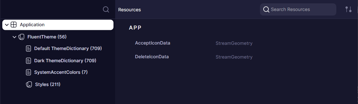
Navigating the resource providers tree
The left panel displays a tree of resource providers, which include:
- Application (root level)
- Resource dictionaries
- Theme dictionaries
- Styles
- Other non-dictionary resource providers
Each node in the tree represents a resource scope. Selecting a node displays its resources in the right panel.
Inspecting and editing resources
The right panel shows resources available in the selected provider.
You can edit resources directly in this view, allowing you to experiment with different values and see changes reflected immediately in your application.
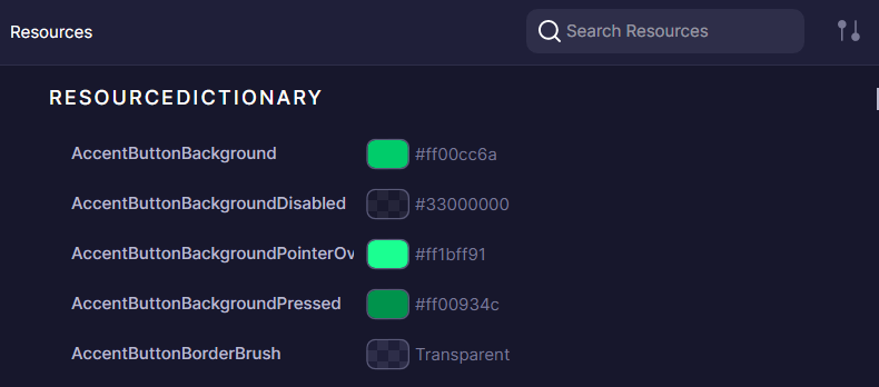
Adding new resources to a provider is not yet supported.
How resource editing maps to XAML
When you edit a resource value in the Resources tool, you are modifying the same runtime object that your XAML resource definitions create. For example, consider the following XAML resource definitions in your App.axaml:
<Application.Resources>
    <SolidColorBrush x:Key="PrimaryBrush" Color="#0078D4" />
    <x:Double x:Key="DefaultFontSize">14</x:Double>
    <Thickness x:Key="StandardPadding">8,12,8,12</Thickness>
</Application.Resources>
These resources appear in the Resources tool under the Application node. You can select PrimaryBrush and change its Color property at runtime to preview a different theme color without rebuilding your application.
If your controls reference these resources with DynamicResource, they update automatically:
<Button Background="{DynamicResource PrimaryBrush}"
        FontSize="{DynamicResource DefaultFontSize}"
        Padding="{DynamicResource StandardPadding}"
        Content="Save" />
Once you find values you are satisfied with, copy them back into your XAML source to make the changes permanent.
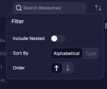
Filtering and sorting
The Resources tool offers several options to help you find specific resources:
- Include Nested: When enabled, shows all resources available at the selected node and its children, simulating how resource lookup works at runtime. This helps you identify which resources are accessible from a specific point in the hierarchy.
- Sort by: Arrange resources alphabetically by key or grouped by type.
- Order: Sort in ascending or descending order.
- Search filter: Search for resources by key or type.